Making the small
print stand out.
A brand identity for Aracor, an AI company making contracts easier to understand.

A clear identity for
a complex subject.
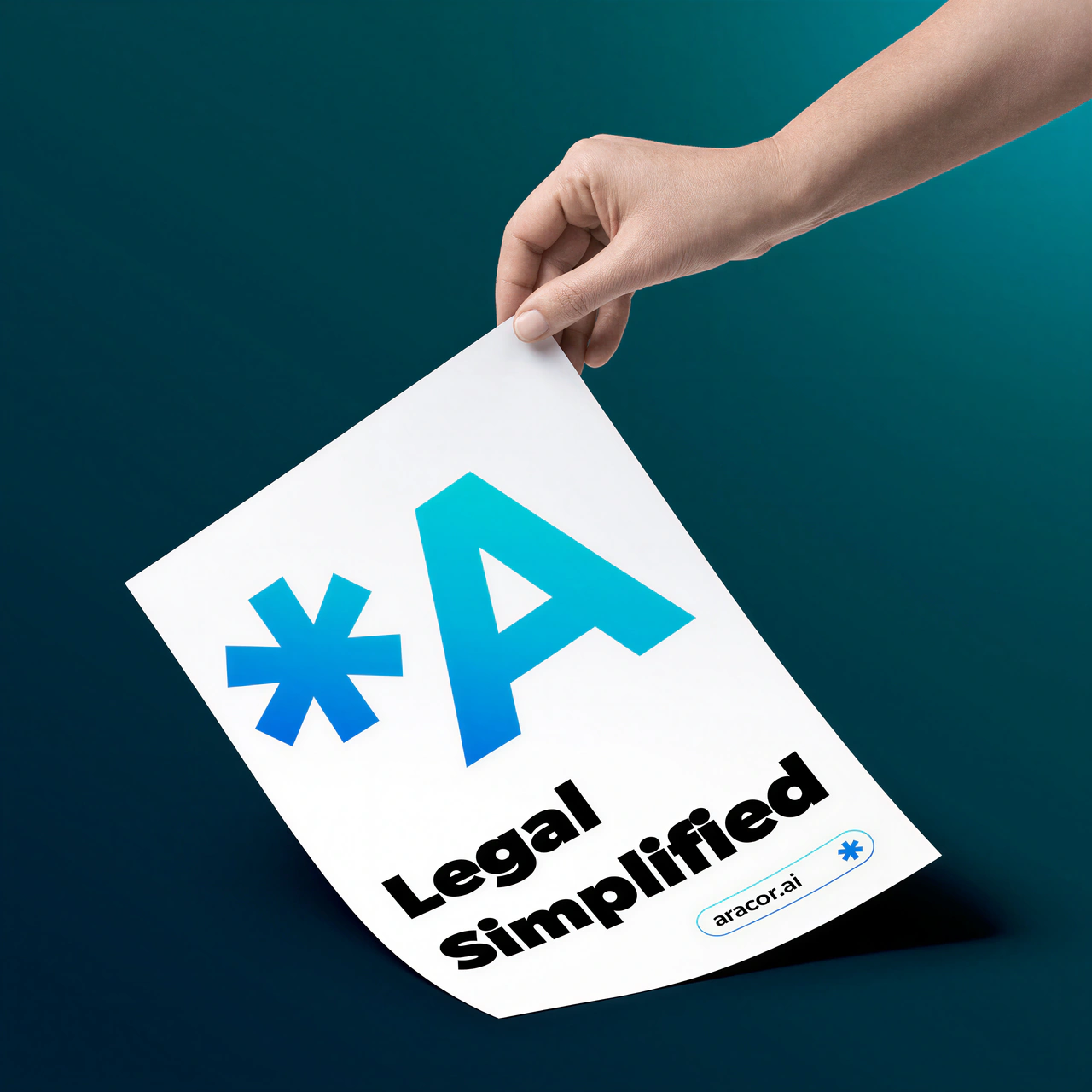
Aracor uses AI to review contracts and simplify legal language. The identity needed to make that promise feel clear and approachable, with a symbol people could recognise and remember.
We found the starting point in the documents themselves: the asterisk that asks a reader to look more closely.
From the footnote.
To the forefront.
An asterisk points to something that needs explaining. For Aracor, we brought it out of the small print and into the name — a compact expression of the company’s purpose.
The details
deserve a
closer look
Clarity.
Front and centre.
A simple mark.
A complete language.
The asterisk anchors a bold wordmark, a blue-to-cyan gradient and a deliberately spare layout. Together, they give the brand a recognisable voice across very different formats.
Confident.
Approachable.
Bold, rounded letterforms give the wordmark presence. The stationery uses Gibson, with clear roles for names, titles and contact details.
whiteBusiness
gradientInk
black
White space carries the content. The three-stop gradient brings emphasis. Black provides contrast.
Three directions.
One clear connection.
Each route explored a different meaning of “legal simplified”. The final choice connected the brand directly to the act of reading and understanding.
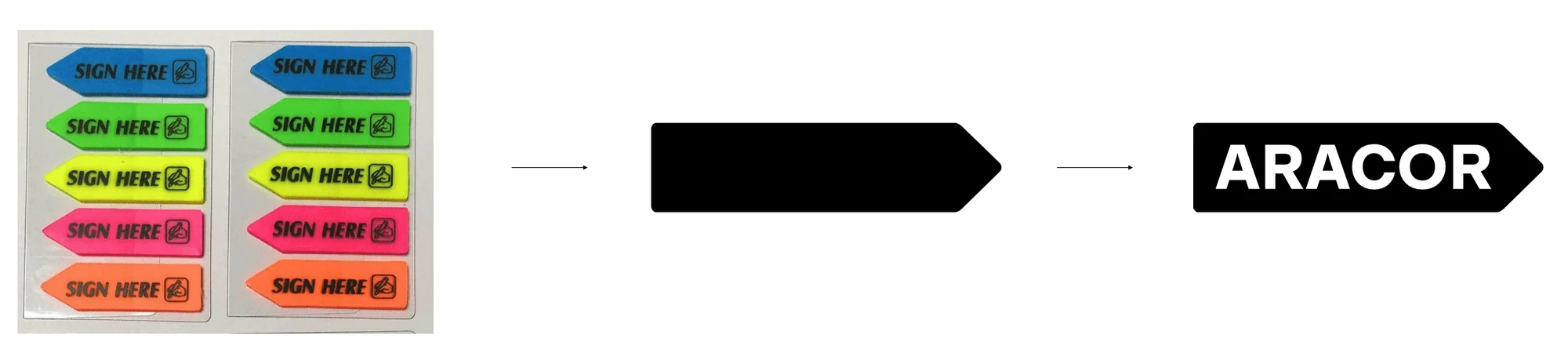
A prompt to sign.
The “sign here” tab offered a familiar cue. But it spoke about signing a document, while Aracor’s promise was to help people understand it.
Complexity, lightened.
A shift from heavy to light lettering suggested simplification. We kept searching for an idea with a closer connection to legal language.
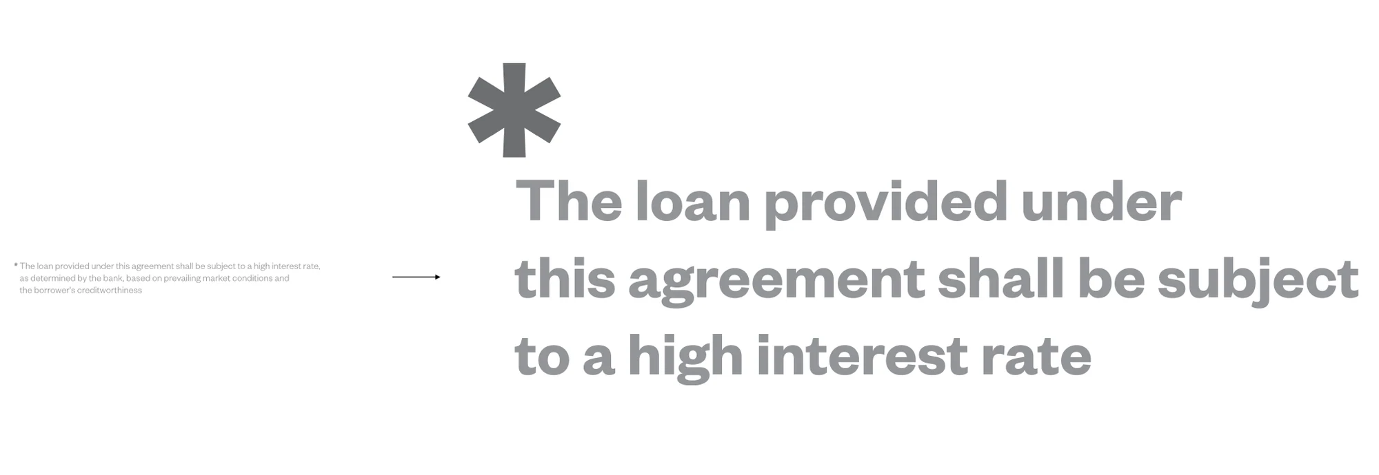
The detail that matters.
The asterisk belongs to the language of footnotes. Bringing it to the front of the name made the idea immediate: pay attention to what is easy to overlook.
From a business card
to a bigger stage.
A consistent identity, with room to adapt. These applications show how the symbol, typography and message work together in print, on objects and in larger spaces.
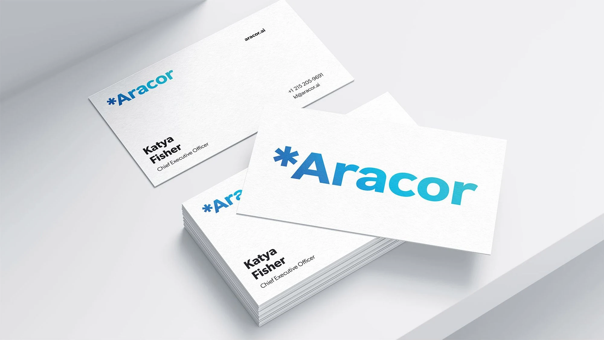
A clear first impression.
Business stationery puts the wordmark first, with space for the details that matter.
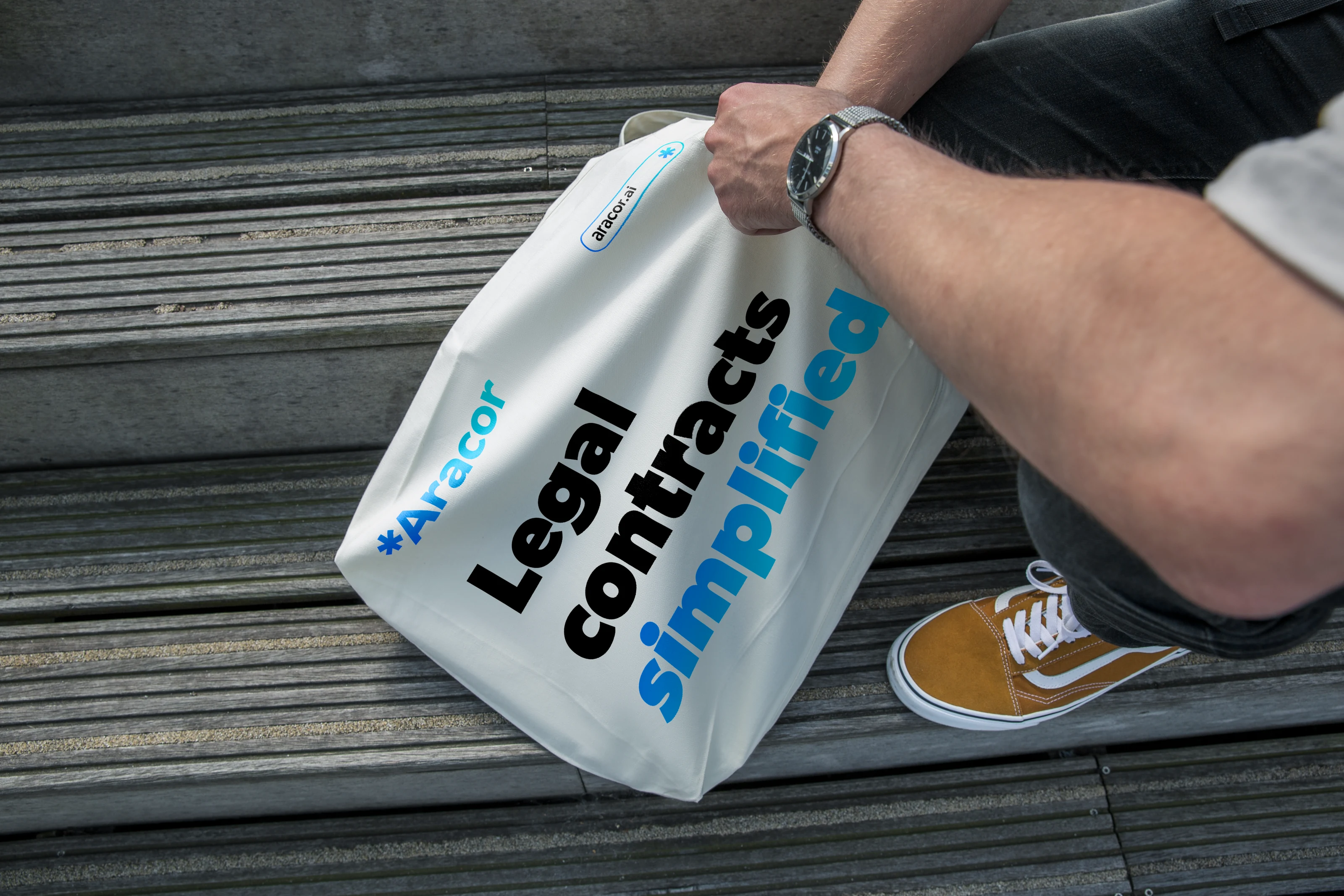
A message that travels.
The symbol and a short promise carry the identity onto everyday objects.
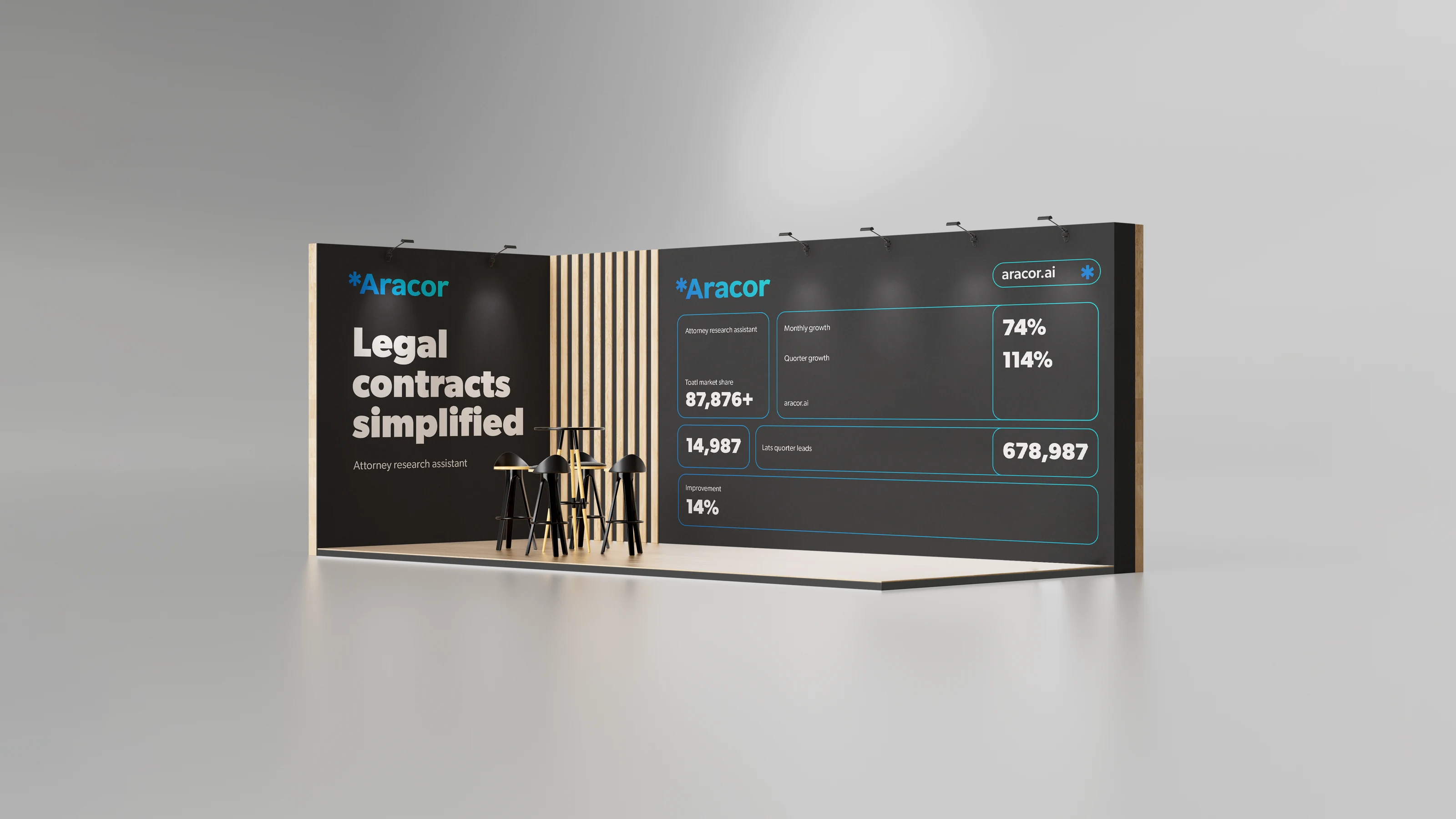
Built to be seen at a distance.
The exhibition concept brings the identity together at an architectural scale.
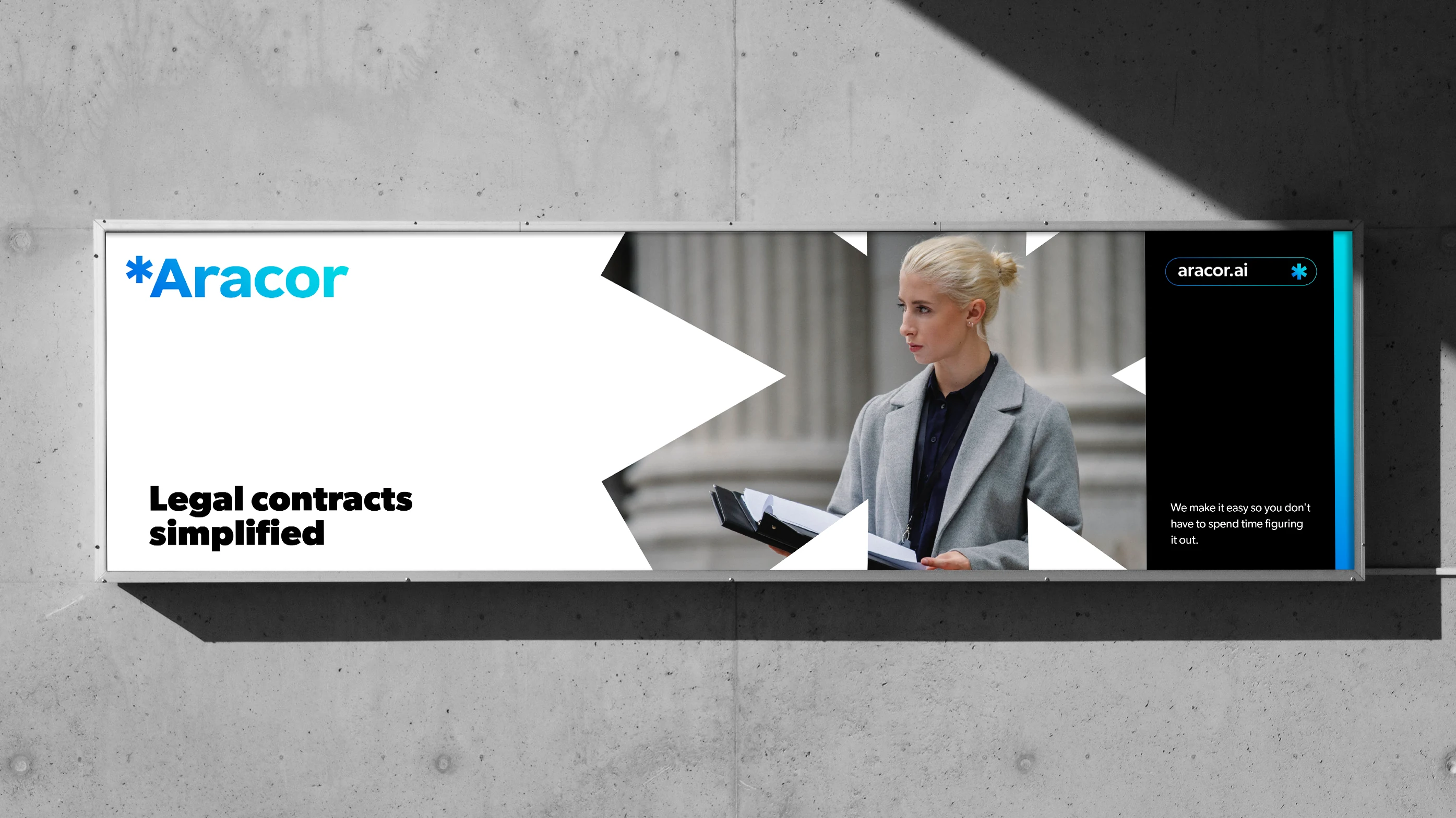
One idea, a larger canvas.
The same contrast of bold typography and open space extends into outdoor communication.
Clear to use.
Easy to keep consistent.
A compact guide brings the identity together: logo variations, clear space, colour, backgrounds and stationery. The same principle carries through to the handover — keep it simple.
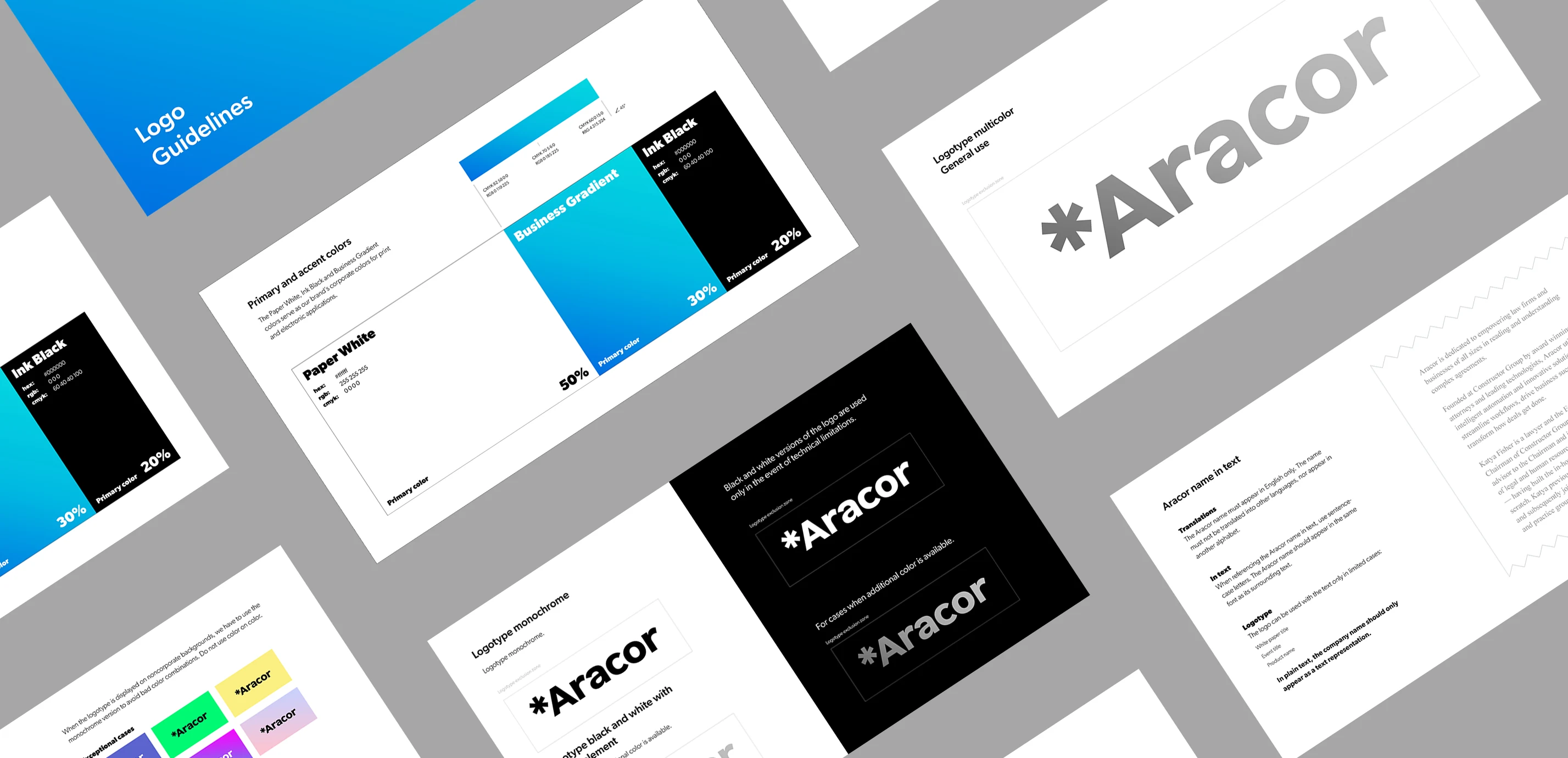
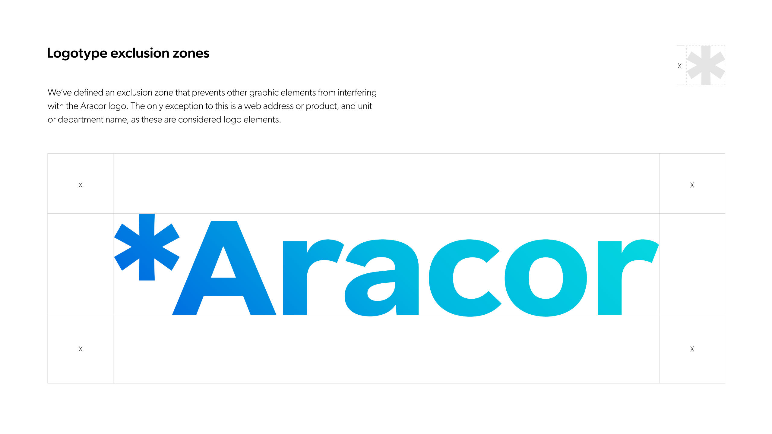
Room around the logo.
Clear space and proportions.
EXPLORE THE DETAIL ↗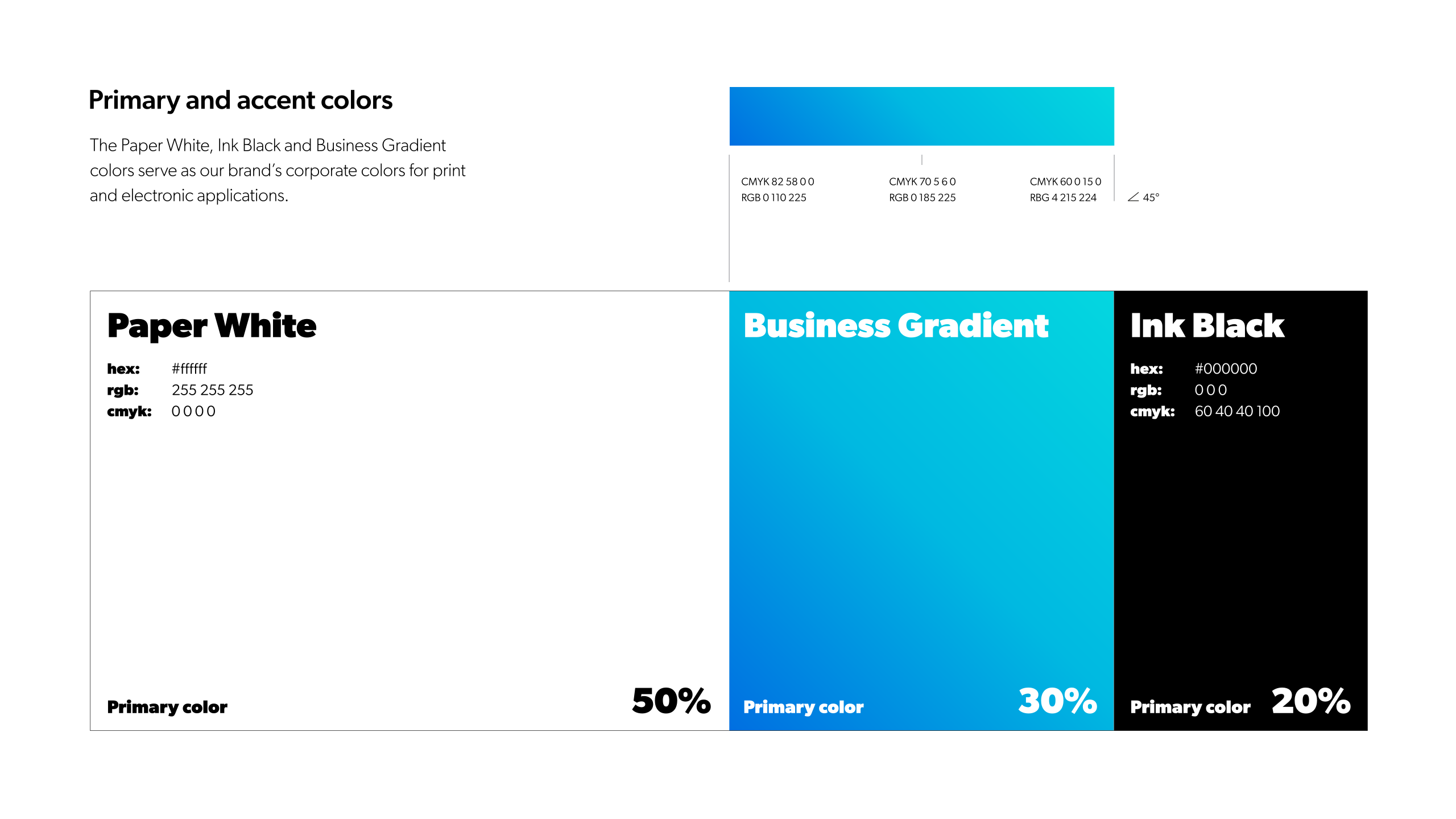
A precise colour system.
Paper White, Business Gradient and Ink Black.
EXPLORE THE DETAIL ↗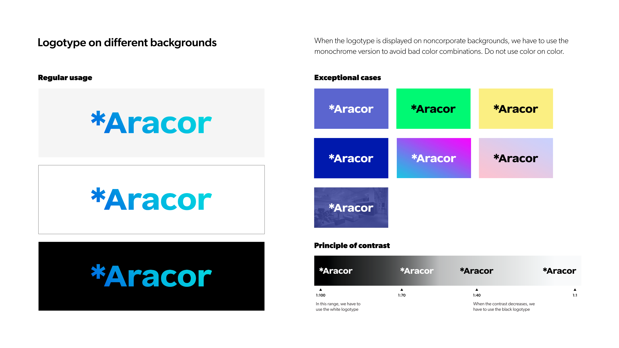
Contrast in every context.
Choosing the right logo variation.
EXPLORE THE DETAIL ↗The result is a visual identity that gives Aracor one consistent way to express its purpose: making legal complexity easier to understand.
- Brand concept and visual identity
- Logo variations and typography
- Business stationery
- Event and merchandise applications
- Brand usage guidelines