
A year of progress, brought to life.

Turning a university’s research, people and achievements into a publication worth exploring.
The challenge
An annual report has many audiences and a lot to communicate. Constructor University needed a publication that could make institutional information accessible while reflecting the life and ambition of its international campus.
The idea
We approached the report as an editorial magazine. A flexible grid, bold section openers, authentic campus photography and carefully structured infographics give dense information a clear rhythm. The design works both on paper and on screen.
Constructor University — Germany’s leading private research university based in Bremen—approached our team with a request to design and layout their Annual Report. Known for its international student body, cutting-edge research, and strong academic reputation, the university needed a visually compelling and professionally structured report to reflect its evolving identity and global mission.
The Annual Report plays a key role in communicating the university’s achievements, strategic goals, research output, and financial performance to stakeholders including prospective students, partners, donors, and the broader academic community. Our goal was to turn complex institutional content into a clear, engaging, and beautifully presented publication.
At Constructor Design, we specialize in designing annual reports and long-form editorial documents for academic, corporate, and nonprofit clients. This project is a great example of how strong editorial design can elevate institutional storytelling.
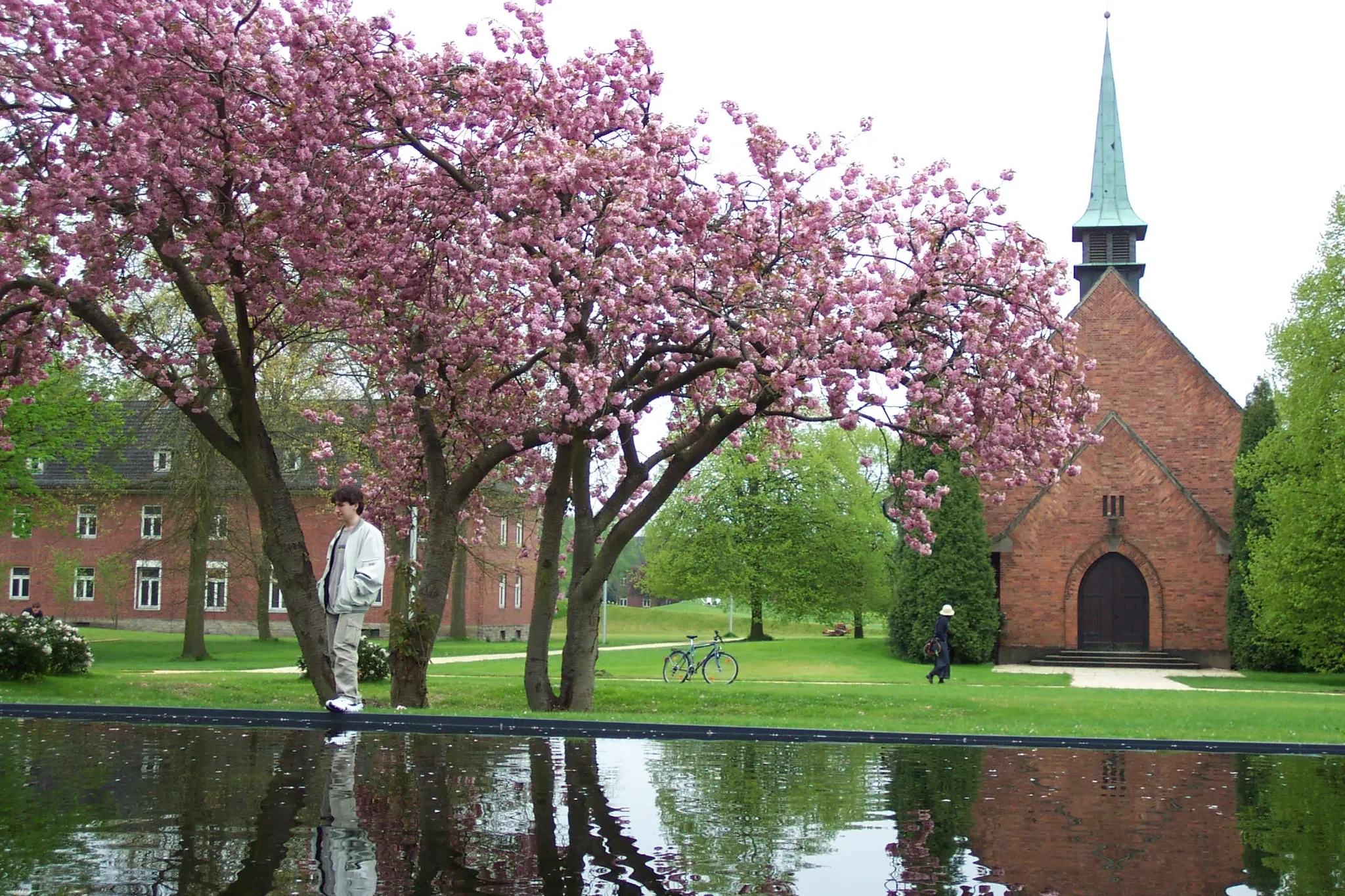
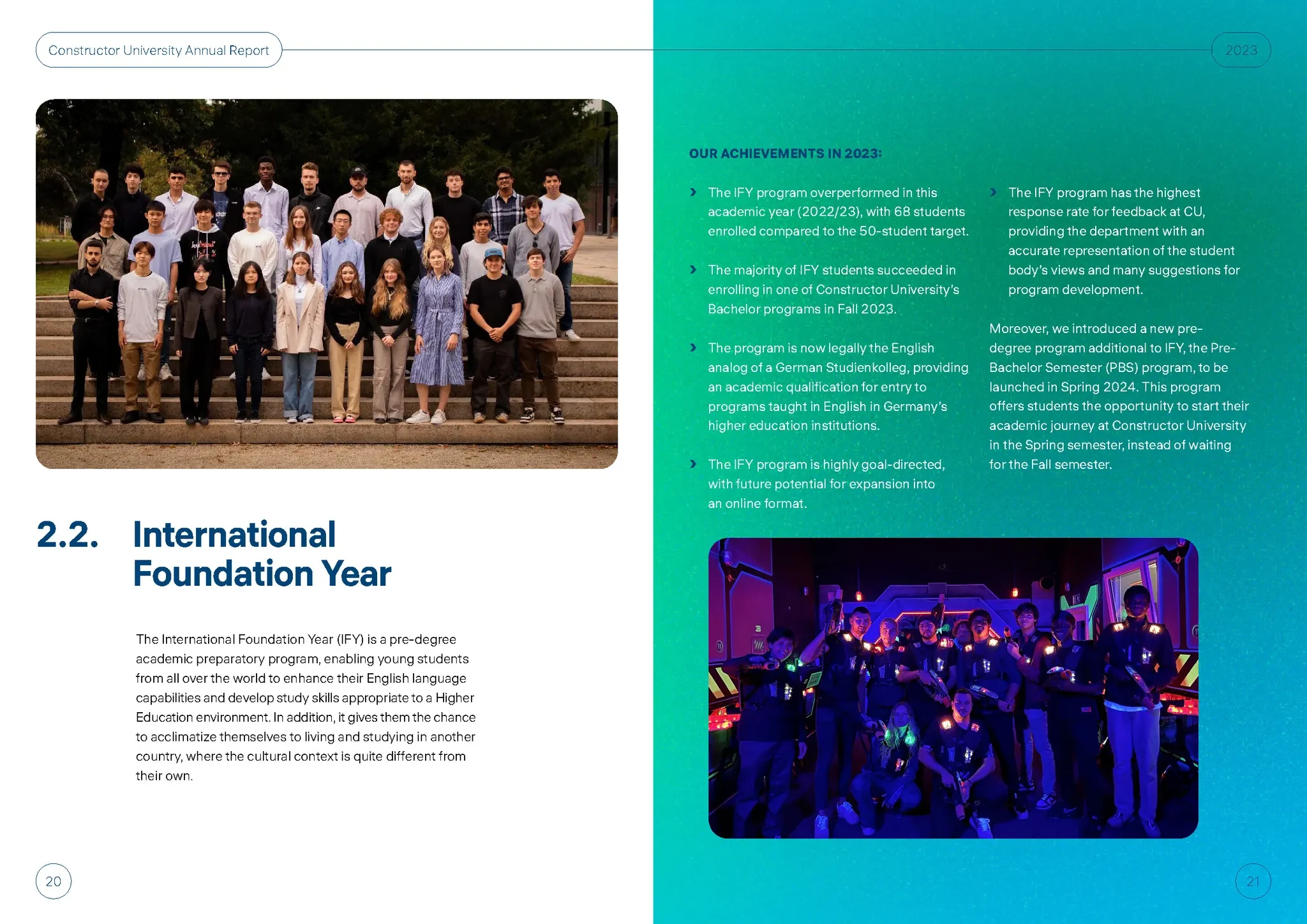
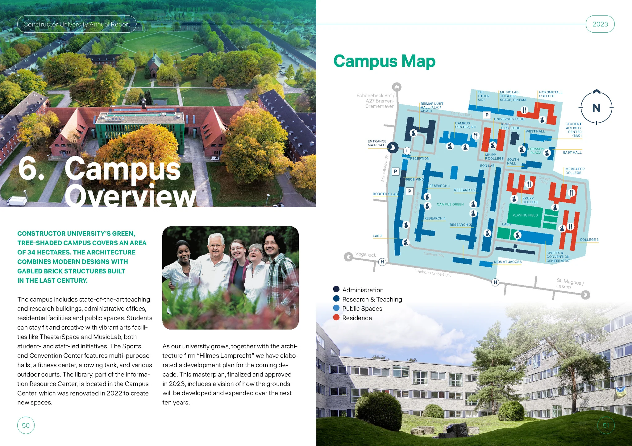
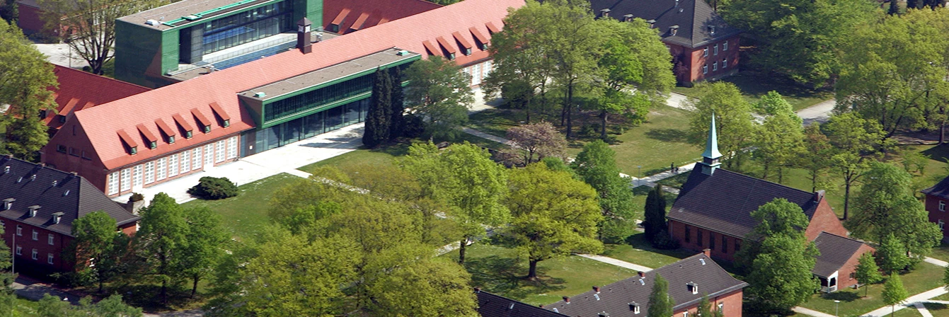
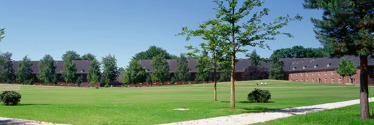
Constructor University is located on a beautiful, green campus in Bremen, combining historic charm with modern architecture. We wanted the report to reflect this unique atmosphere, so we made real photography a central part of the design. By using authentic images of students, faculty, and the campus itself, we brought warmth and personality to the publication—making it feel both human and inspiring.
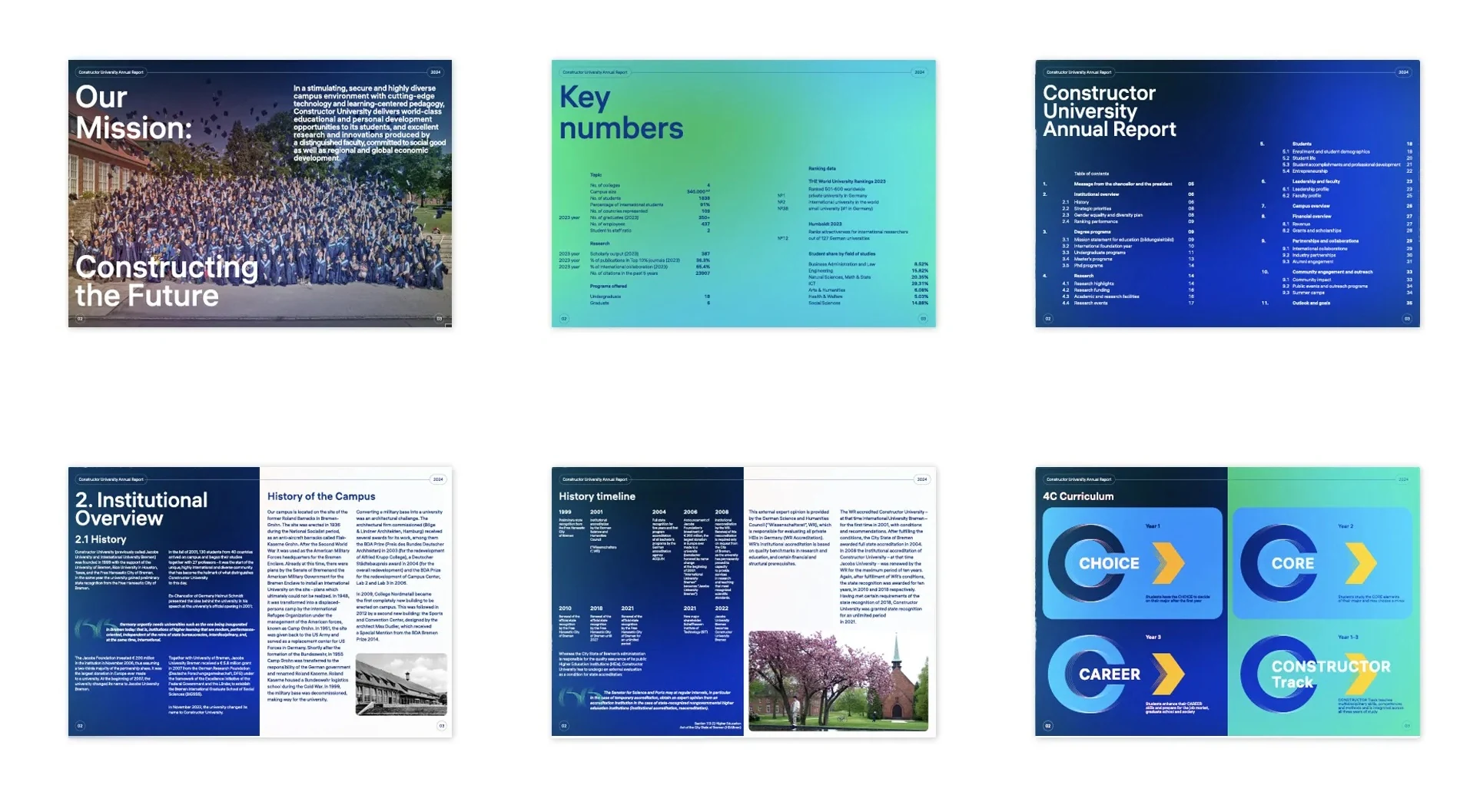
We deliberately moved away from the traditional, dull report style and approached the project more like an editorial magazine. Our goal was to create a vibrant, engaging publication that celebrates the university’s achievements. Bold colors, strong typography, and dynamic layouts helped turn dense content into a visually exciting and easy-to-read experience.
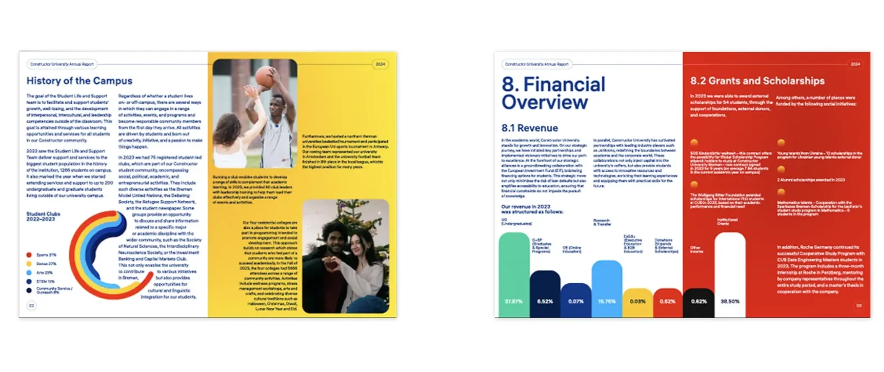
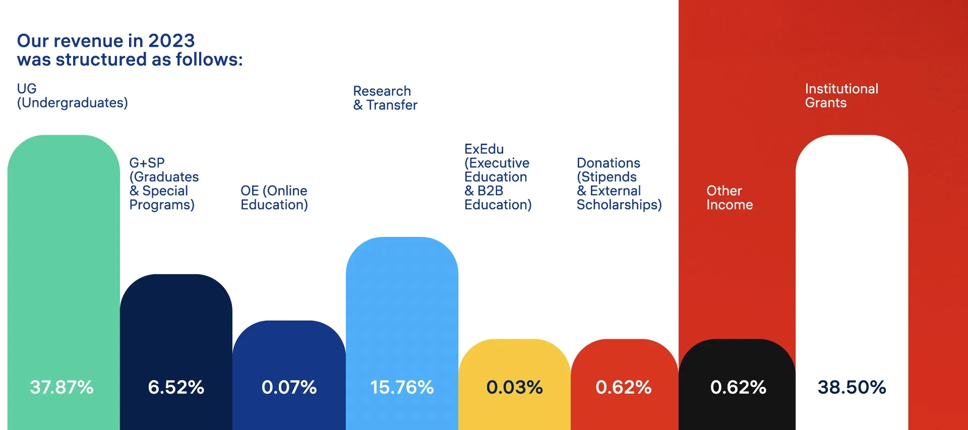
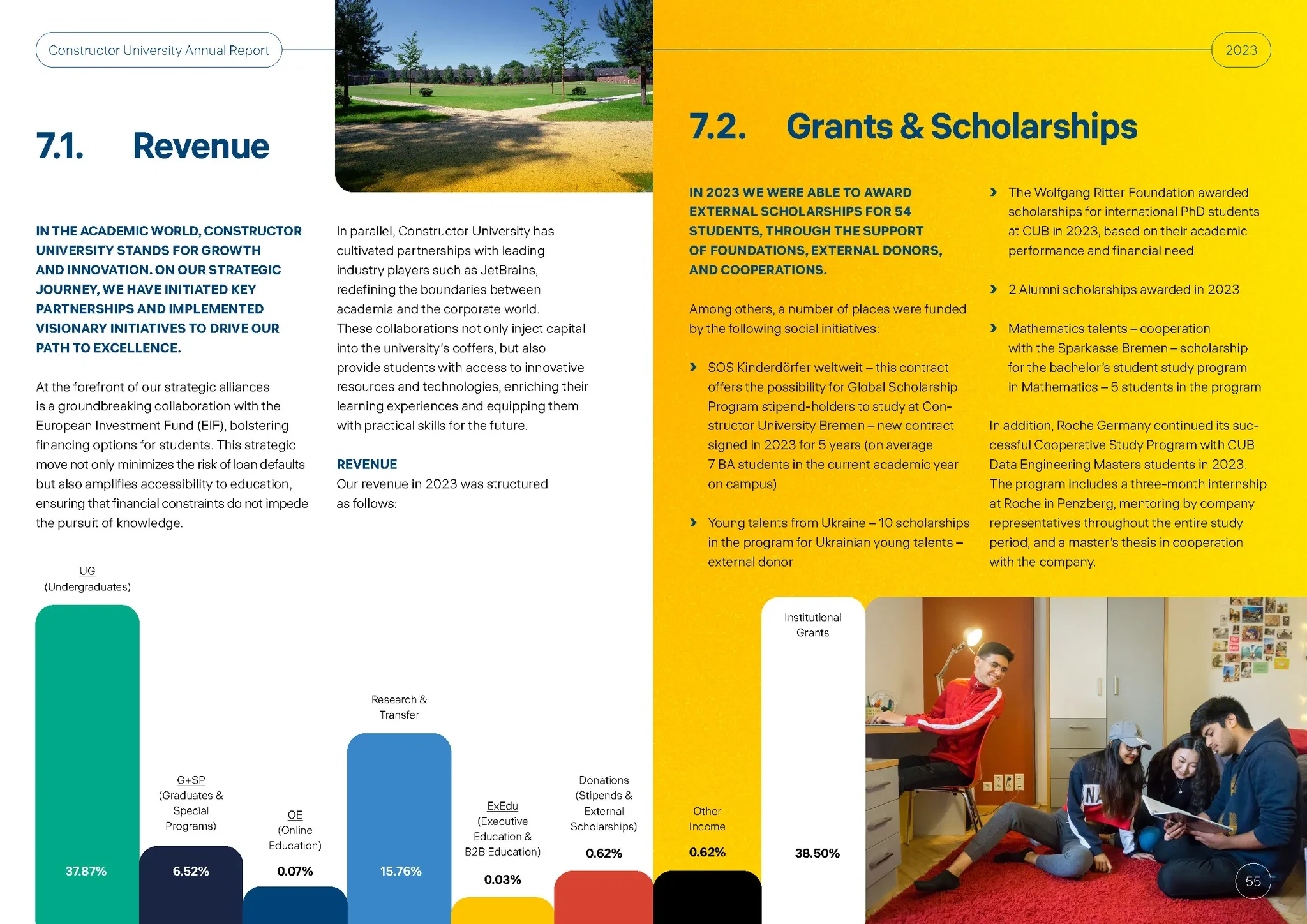
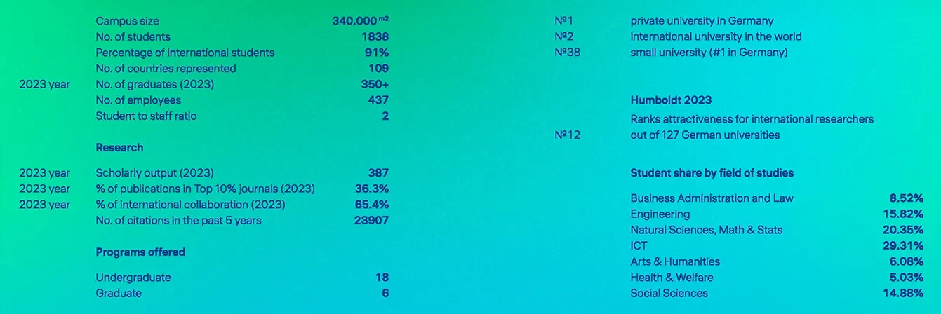
To make the report not only informative but also engaging, we transformed complex tables and statistical data into clear, visually appealing infographics. This approach made key figures — such as student demographics, research output, and rankings — more accessible and enjoyable to explore, even for readers outside academia.
Constructor University’s campus is more than just a backdrop—it’s an essential part of the university’s identity. Set on 34 hectares of green space in Bremen, the campus combines historical architecture with modern labs, libraries, and student facilities. We made sure to highlight this unique environment throughout the report, using full-bleed images and section dividers to immerse the reader in the daily life and energy of the university.
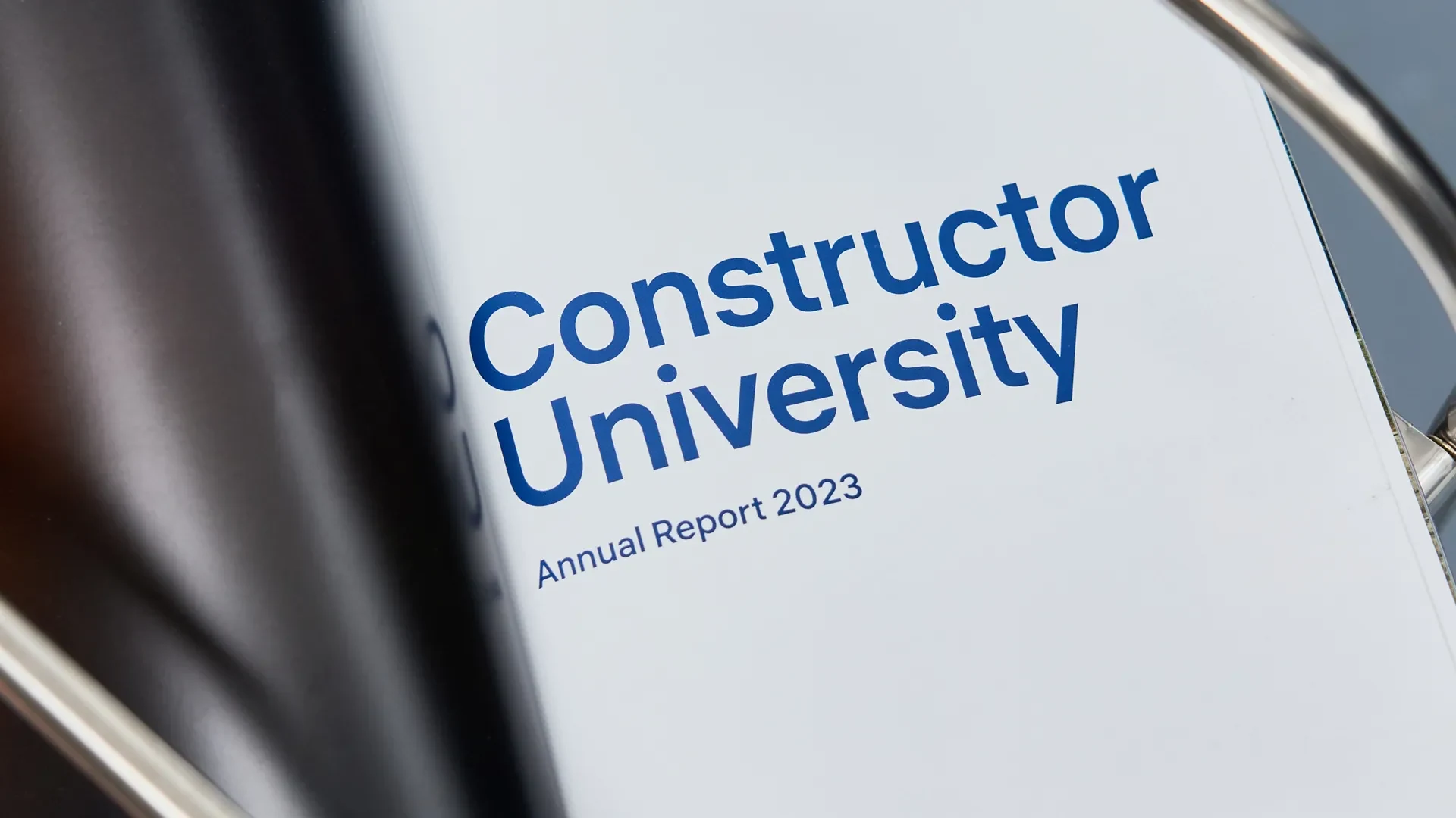
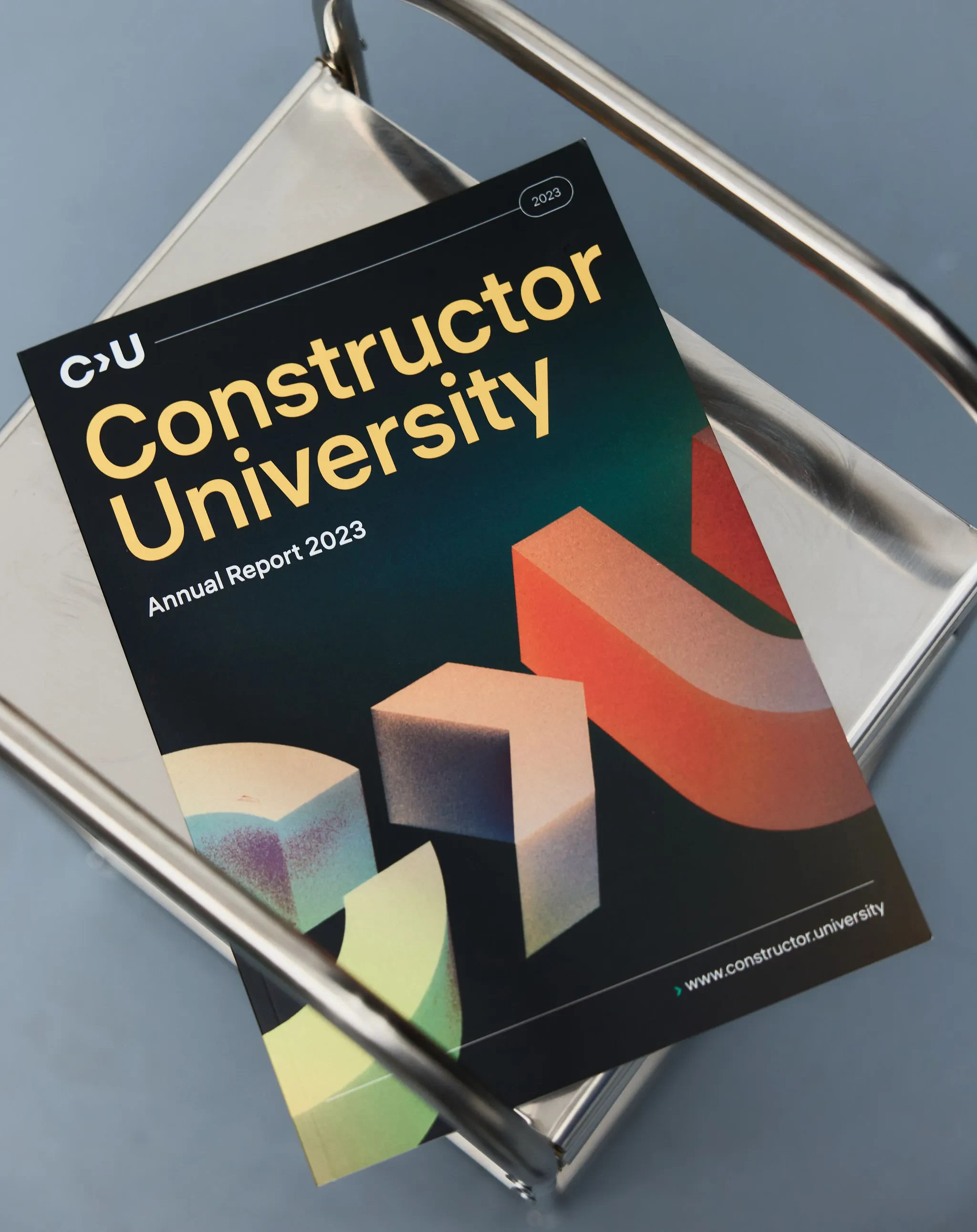
The cover follows a minimalist, editorial-inspired approach. With bold typography, restrained layout, and brand-aligned colors, it reflects Constructor University’s modern identity and academic excellence. A subtle yet distinctive highlight is the 3D “C > U” emblem—a symbolic abbreviation of the university’s name. This visual element reinforces the brand and adds depth and character to the otherwise clean layout.
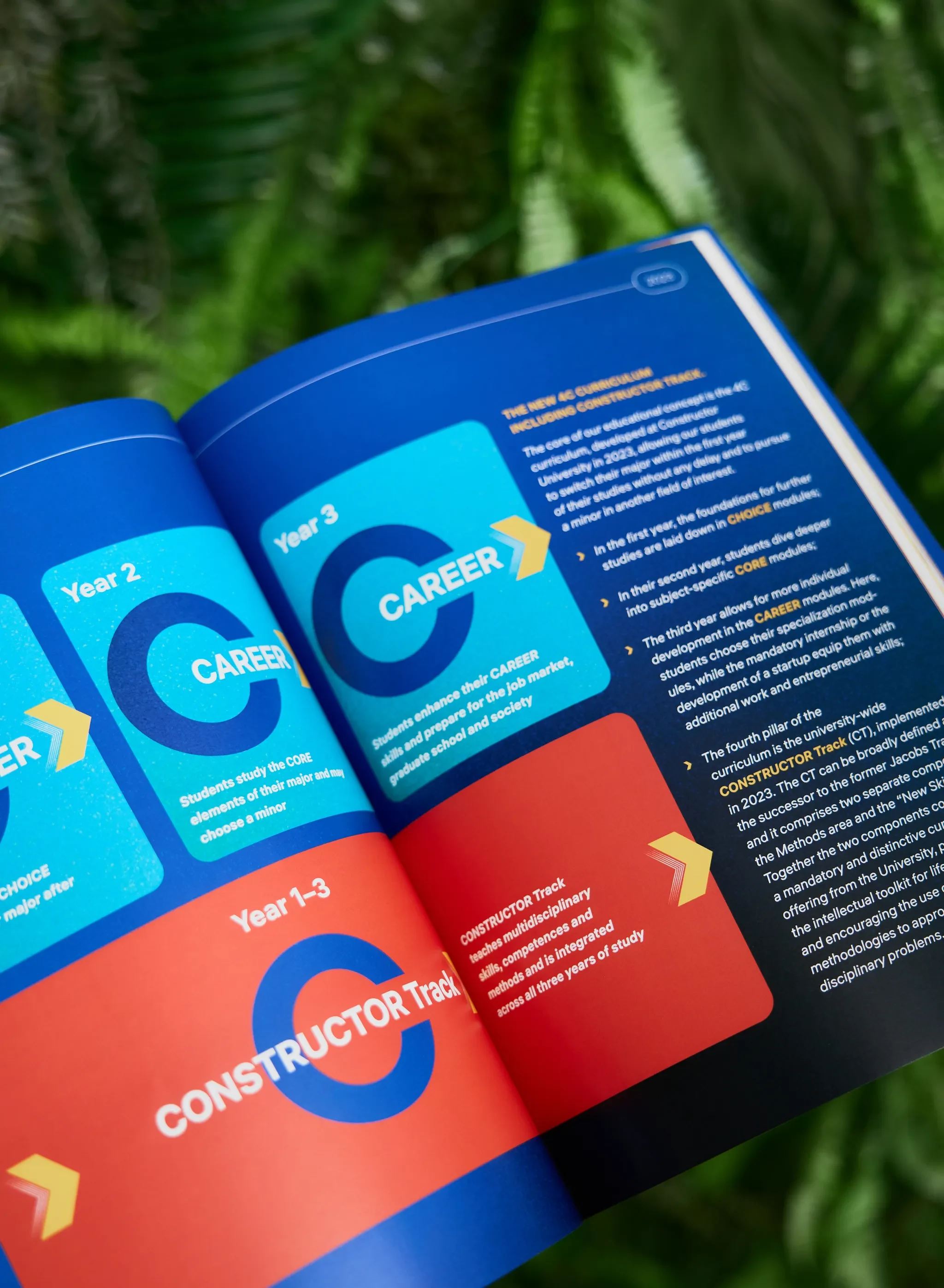

The report is organized into clear, well-defined sections—ranging from academic programs and research to student life, partnerships, and financials. We designed a consistent layout system using a flexible grid, allowing each spread to adapt to different types of content without losing visual coherence. Repeating elements like typographic hierarchies, margin logic, and color-coded section openers help readers navigate the document smoothly, whether flipping through highlights or reading in depth.
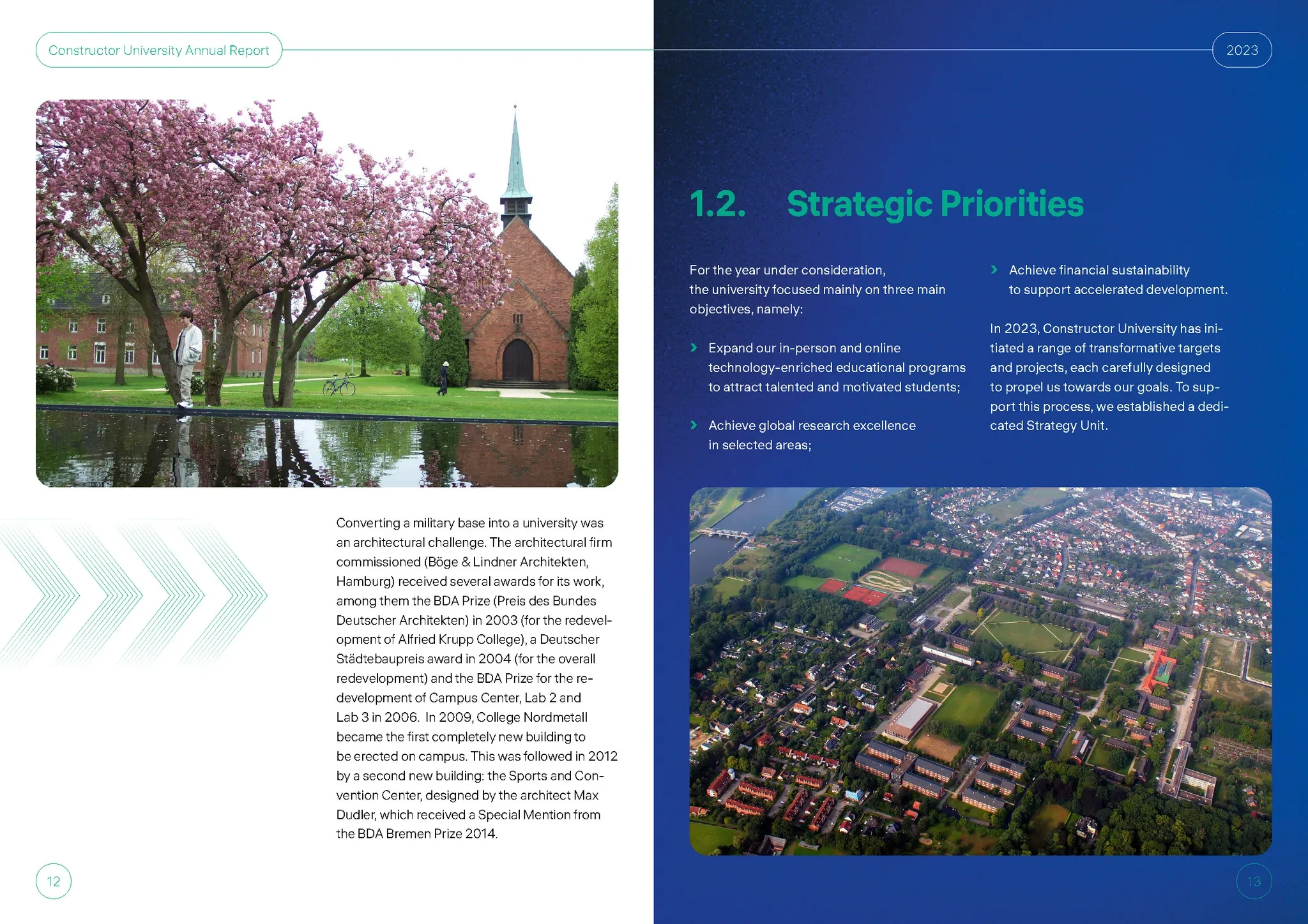
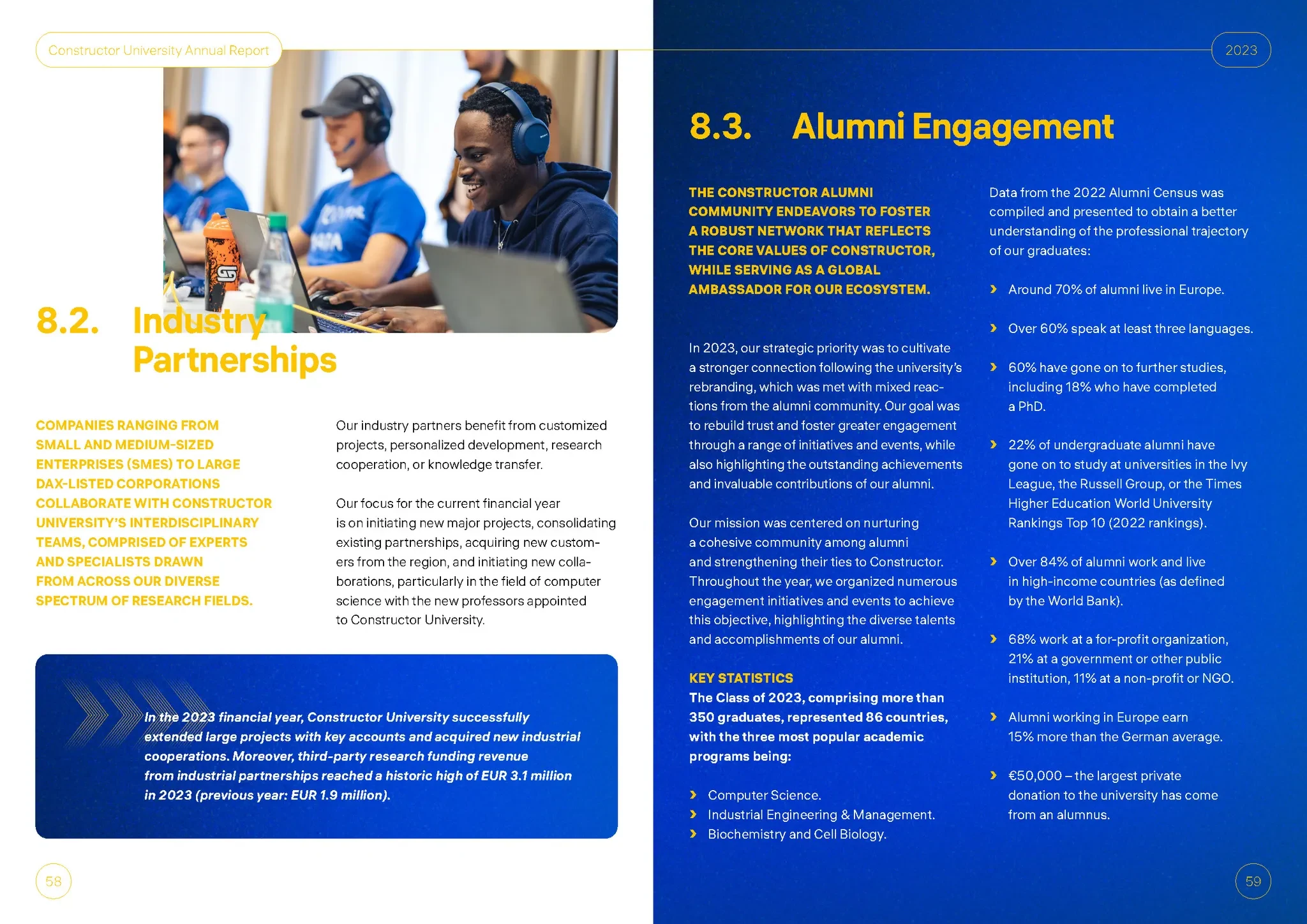
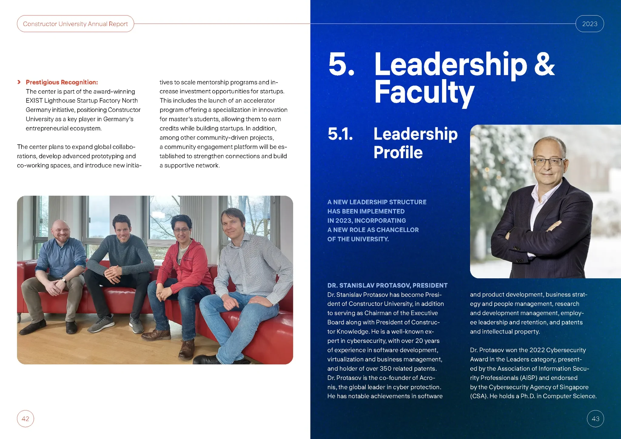
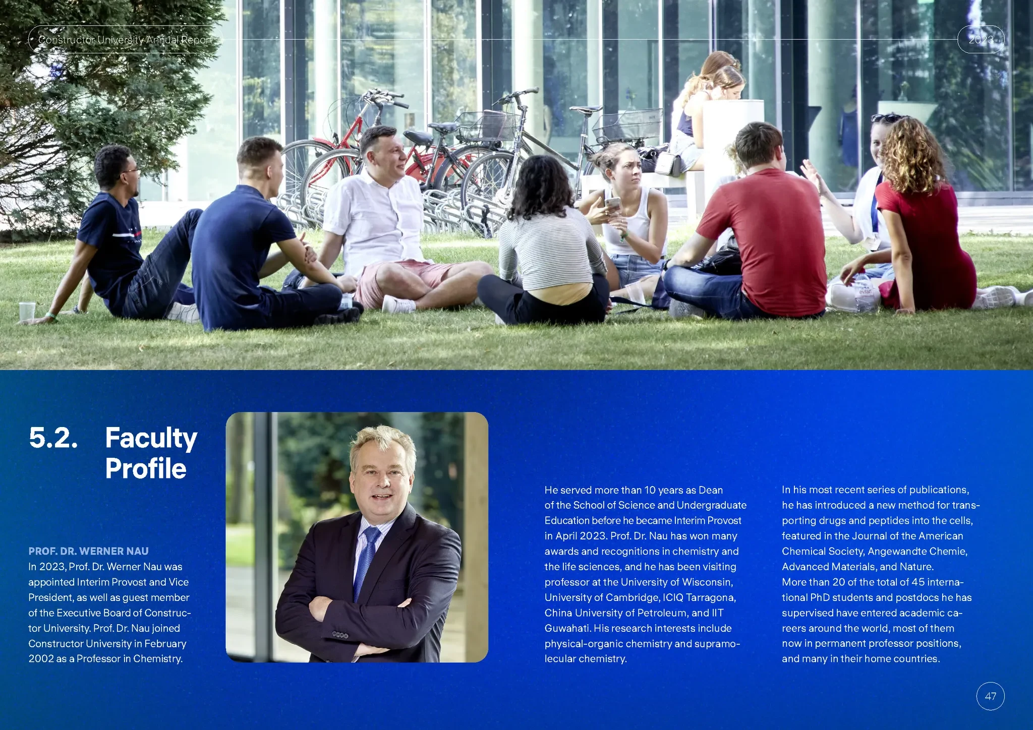
From the start, we designed the report to work seamlessly both in print and on screen. The layout was optimized for readability on standard paper sizes, with careful attention to margins, spacing, and contrast. At the same time, we ensured the PDF version would feel just as polished on desktop and tablet—adding clickable navigation elements, high-resolution images, and clear typographic rhythm for digital consumption. The result is a publication that feels equally at home as a printed document or an online experience.
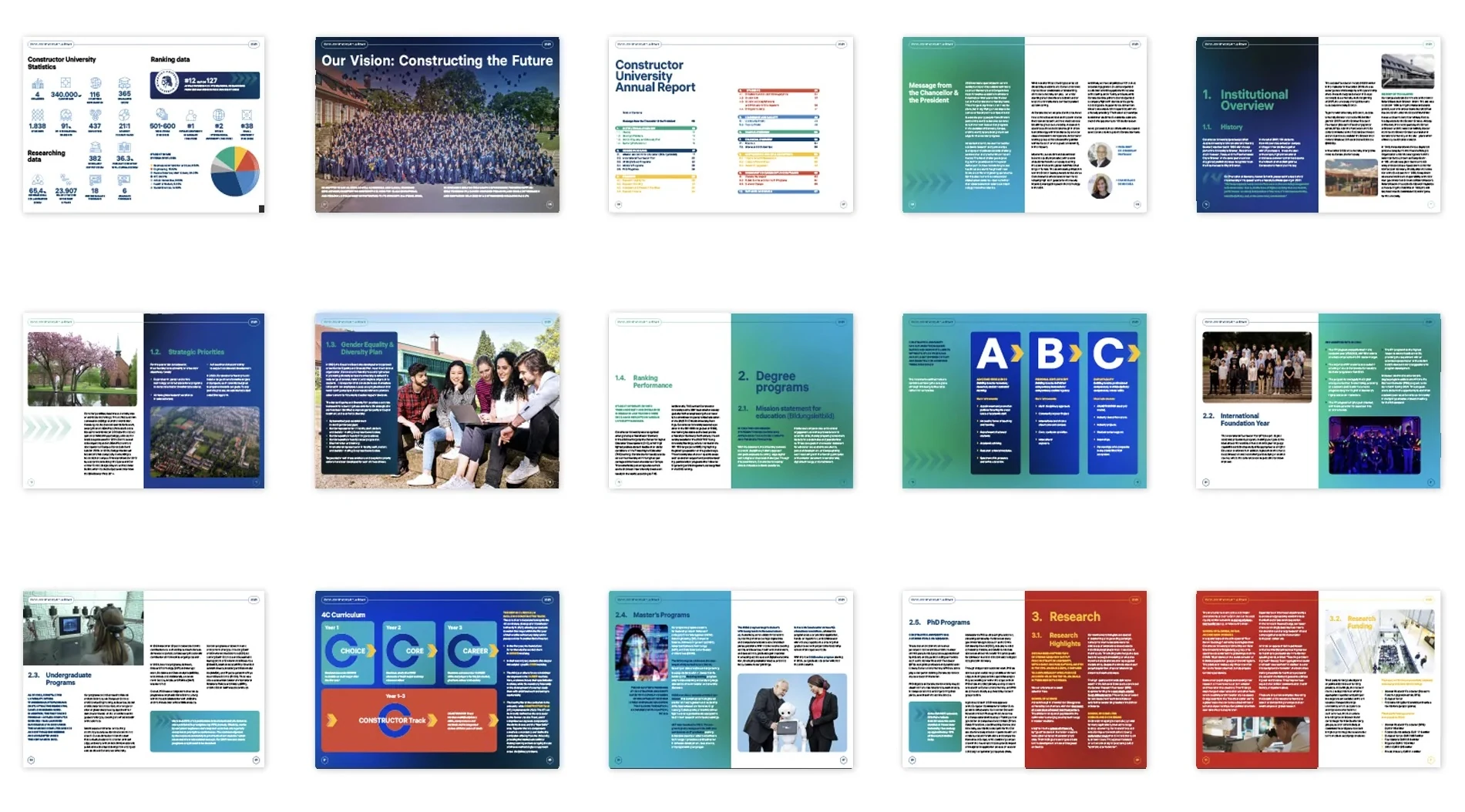
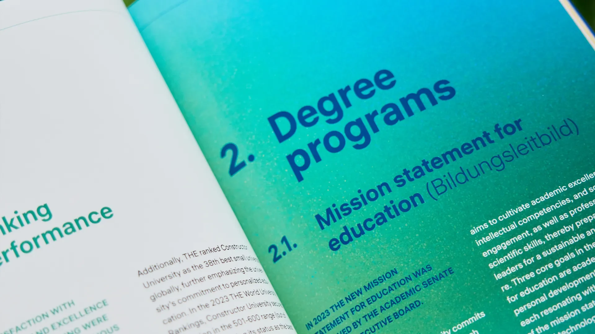
While Constructor University already had an established visual identity, we saw the Annual Report as an opportunity to push it further—within boundaries. We worked closely with their brand guidelines, applying the core palette, fonts, and visual language in a fresh and expressive way. The result feels consistent with the university’s image while allowing room for creative storytelling, especially through typography, layout rhythm, and custom graphic elements.
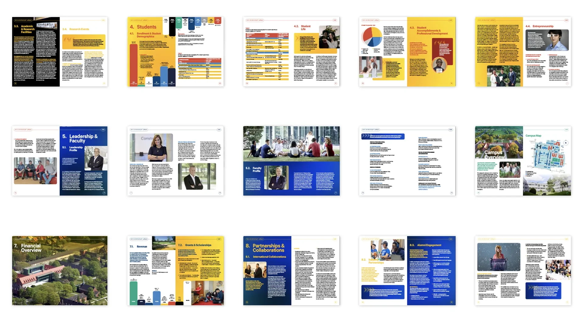
This project was more than just layout — it was about telling the story of a university in transformation. By combining thoughtful design, authentic visuals, and editorial structure, we helped Constructor University present itself with clarity, confidence, and style. The result is a report that not only informs but inspires.
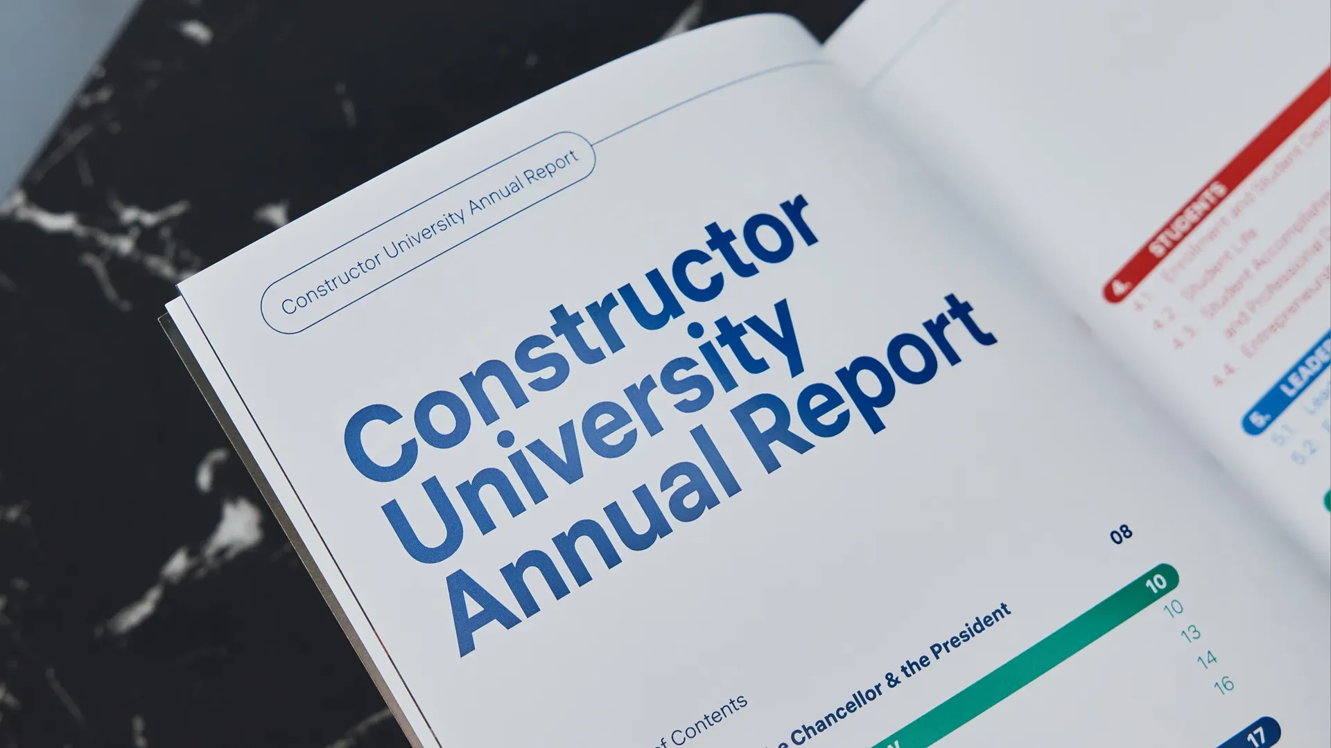
If you’re looking to elevate your institution’s annual report—or any long-form publication—we’d be happy to help.
Made to work
in the real world.
A cohesive publication brings academic programmes, research, student life and institutional information together. Its layout and navigation support both a quick overview and a more detailed read.
Have a similar challenge? ↗Schaffhausen Institute of Technology
Tell us what
you need.
Share your scope, timing and budget. We’ll suggest the right next step.
Start a project