
Swiss precision. Room to experiment.
A living identity spanning an institute, its community and an autonomous racing team.
The challenge
SIT needed an identity that could convey academic credibility and the experimental energy of a new technology institute. It also had to adapt to different divisions and audiences.
The idea
We combined a minimal typographic foundation with a flexible graphic system. Four red squares reference the Swiss flag. The identity expands through colour, patterns and applications; for SIT Autonomous, the Swiss flag meets the chequered flag of motorsport.
When the Schaffhausen Institute of Technology (SIT) approached us, they brought not just a name but an inspiring story of innovation, science, and education. An international institution based in Switzerland, SIT was founded by visionary entrepreneurs, guided by world-class scientists, and driven by cutting-edge research. With expertise in Quantum Computer Science, Advanced Materials, and Quantum Business Sciences, their mission is to empower the next generation of digital leaders and tackle some of the most complex challenges of our time.
From the very beginning, we understood that creating a brand identity for SIT would require more than just design—it demanded a deep understanding of their values and vision. The task was clear but ambitious: to craft a logo and visual language that would reflect the institute’s modern and forward-thinking approach while preserving the academic rigor and credibility that define their work.
We started by diving into their world, exploring the intersection of science, education, and technology that makes SIT unique. We wanted to create a brand that would resonate with scientists, students, and business leaders alike—a brand that feels innovative and cutting-edge, yet timeless and trustworthy. This meant finding a delicate balance between modern aesthetics and academic tradition, blending elements of precision, progress, and intellectual depth.
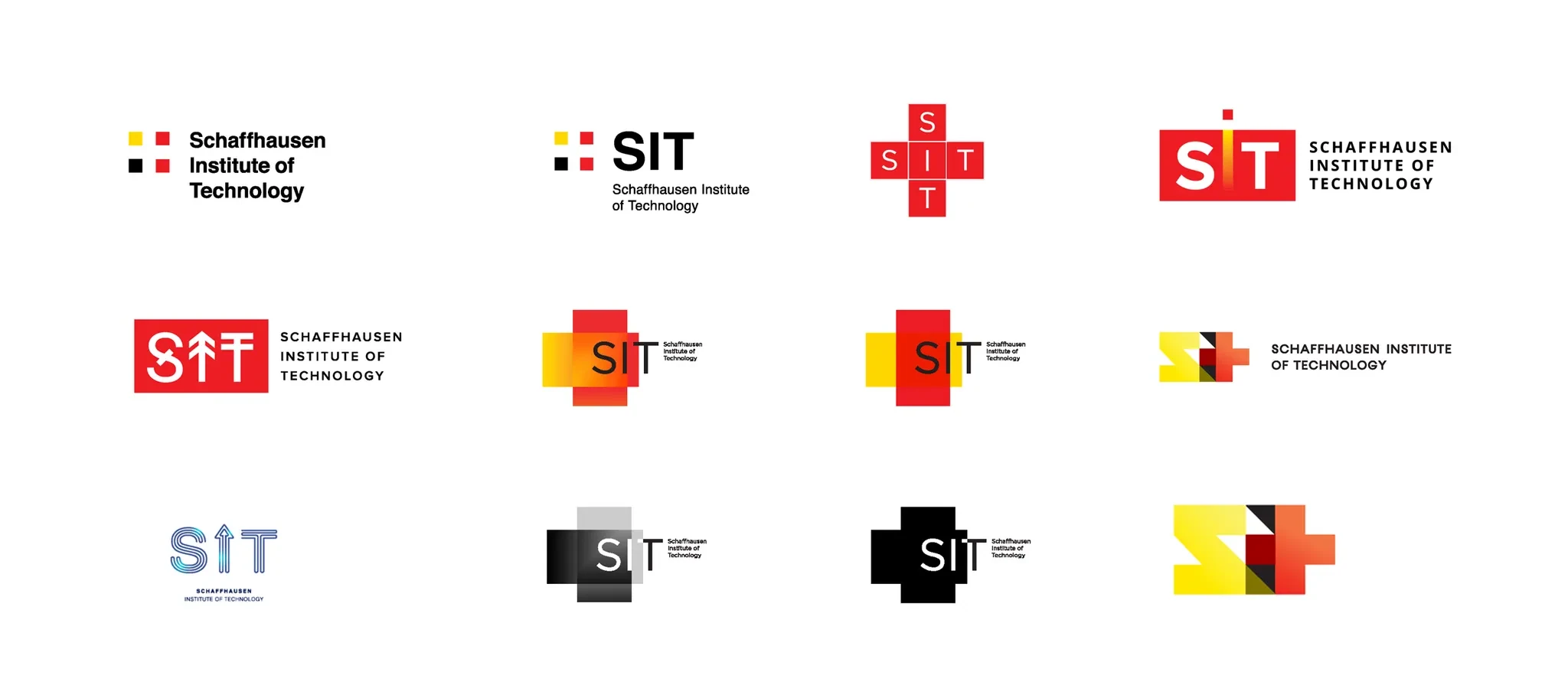
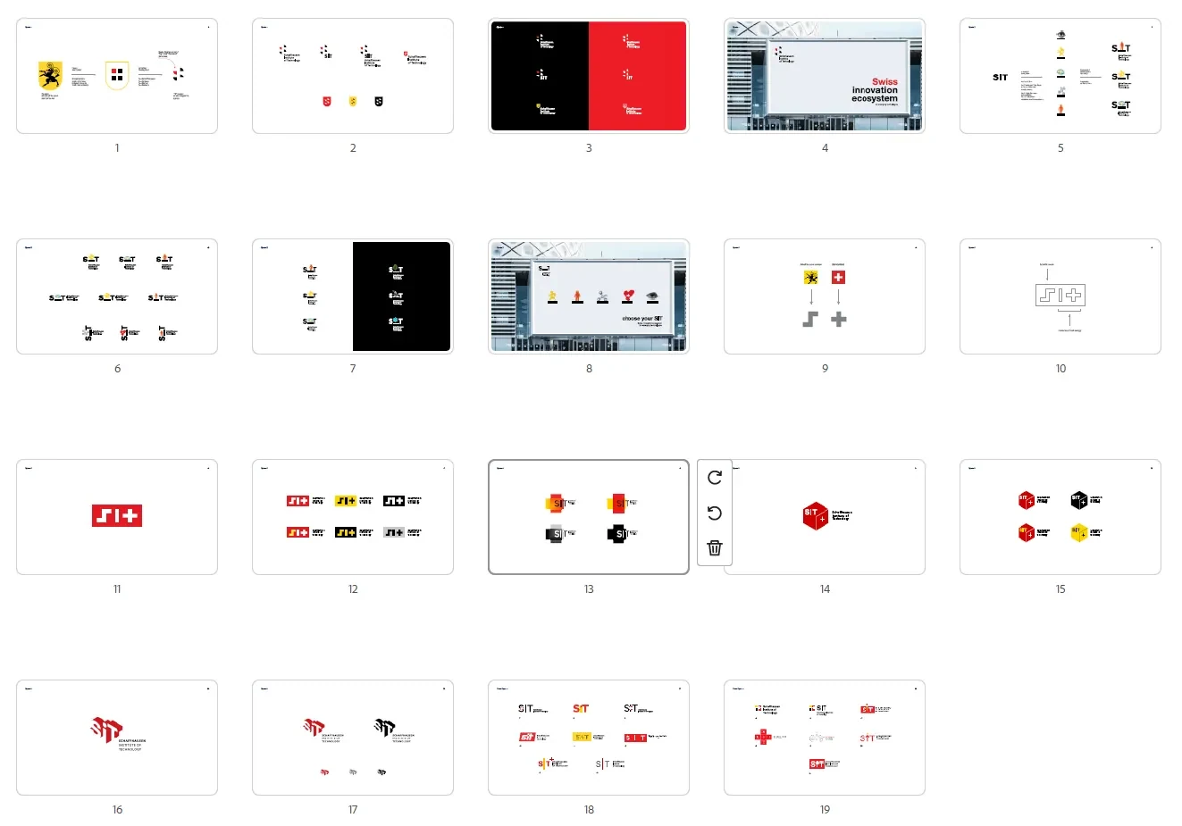
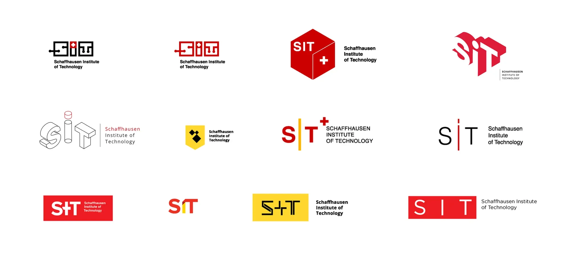
Our journey began with a series of creative explorations, analyzing the symbolism of knowledge, discovery, and innovation. We drew inspiration from the fields they specialize in—quantum computing, advanced materials, and leadership in the digital age—seeking to distill these concepts into a visual language that speaks to their essence. The result would not just be a logo, but a statement of who SIT is and the impact they aim to achieve.
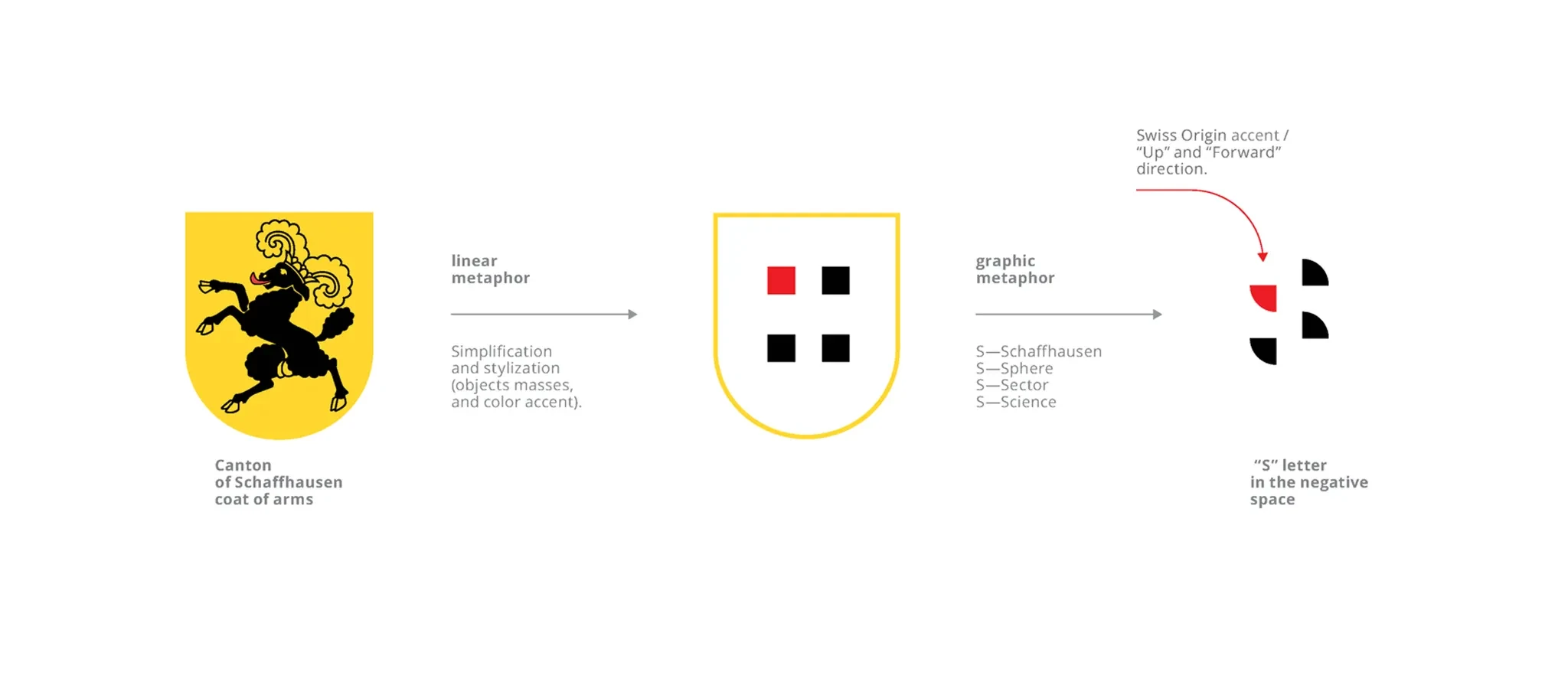
To ground SIT’s identity in its origins, we looked to the Swiss canton of Schaffhausen, a region rich in history and culture. The canton’s coat of arms, featuring a bold ram’s head, became a source of inspiration for our design process. We explored ways to reinterpret this traditional symbol, blending its strength and heritage with the institute’s modern, innovative vision. This fusion of tradition and progress became a key theme in our creative journey.
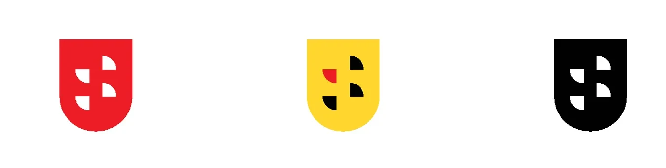
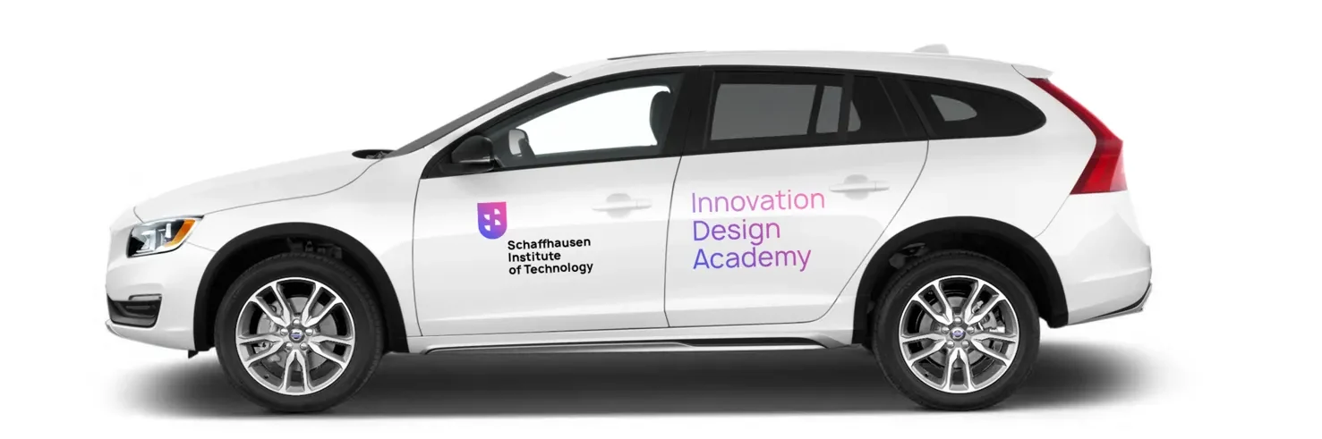
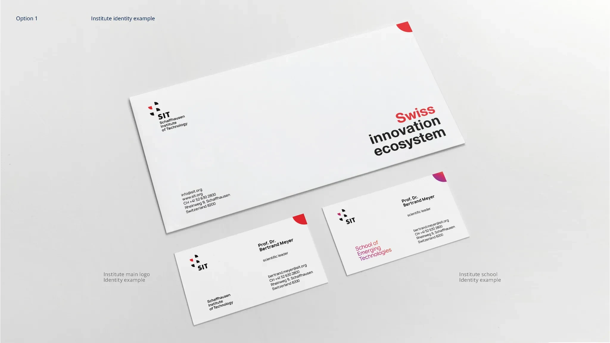
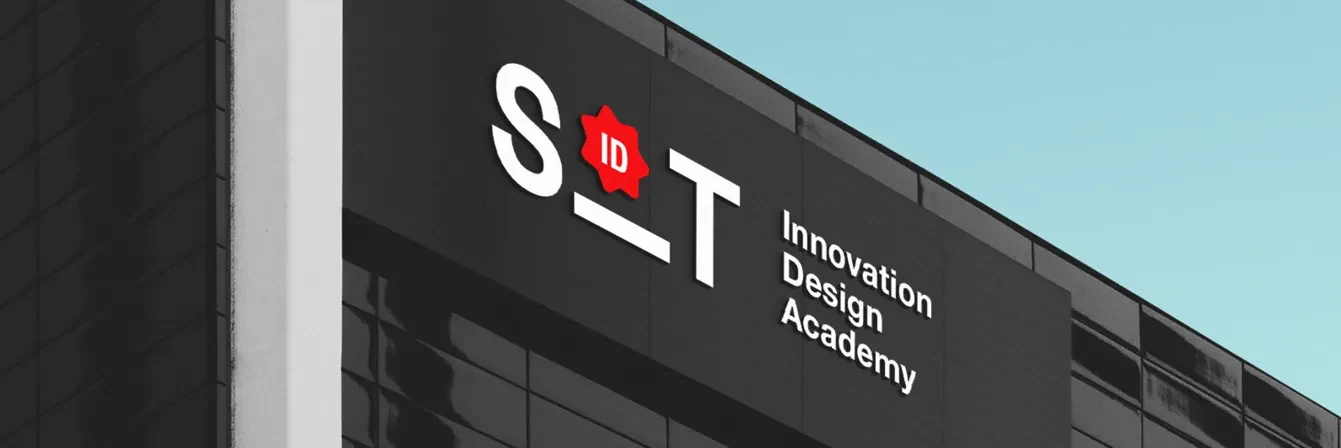
As our ideas took shape, we tested how the logo would perform in real-world scenarios, from digital platforms to printed materials, ensuring it was versatile and impactful in every context. Recognizing the need for a dynamic and engaging identity, we decided against limiting the color palette. Instead, we developed a vibrant and flexible system that resonates with SIT’s innovative spirit and speaks directly to its diverse community of students, embodying creativity and forward-thinking at its core.
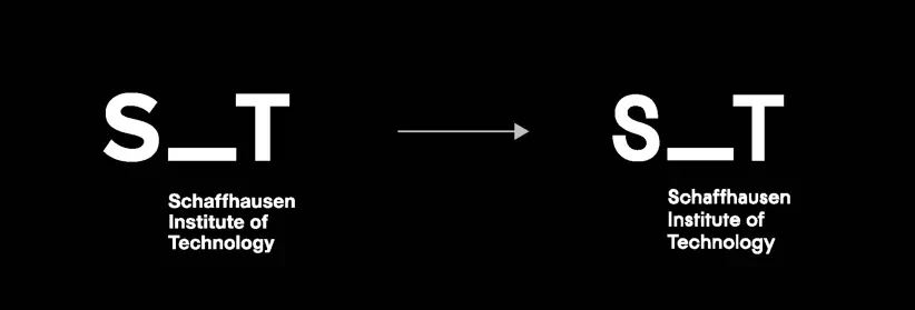
But then we realized we wanted something fresh—something unlike the standard logos typically associated with academic institutions. That’s when we decided to tilt the “I” in SIT on its side, transforming it into a platform—a foundation for all the dynamic and groundbreaking things happening within the institute. We aimed for a design that balanced Swiss minimalism with a touch of bold, creative madness, ensuring the logo would not only stand out but also leave a lasting impression.
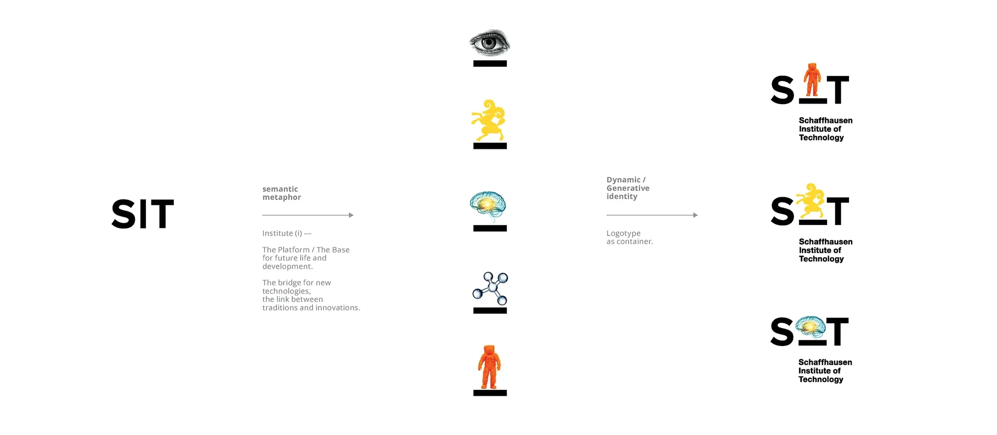
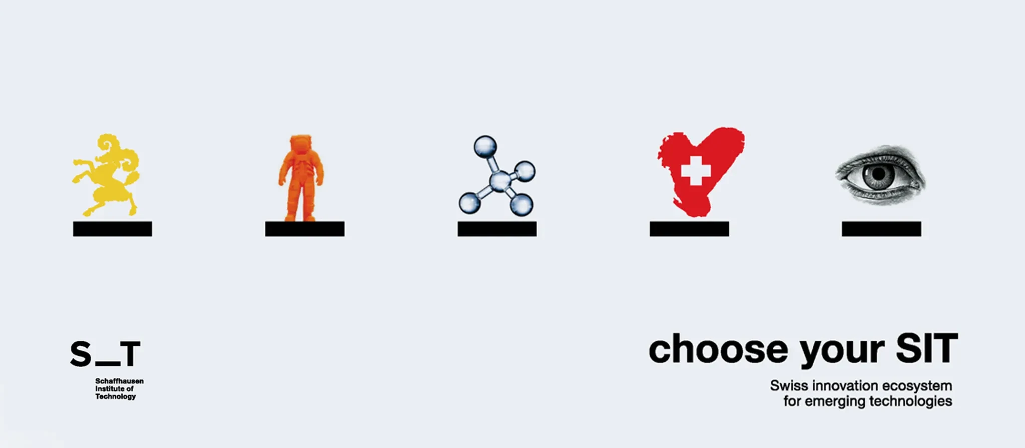
This approach resulted in a logo that is both strict and simple, yet incredibly dynamic. By allowing for the inclusion of different letters, icons, and images within the design, the logo becomes highly flexible without losing its unique identity. It strikes a perfect balance between adaptability and distinctiveness, making it a living, breathing representation of the institute’s innovative spirit.
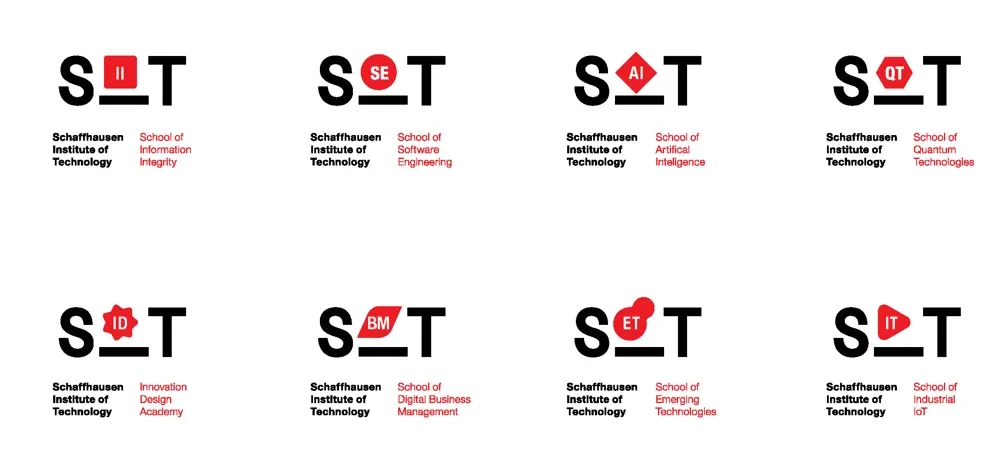

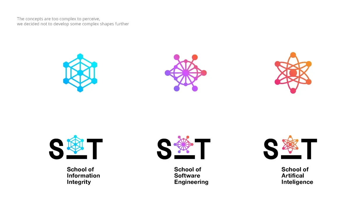
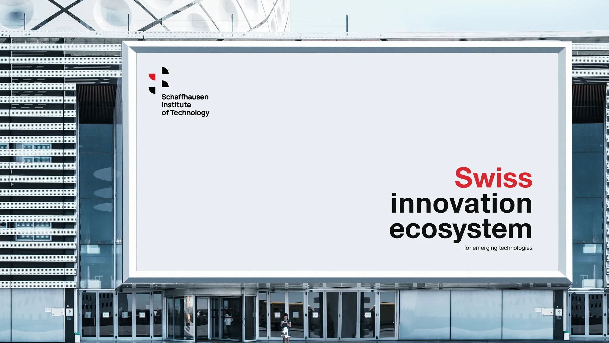
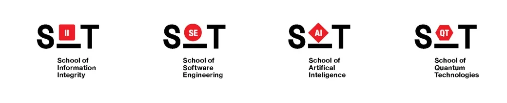
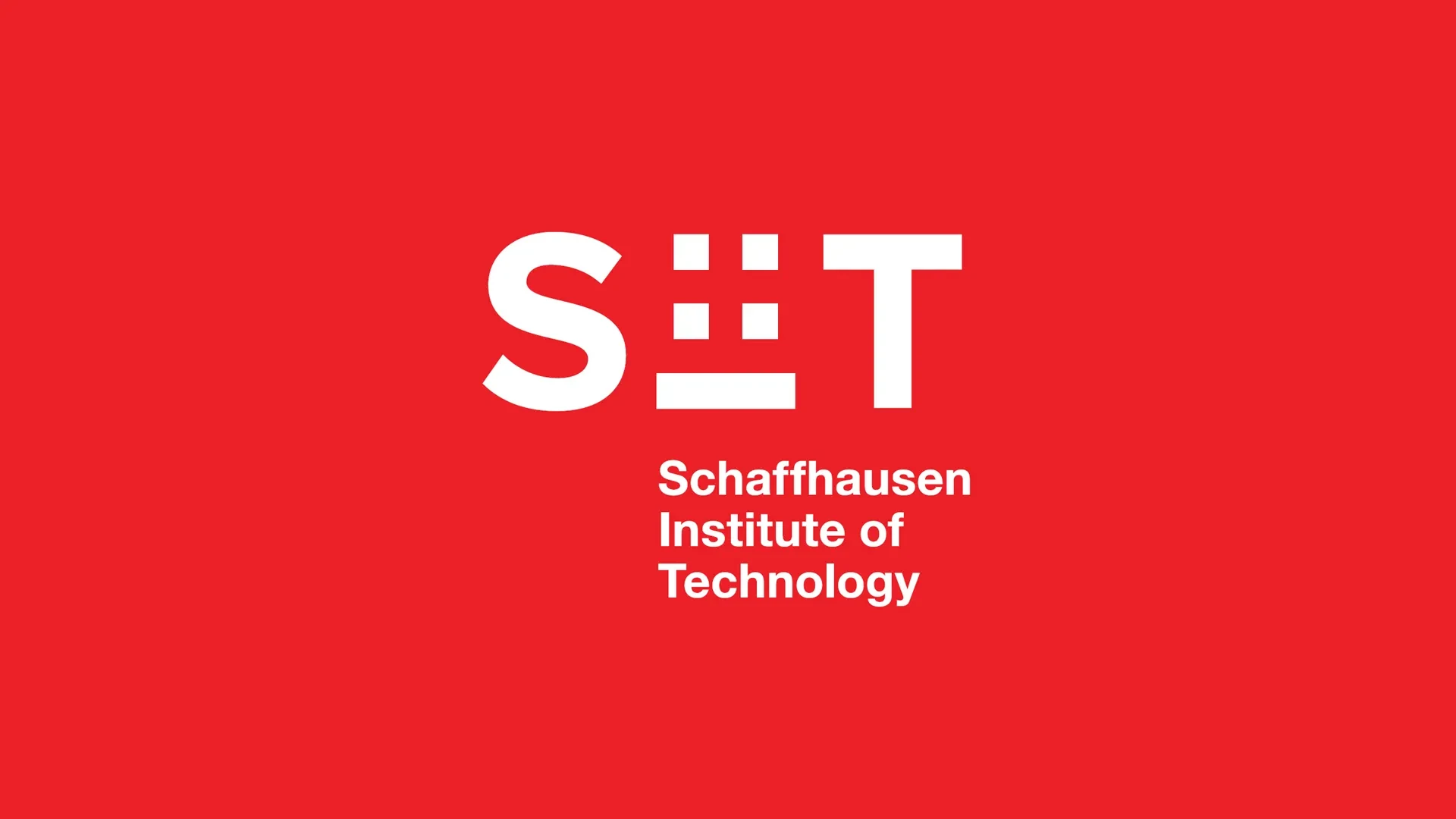
We needed to create a “core” version of the logo—something that would serve as the foundation of SIT’s identity. To achieve this, we decided to incorporate four red squares into the design. Why? Because together, they subtly form the Swiss flag, connecting the institute to its roots. At the same time, this solution remains simple and minimalist, perfectly aligning with the clean and modern aesthetic we envisioned.

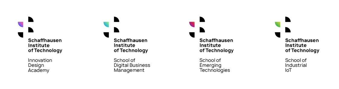
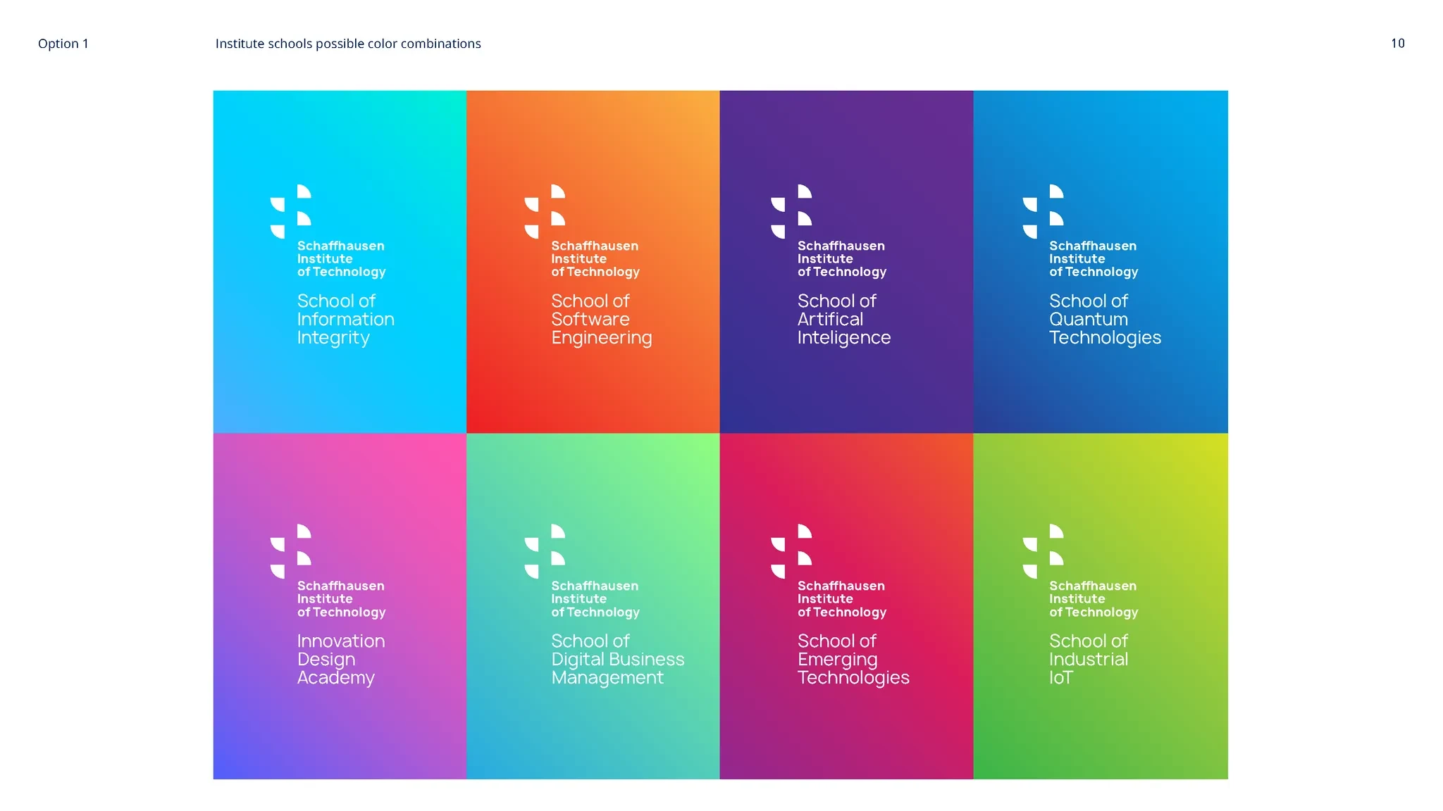
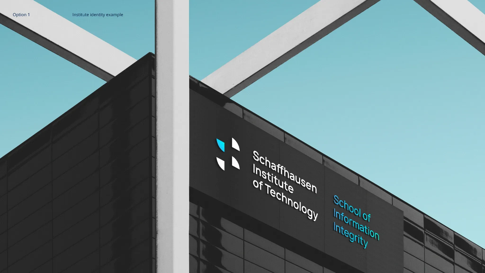
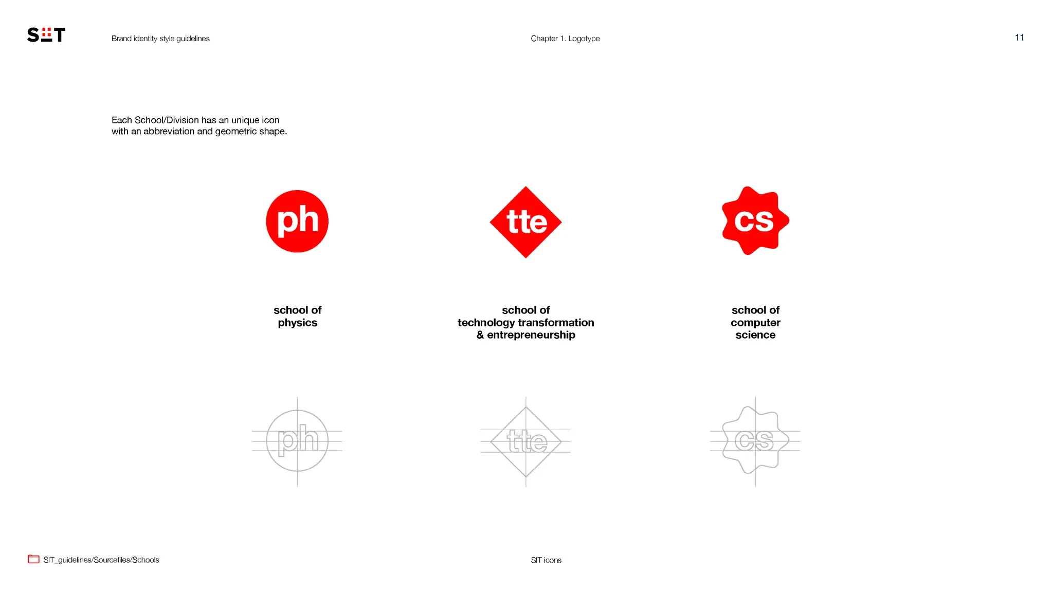
Within the institute, there are various departments and divisions, each with its unique focus. To reflect this, we developed a system of logos that maintain a cohesive style while allowing each division to have its own distinct identity. This approach ensures unity across the institute’s branding while giving individual departments the flexibility to highlight their specific missions and areas of expertise.
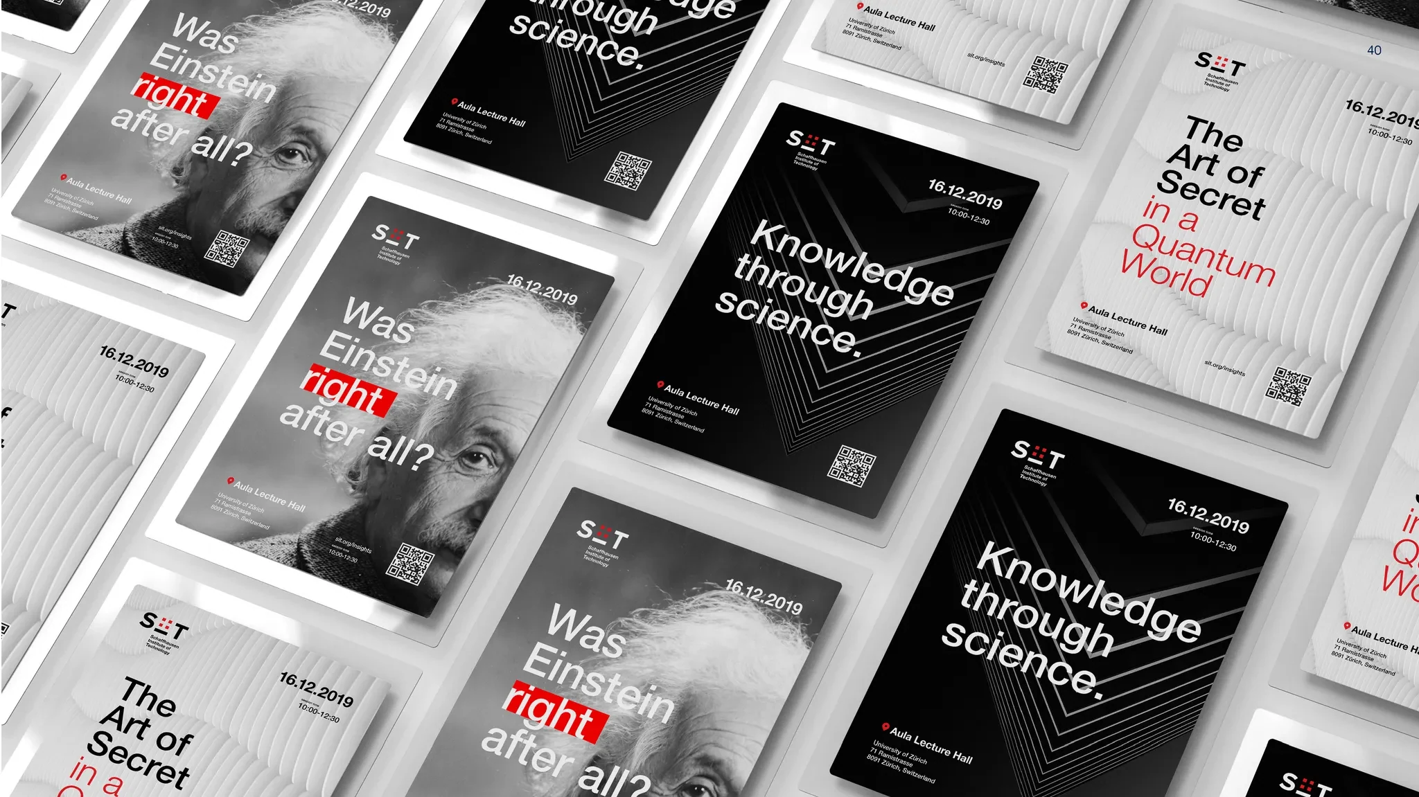
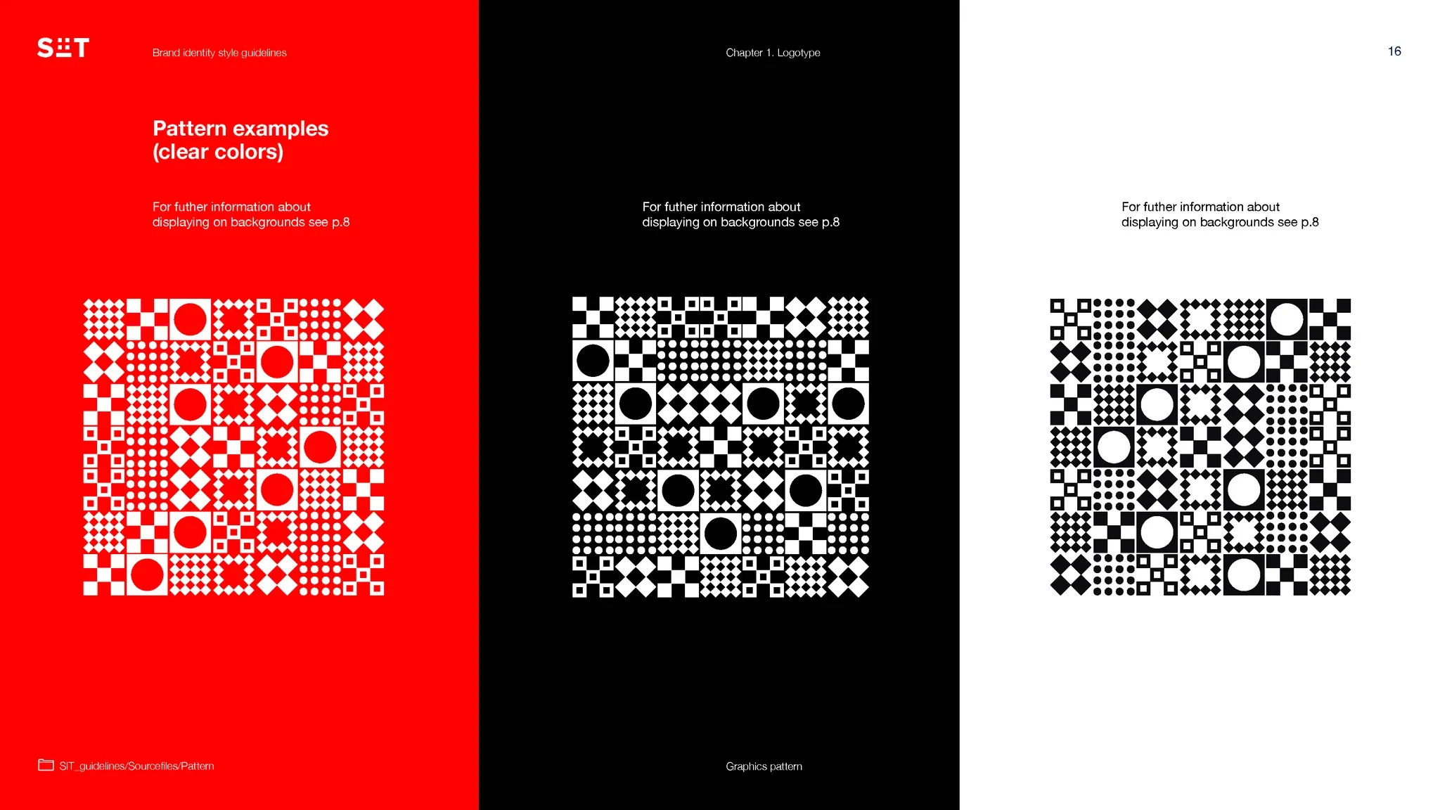

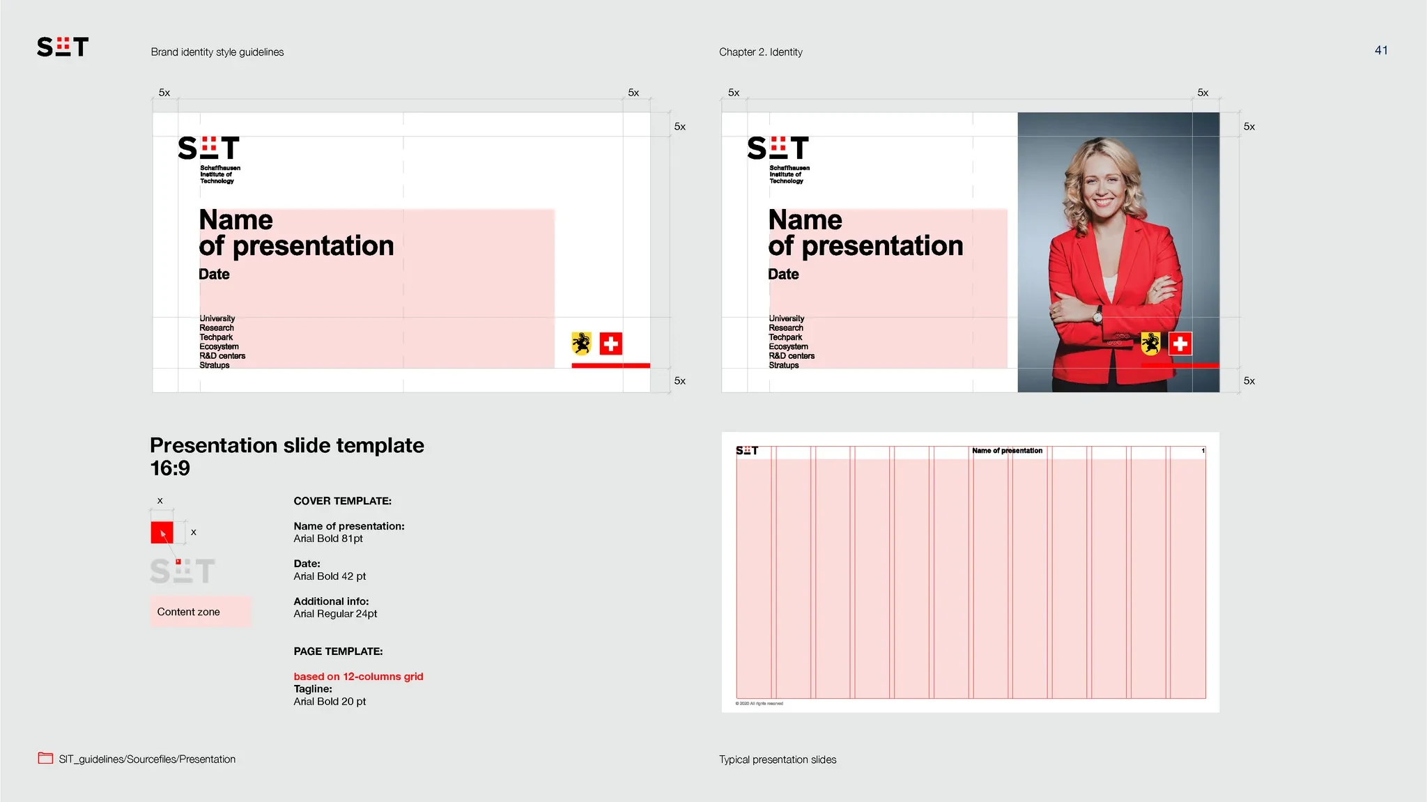
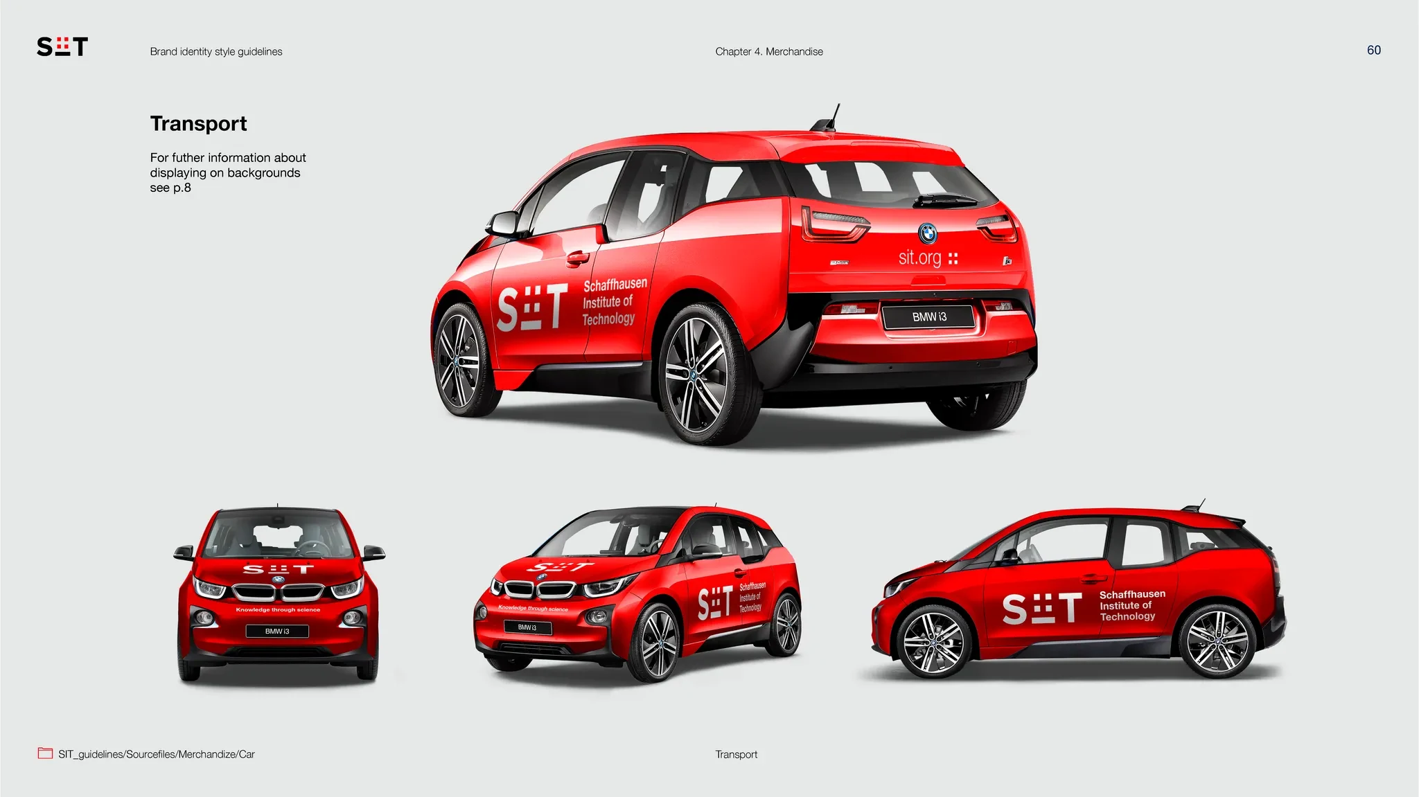
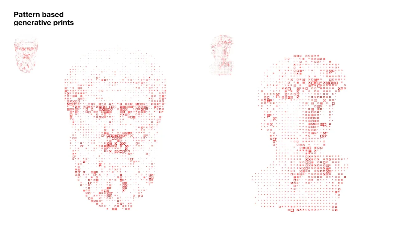
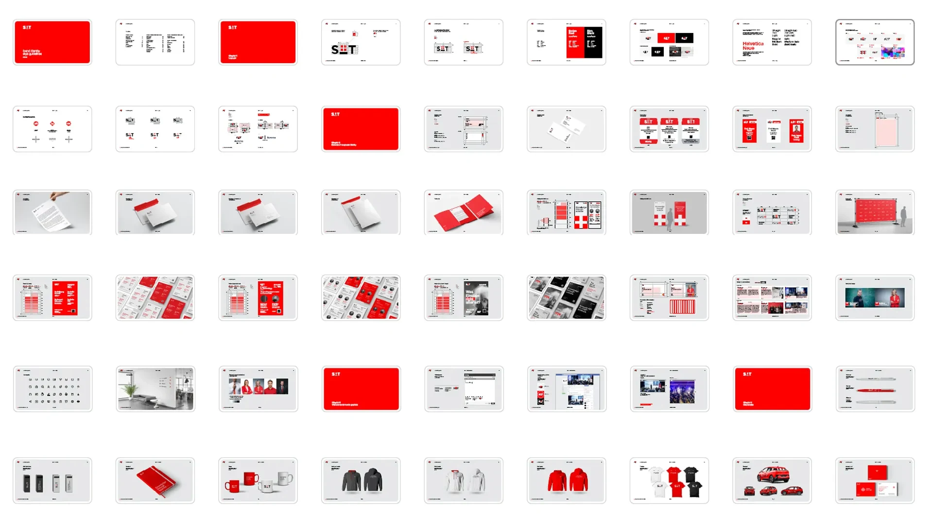
Next, we moved on to developing the elements of the brand identity. The core idea remained rooted in Swiss minimalism, emphasizing clean, functional, and elegant design. To complement this, we created a series of unique geometric patterns. These patterns add a distinctive visual language to the brand, providing versatility and depth while maintaining the minimalist aesthetic. They became a key component for use across various applications, from print to digital media.
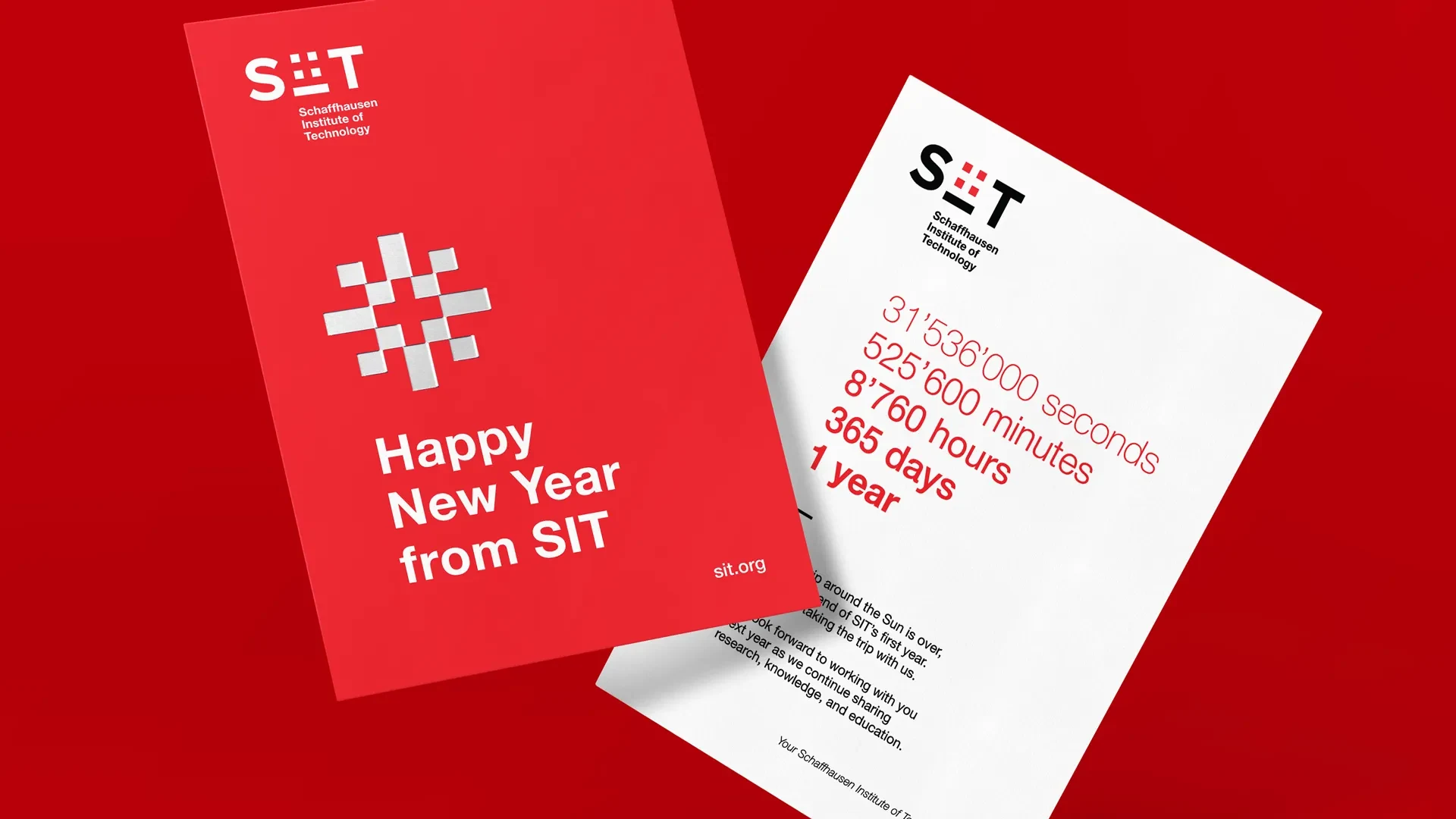
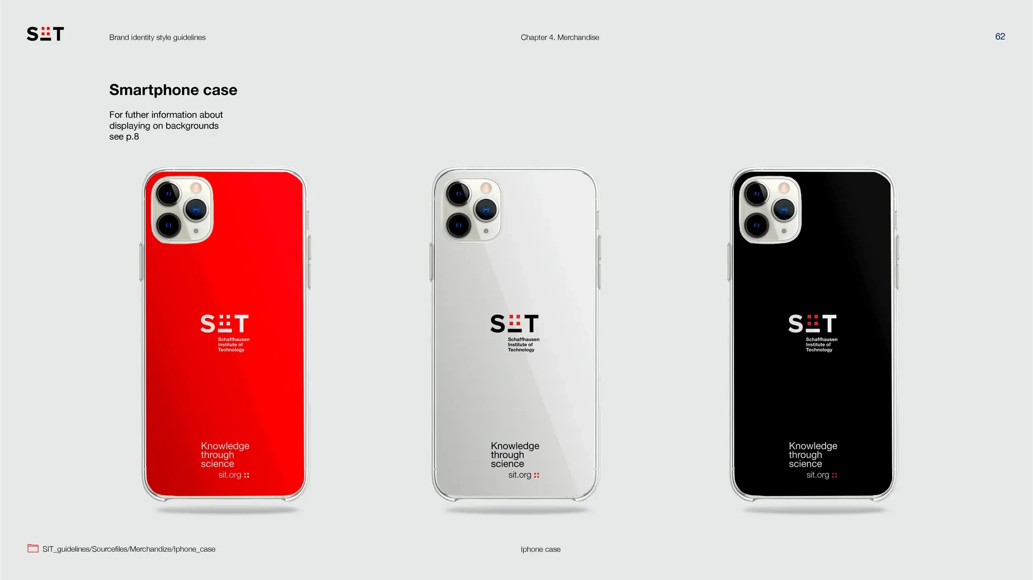
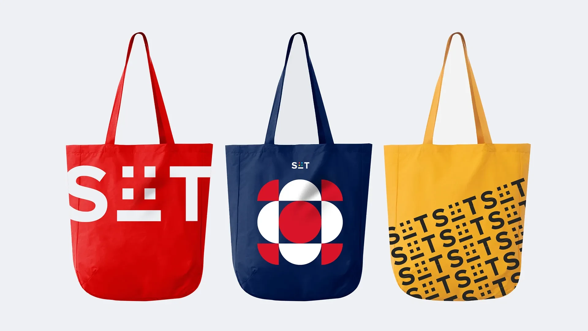
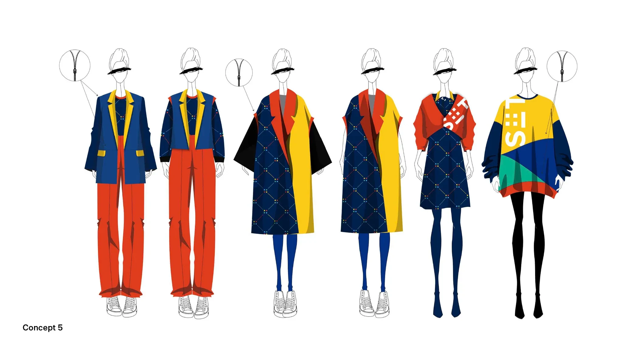
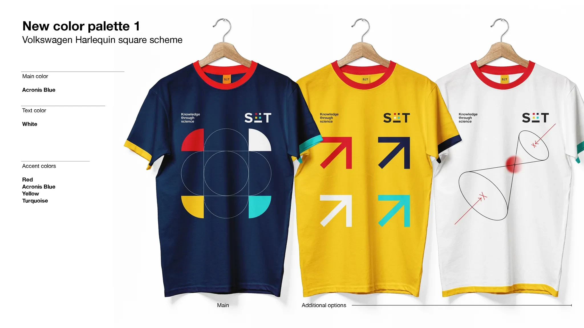
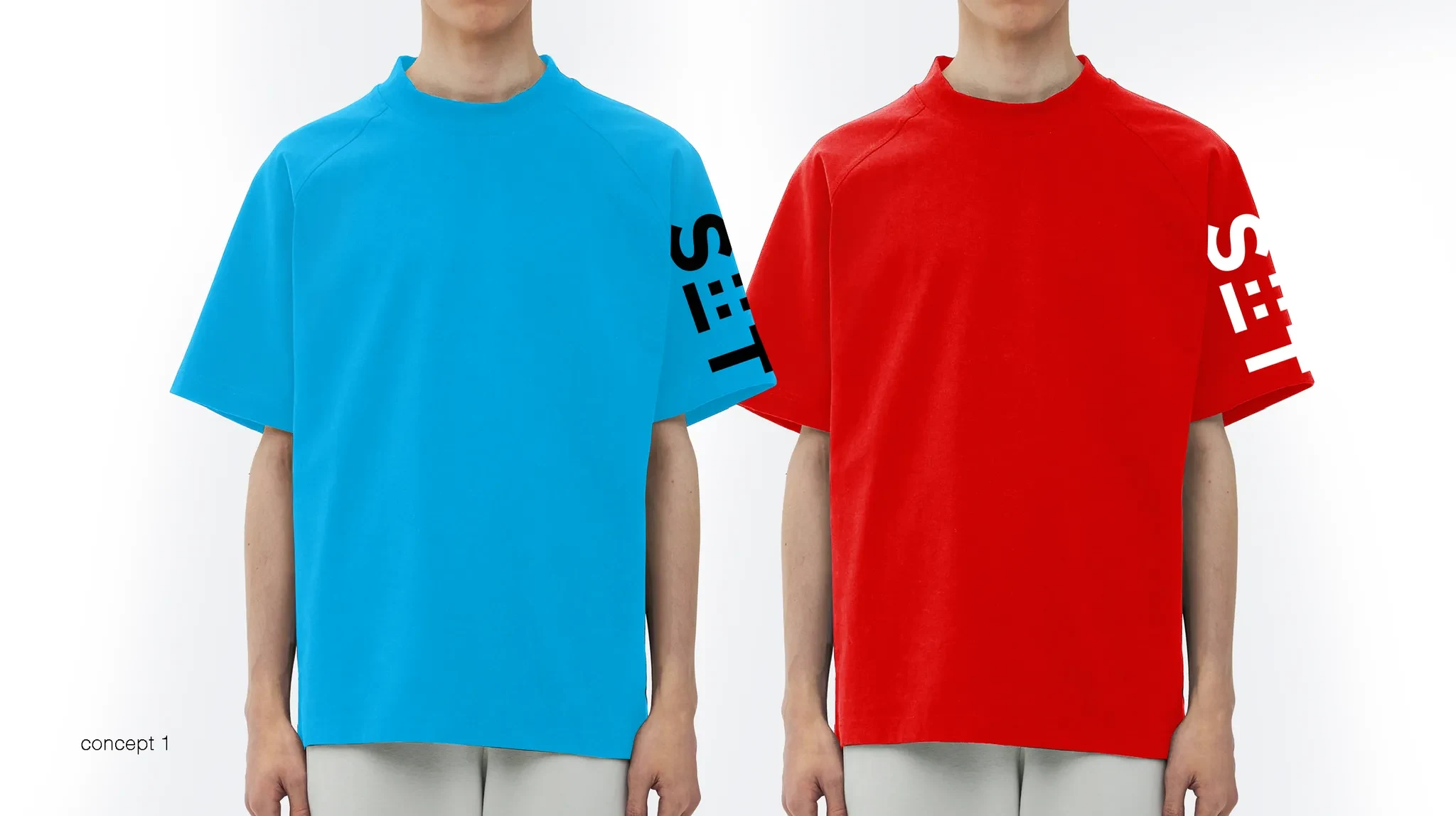
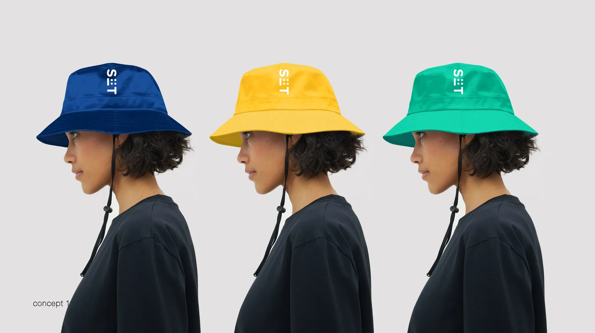
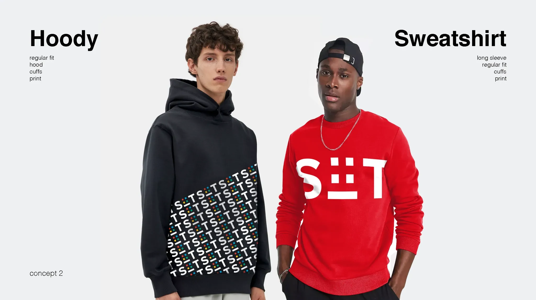
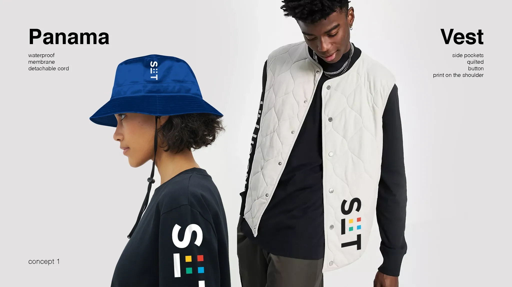
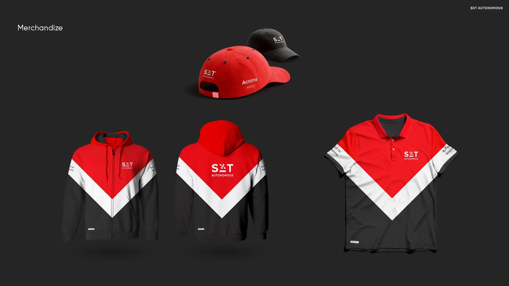
Initially, we planned to stick to a minimal “Swiss” color palette of red, white, and black for the brand identity. However, we quickly realized this wouldn’t be enough to resonate with students. People on campus crave variety, and we didn’t want a monotone sea of red dominating everything. Diversity became our guiding principle. We began exploring vibrant color options that would bring energy and individuality to the brand. This shift led us to think beyond the visual identity—we started imagining merchandise, uniforms, and other elements for students, faculty, and staff. Our work even extended into the realm of fashion, ensuring that every piece reflected the dynamic, inclusive, and creative spirit of the institute.
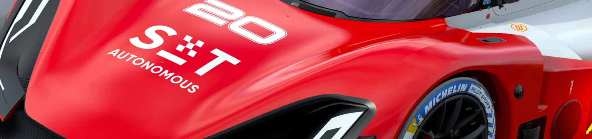
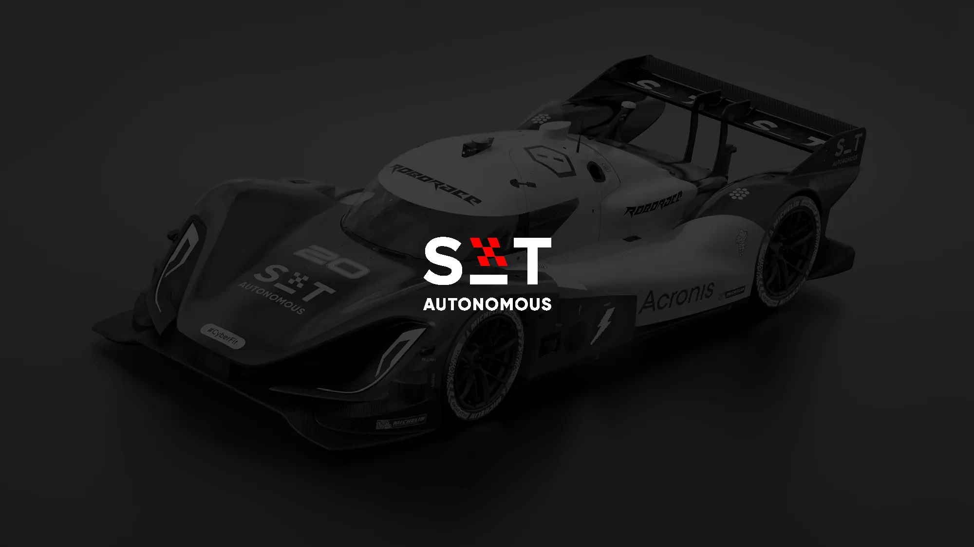
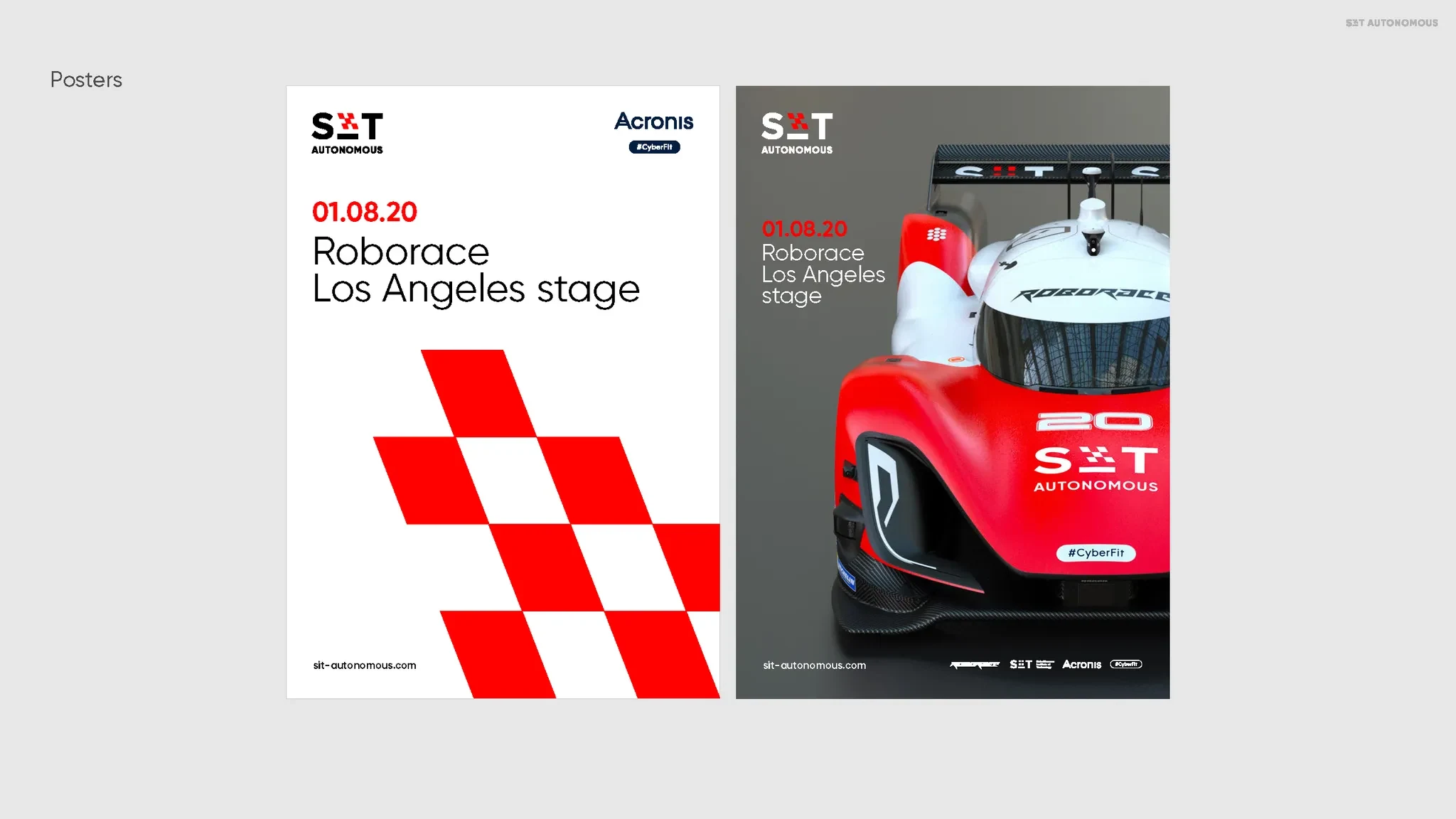
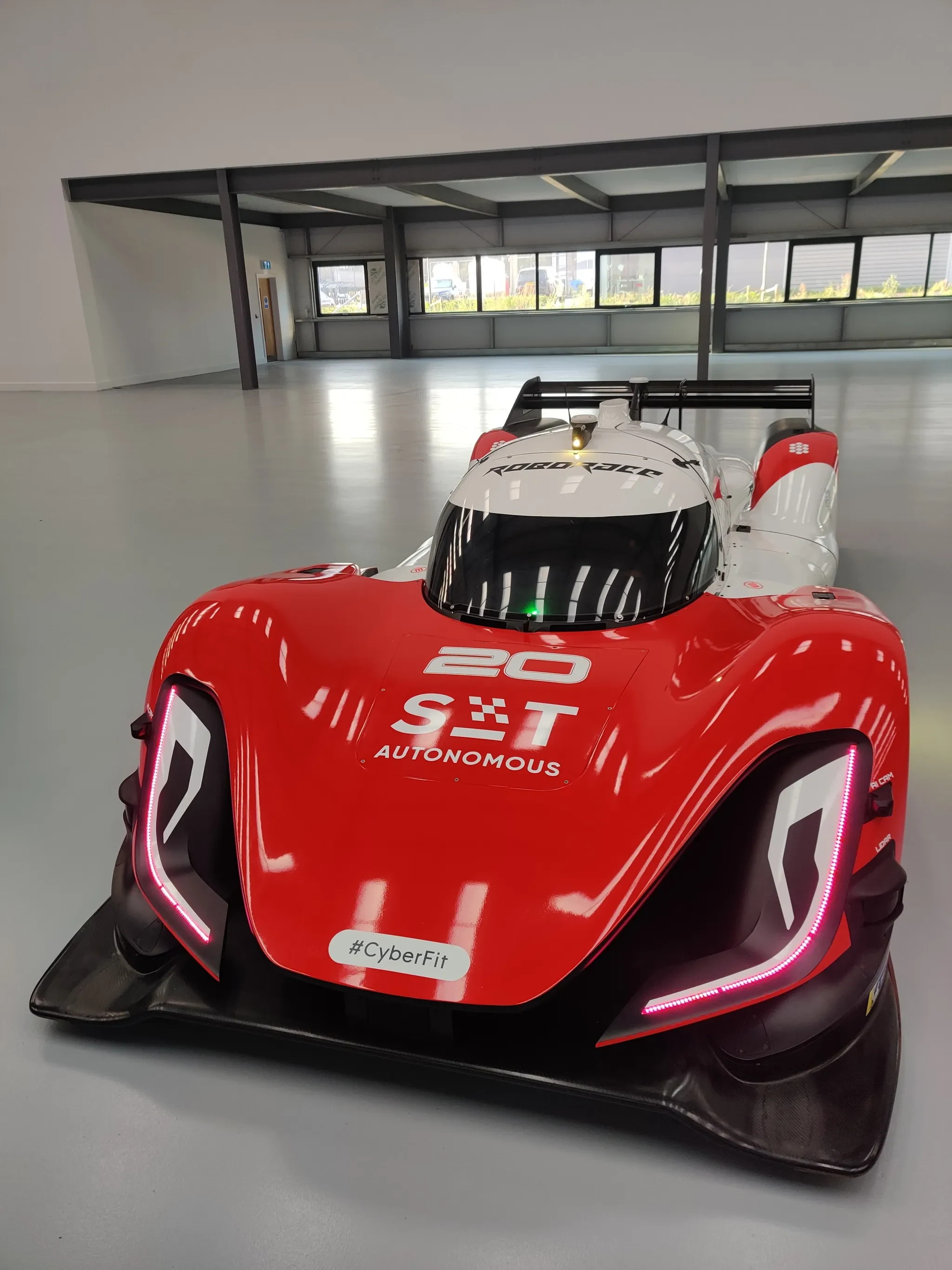
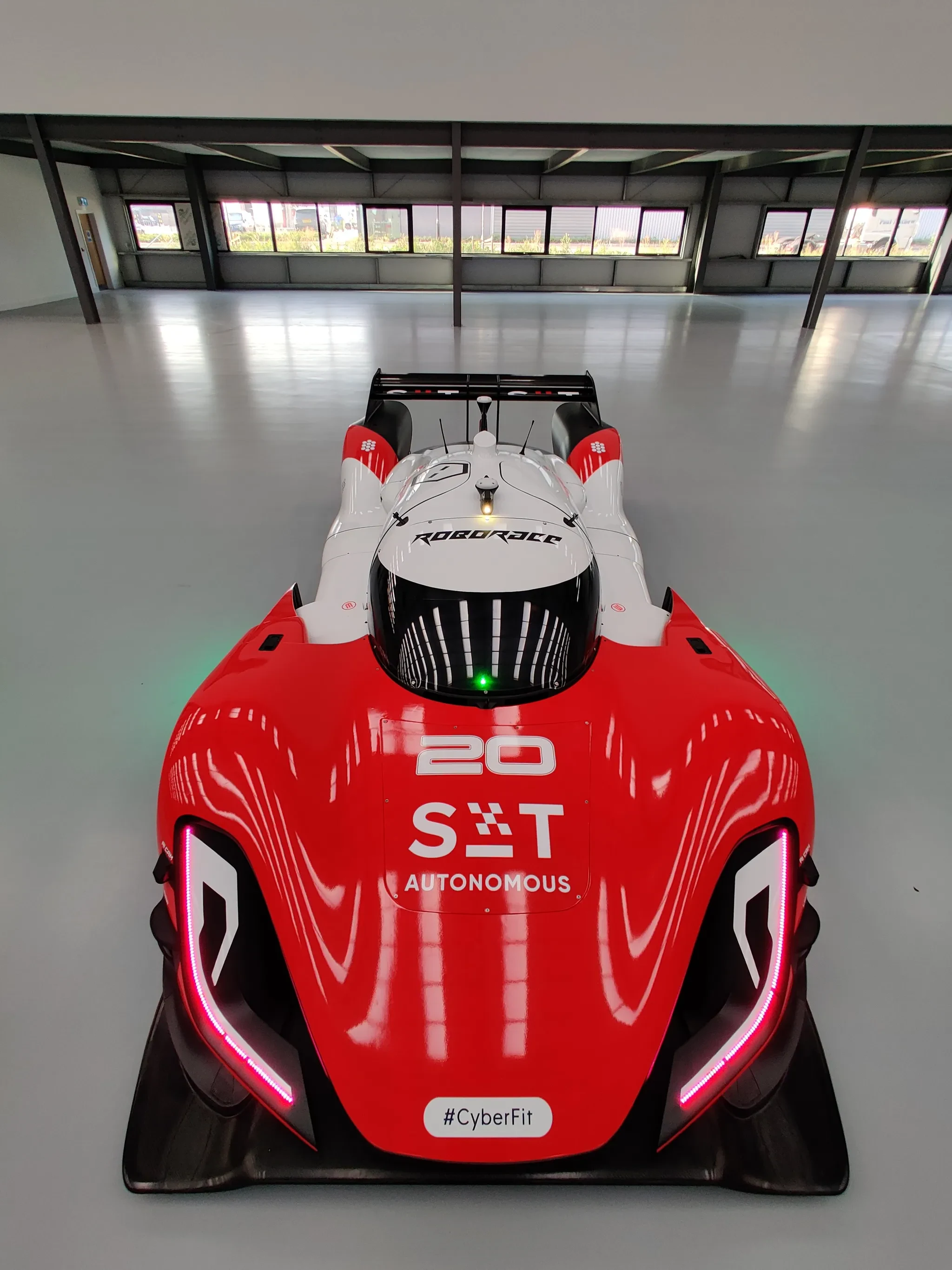
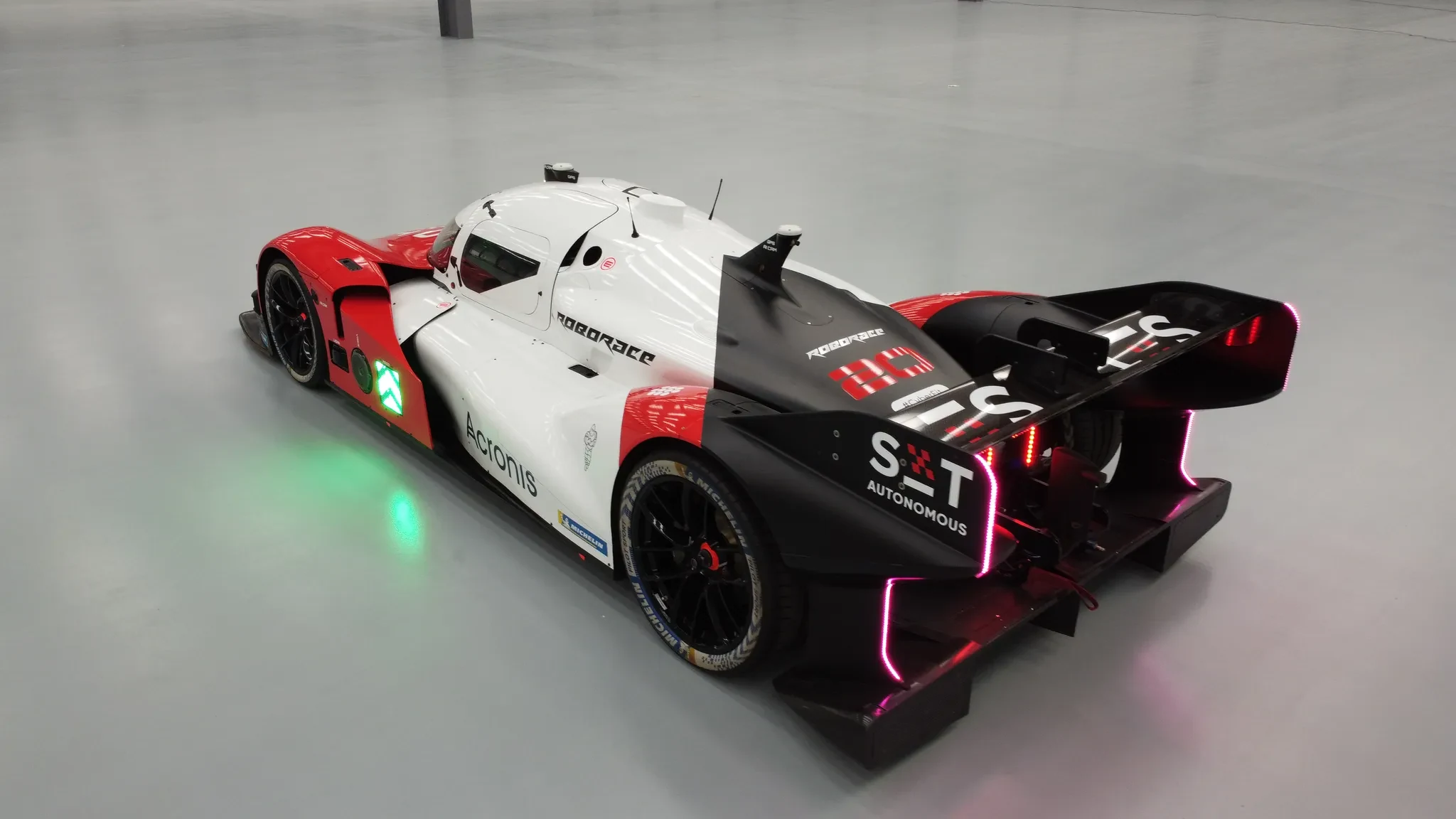
One of the most memorable parts of the project was working with SIT Autonomous, a division focused on AI-driven solutions for racing. Their cutting-edge technology and ambitious vision inspired us to create a logo that cleverly combined the Swiss flag with the iconic checkered racing flag. This fusion symbolized both precision and innovation, aligning perfectly with their mission.
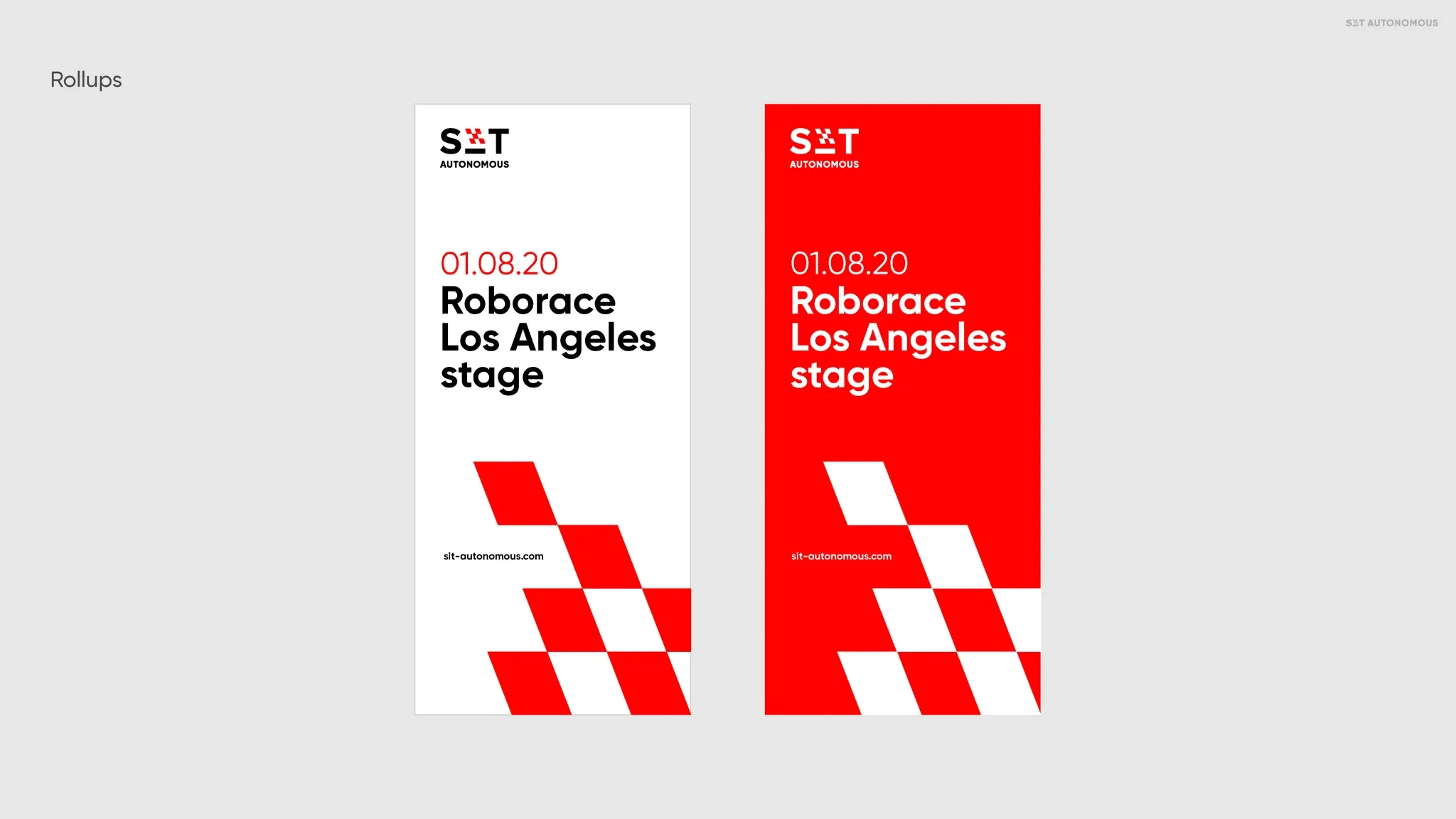
We extended this concept into the design of their autonomous race car, crafting a bold and dynamic look that stood out on the track. Beyond the car itself, we developed branding for their events, ensuring every detail—from signage to merchandise—reflected their identity. We even designed uniforms for the team, blending functionality with style to create a cohesive and professional look. It was a project where creativity met high performance, pushing the boundaries of what a racing brand could be.
In 2023, it was decided to transform Schaffhausen Institute of Technology (SIT) into Constructor Group, marking a new era for the organization and reflecting its global expansion and ambitions. As designers, we are proud to have been part of SIT’s journey, creating a bold and innovative visual identity that resonated with its mission of excellence in science, education, and technology. However, with this transformation, it’s time to move forward. The rebranding presents an exciting opportunity to craft a fresh identity that captures Constructor’s expanded vision, celebrates its dynamic growth, and continues to inspire its global community.
Made to work
in the real world.
The visual system connected the institute’s academic and technology activities, extending into presentations, clothing, events and race-car livery. SIT later became part of the Constructor story.
Have a similar challenge? ↗The Grapes
Tell us what
you need.
Share your scope, timing and budget. We’ll suggest the right next step.
Start a project