
Italian roots.
A Singapore edition.
A wine identity that connects Tuscan heritage with a new audience — from the first mark to a bottle made for Singapore.
- CLIENT
- The Grapes
- CONTEXT
- Bacci wines / Singapore
- OUR WORK
- Brand identity
Packaging & print
Special-edition labels
From Tuscany to Singapore.
The Grapes brings the Bacci family’s Tuscan wines to Singapore. The brief was to give the boutique its own identity while keeping a clear connection to the wines and their Italian heritage.
We built the identity around a simple letterform, a wine-inspired detail and a restrained navy-and-gold palette. The work then grew into packaging and labels for a Singapore-only edition.
A little wine
inside the A.
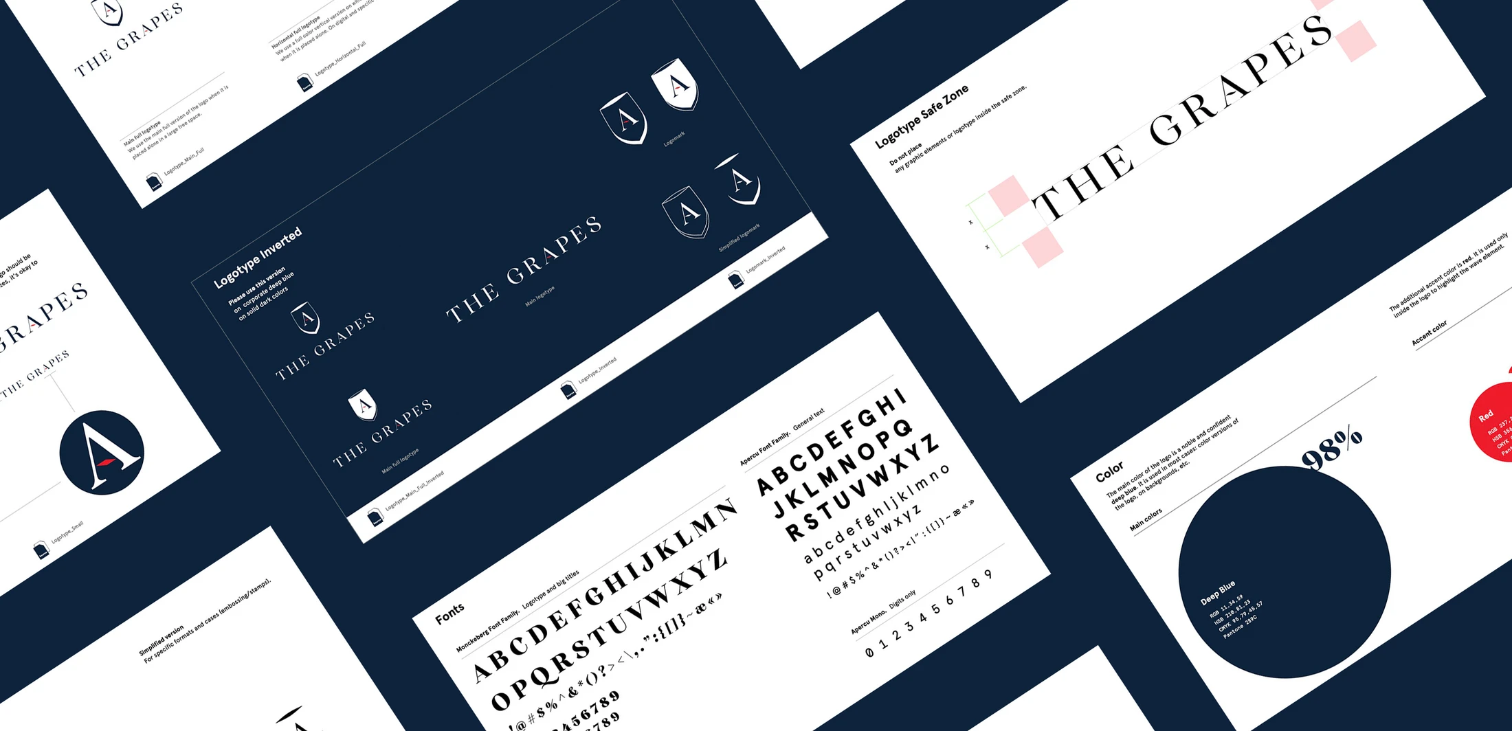
The mark begins with a letter from the middle of “Grapes”. Its red, wave-shaped crossbar suggests wine moving in a glass. A shield gives the symbol a more traditional expression without losing the simplicity of the letterform.

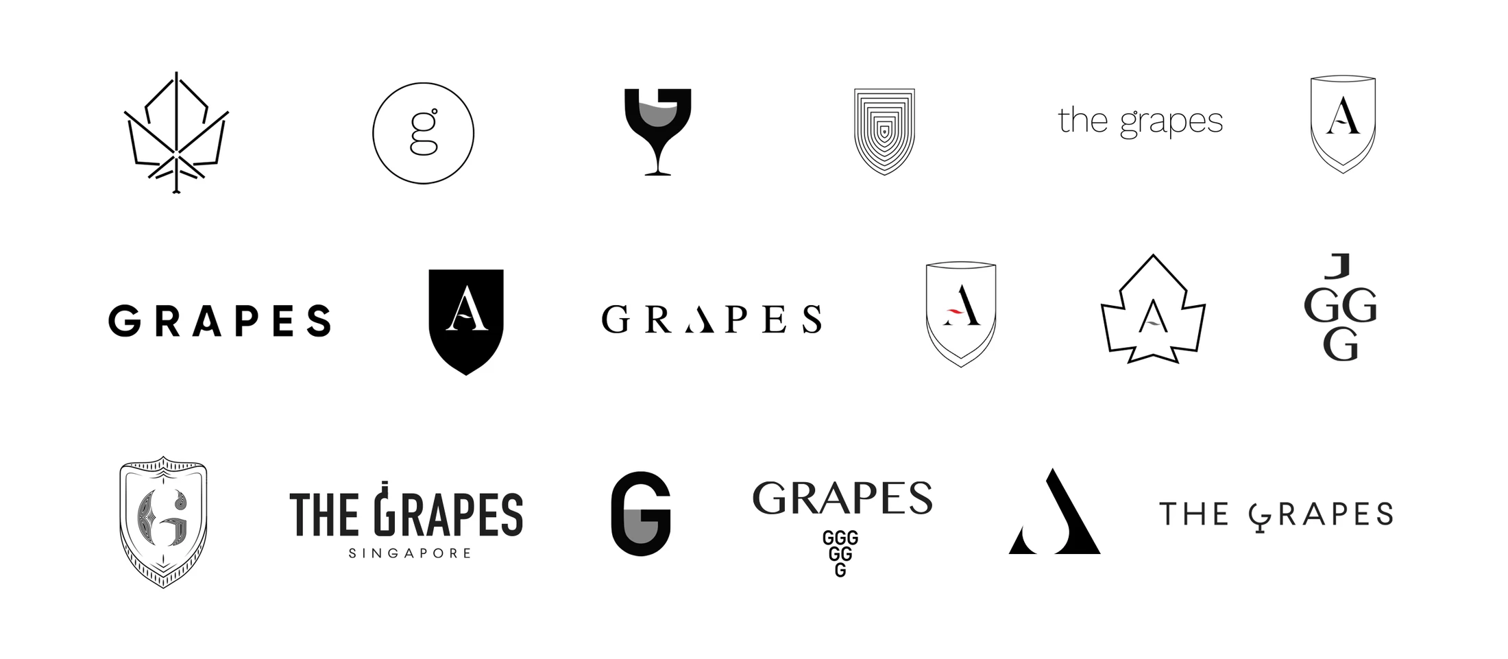
Behind the mark: early directions
Early logo studies explored grape, glass and letterform symbols before the identity developed around the A.
One identity.
More than a label.
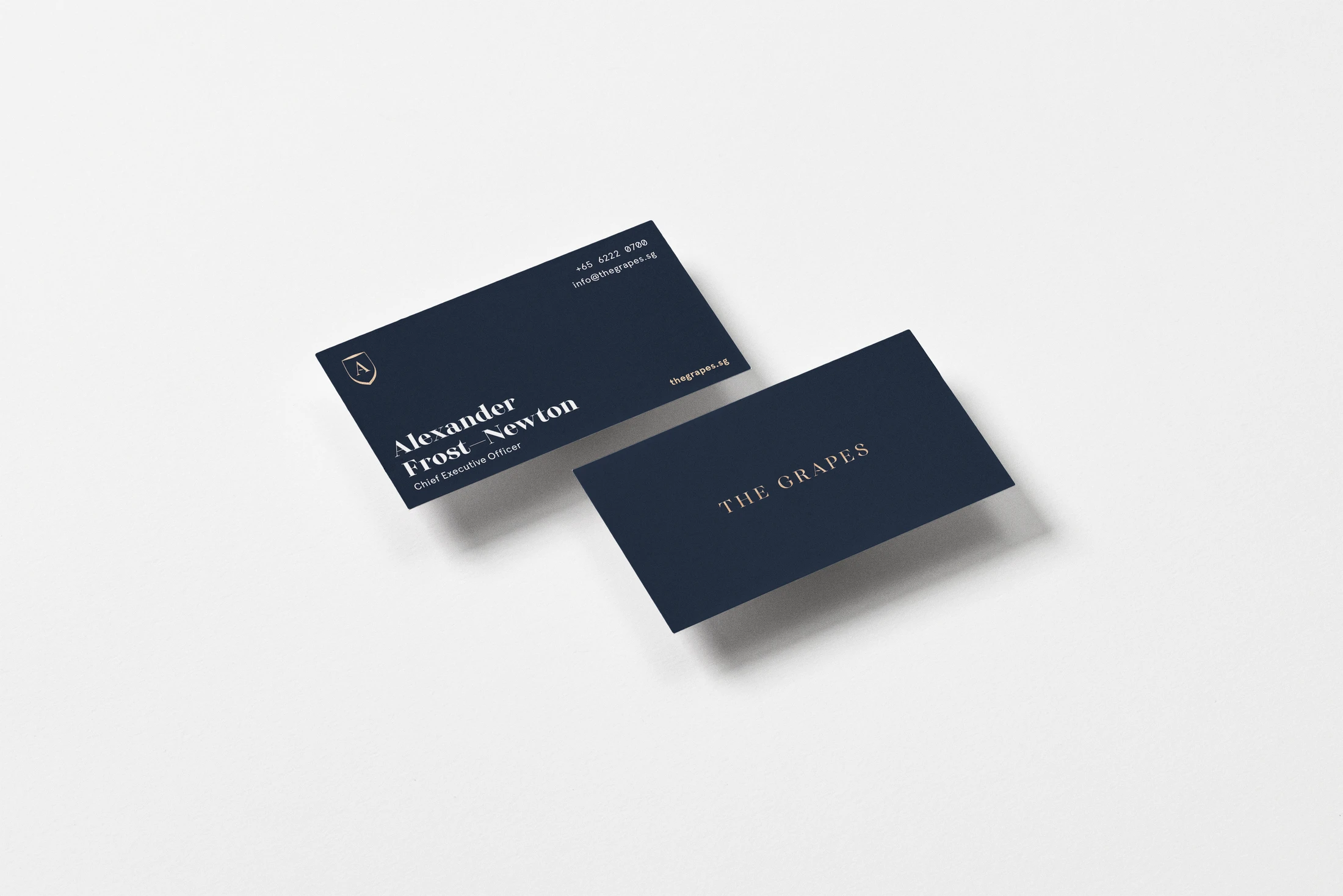
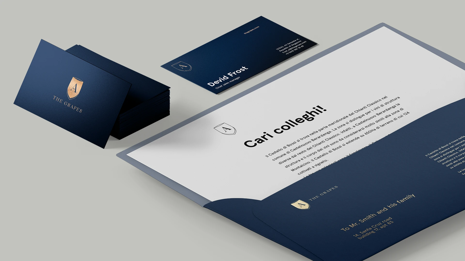
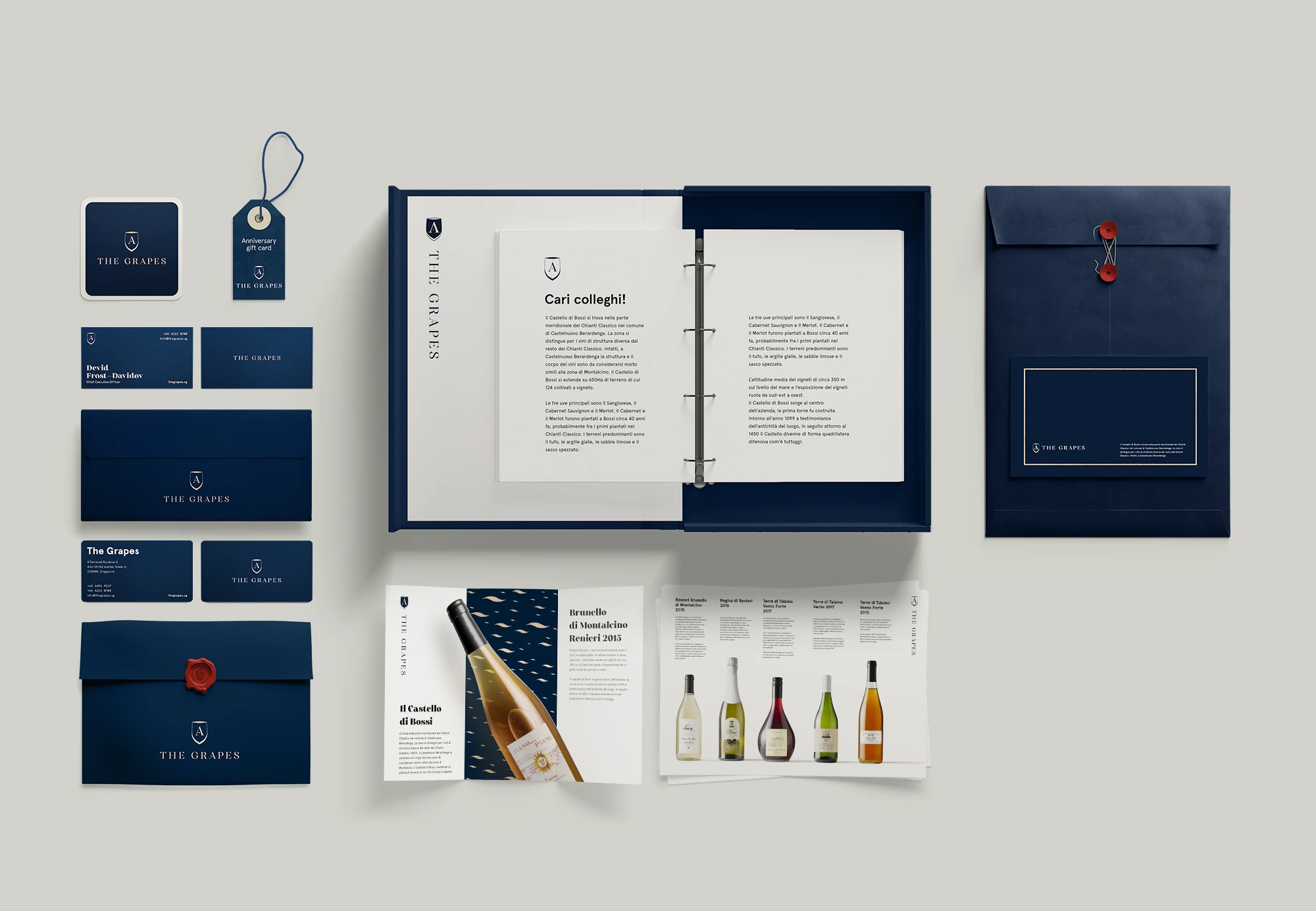
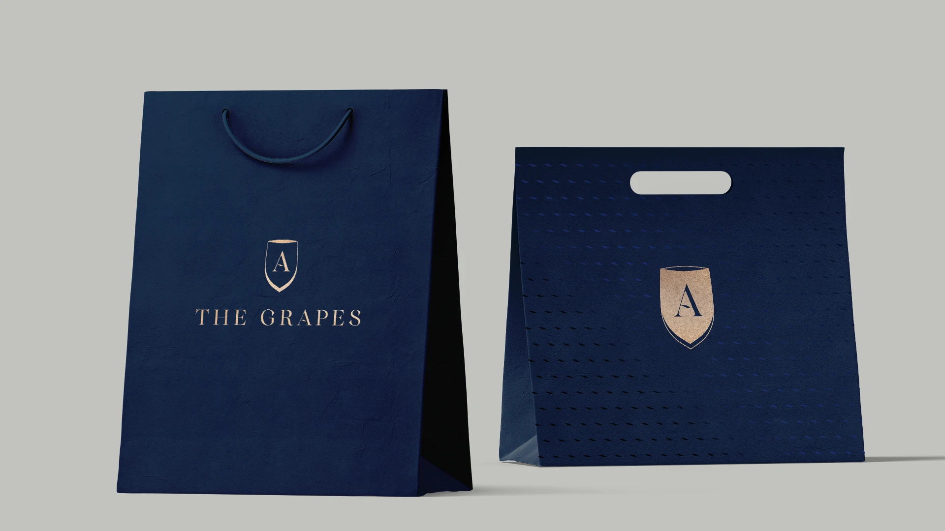
The wine-wave detail becomes a repeat pattern. Paired with fine gold accents and deep navy, it connects stationery, packaging and promotional materials without making every application look the same.


A new place.
The same provenance.
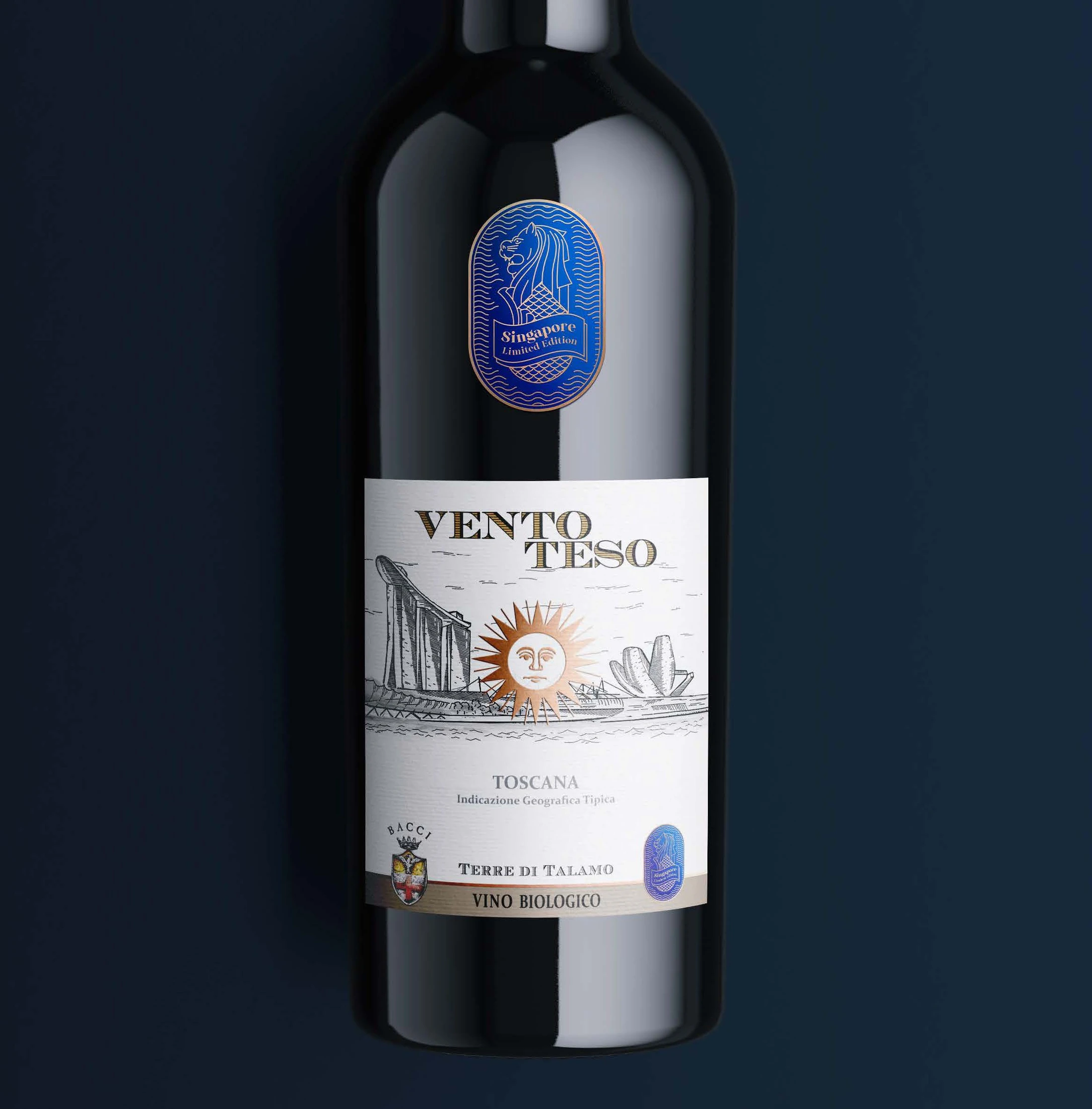
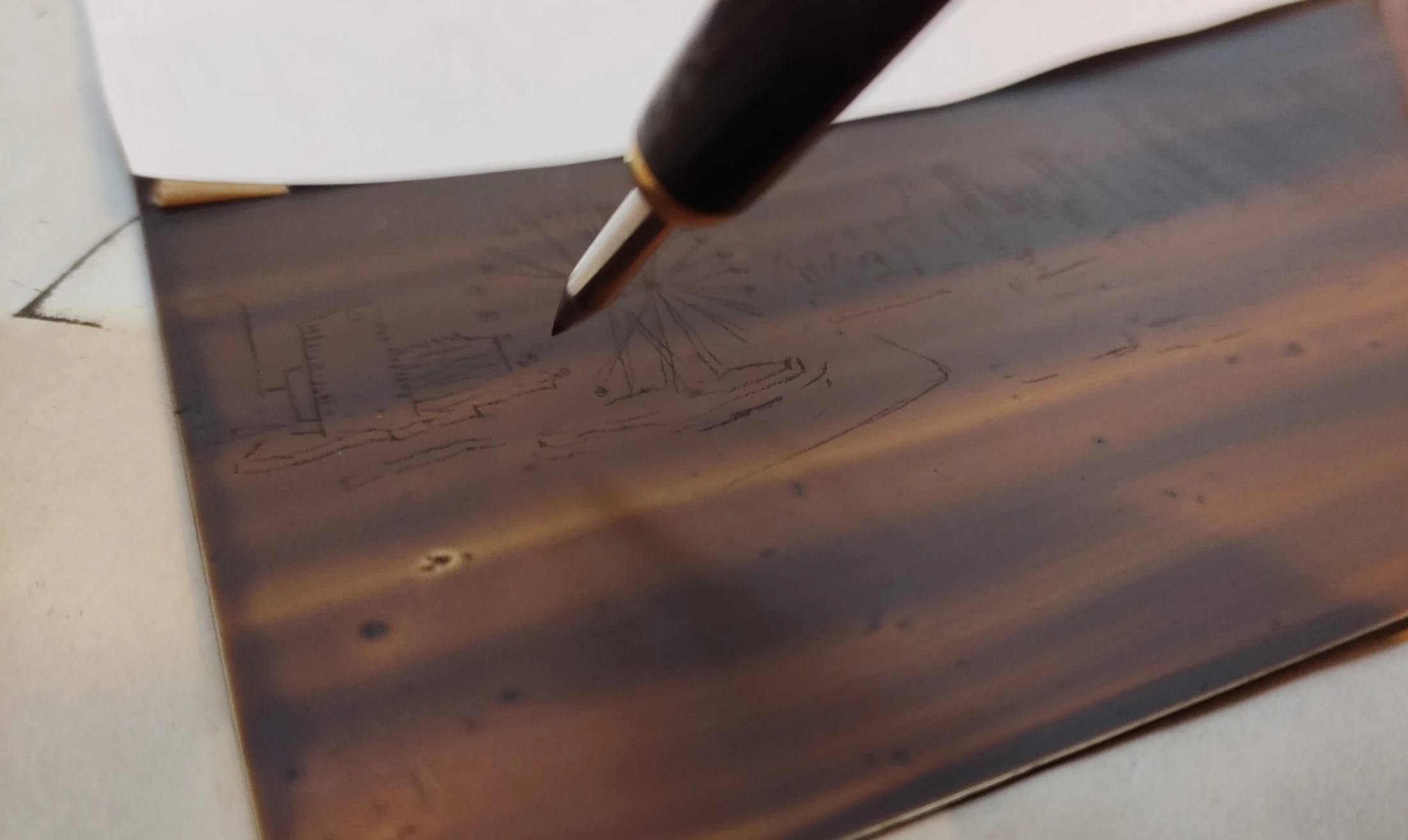
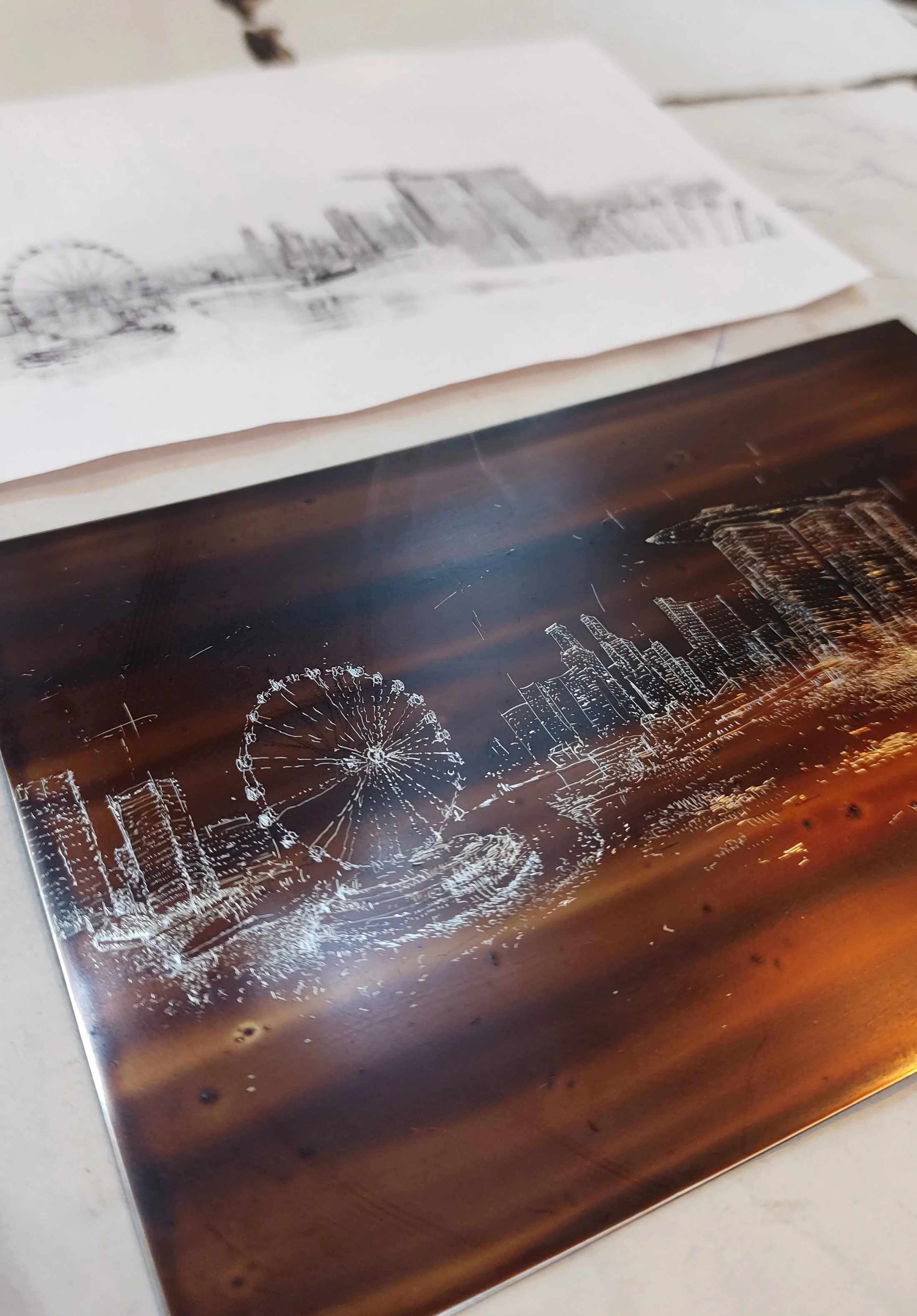
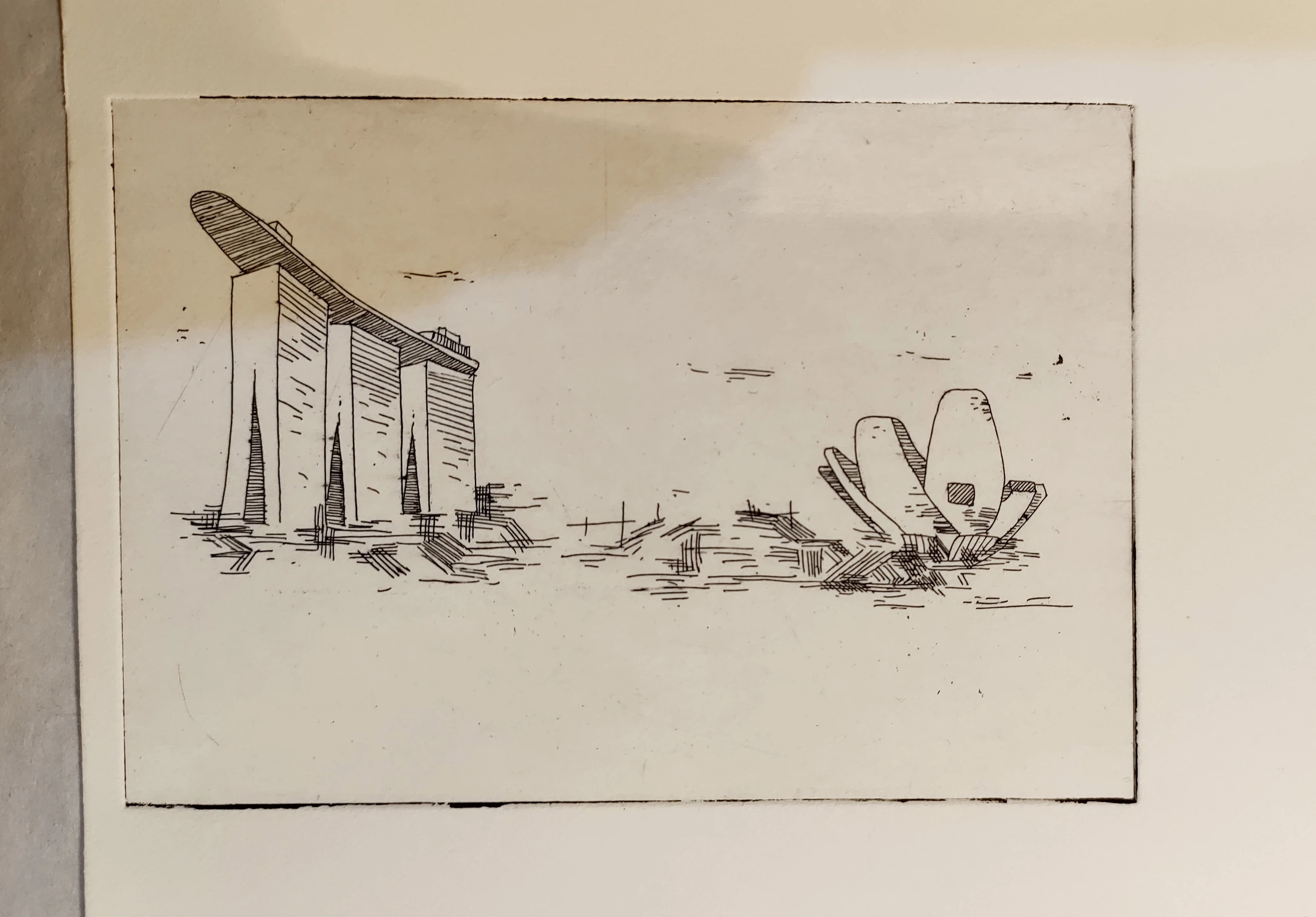
For the special edition, Marina Bay becomes an engraved-style illustration on the wine label. The skyline and sun introduce Singapore while the traditional lettering and producer marks preserve the connection to Bacci.
A small seal.
A clear sense of place.
A blue-and-gold “Singapore Limited Edition” sticker distinguishes the bottle. The Merlion connects the release to its destination, in a form that complements the original wine label.
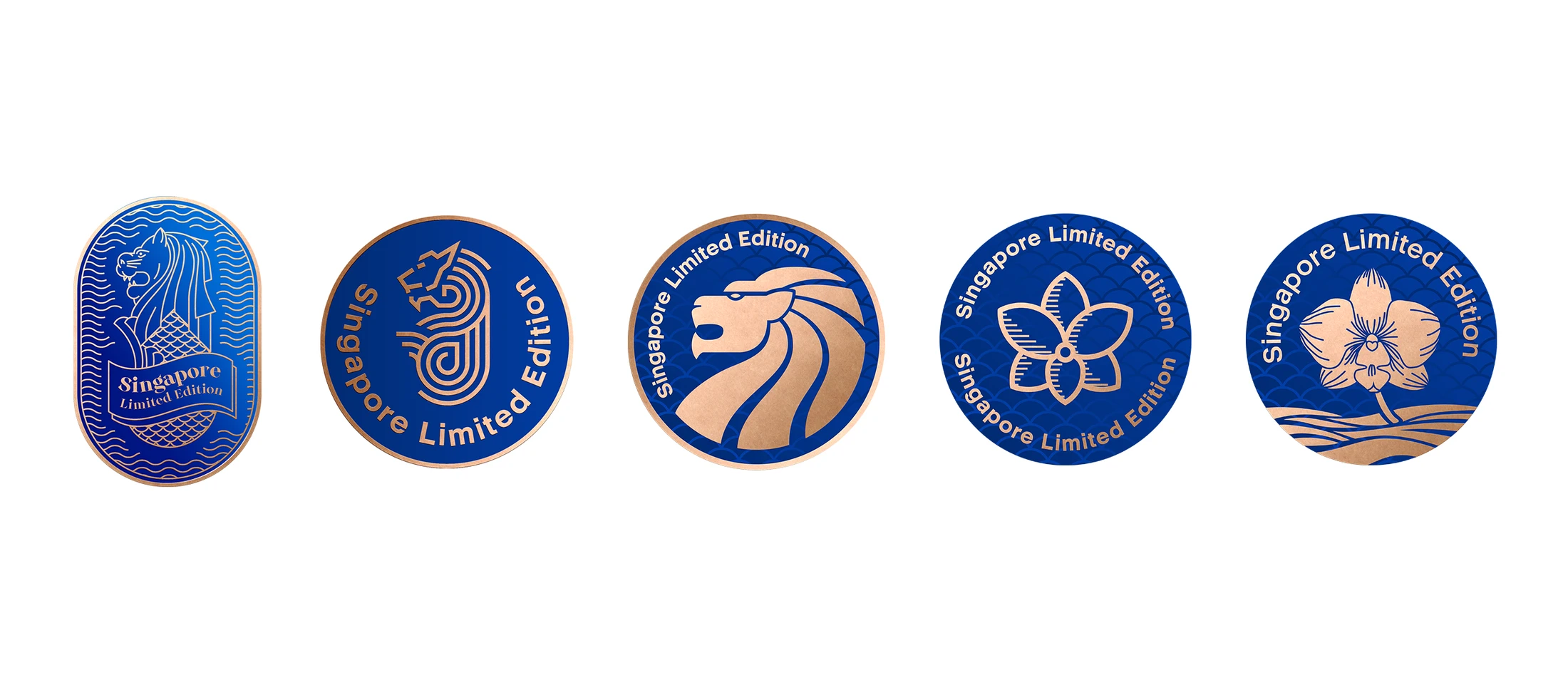
Seal design studies.
From a single mark
to a complete edition.
Brand identity, print applications, packaging patterns and Singapore-edition labels — connected by a shared visual language.
Discuss a brand or packaging project ↗