← ALL WORK
Constructor University · 25 yearsAnniversary identity, illustration & merchandise

University anniversary branding & visual identity.

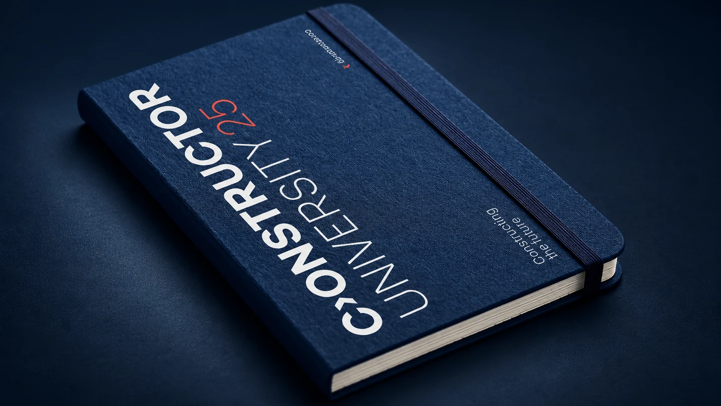
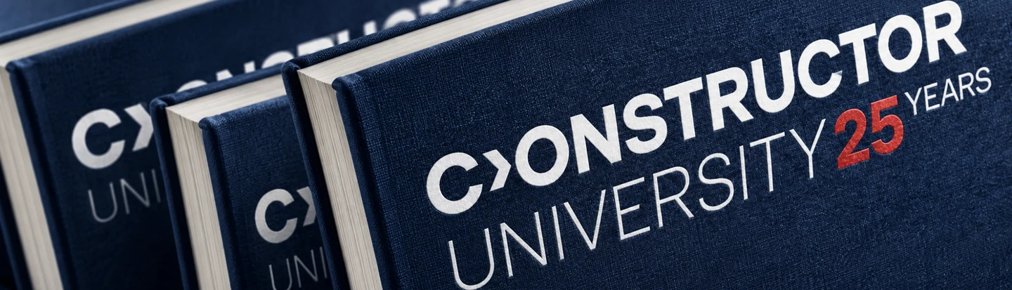
Constructor University 25th anniversary branding on navy notebooks.
01 / THE BRIEF

One anniversary.
A university-wide
visual identity.

Constructor University in Bremen, formerly Jacobs University, marks 25 years since its first students arrived. We created one anniversary identity for campus graphics, merchandise and alumni events — visible across the university without becoming a competing second brand.

CLIENT
Constructor University · Bremen, Germany
OCCASION
25th anniversary · 2026
OUR WORK
Anniversary identity, illustration, merchandise and event design
LOGO DESIGN / EXPLORATIONS

Finding an anniversary mark.
Not a replacement logo.

We explored wordmarks, academic badges and heraldic emblems, looking for a mark that could travel from a lapel pin to a sign across campus.

01 / START WITH THE NAME

How much can
one number do?

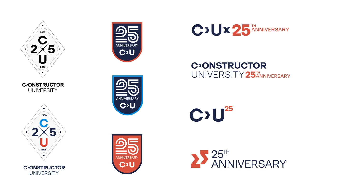
One route kept the full university name and added 25. Another compressed the message into C, U and a number. The first is immediately clear; the second is compact, but asks the audience to decode more.

That became a useful test for the whole project: can you read the anniversary before you have to work out the design?
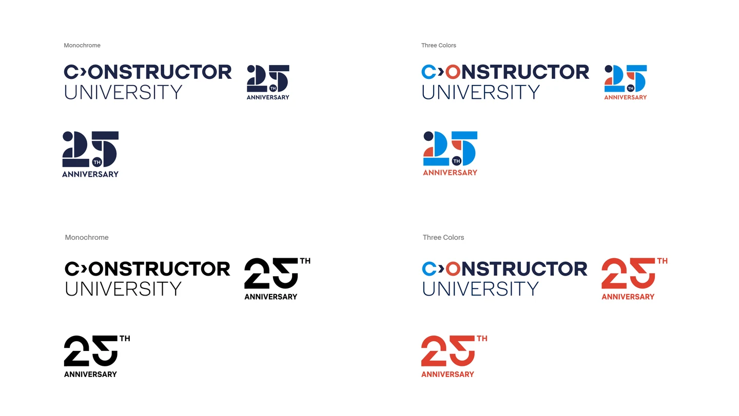
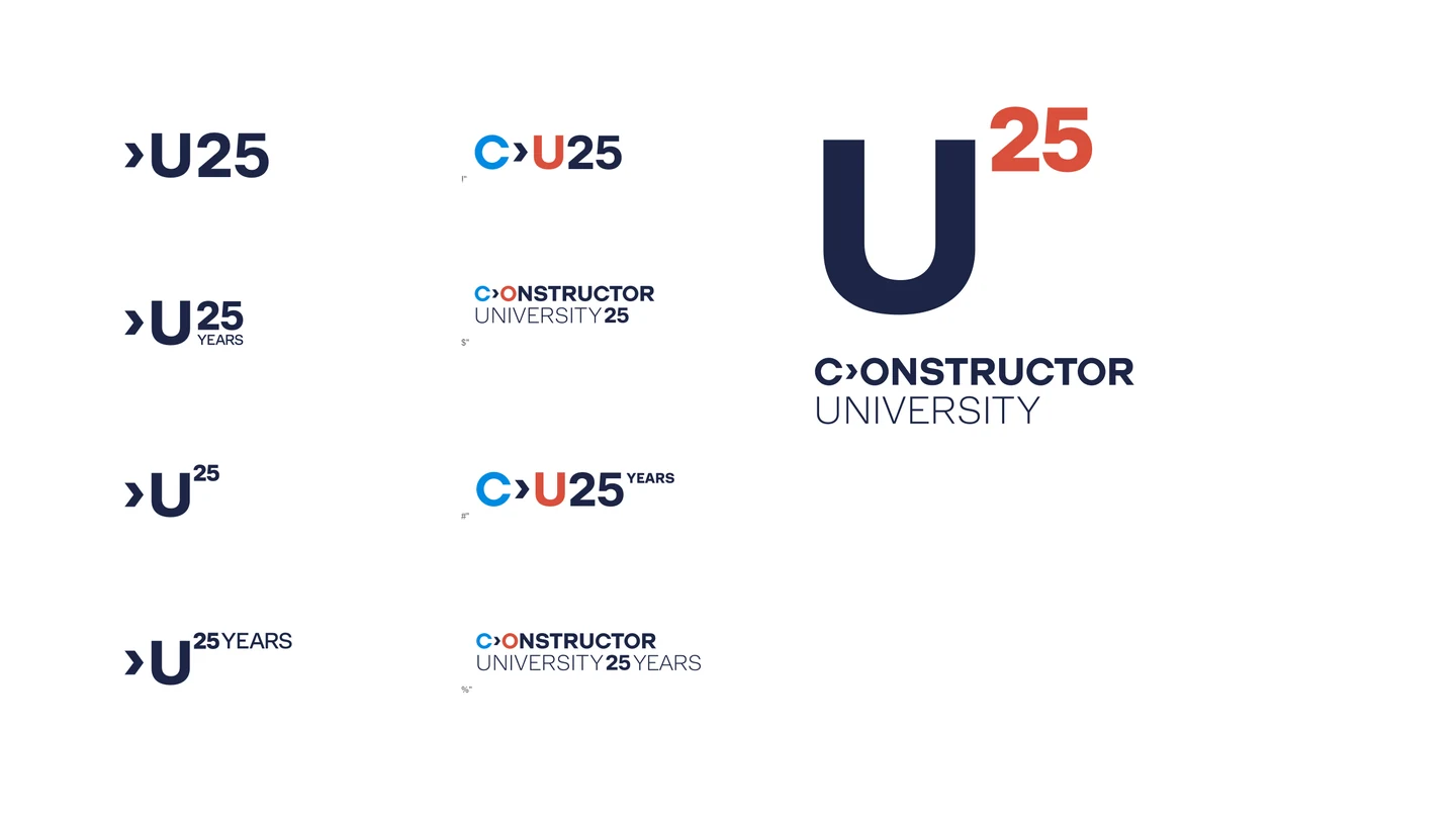
Early directions: a milestone alongside the university wordmark.
Finding the simplest relationship between C, U and 25.
Badges, shields and typographic combinations.
02 / TRY THE ACADEMIC BADGE

A strong emblem.
But a lot to carry.

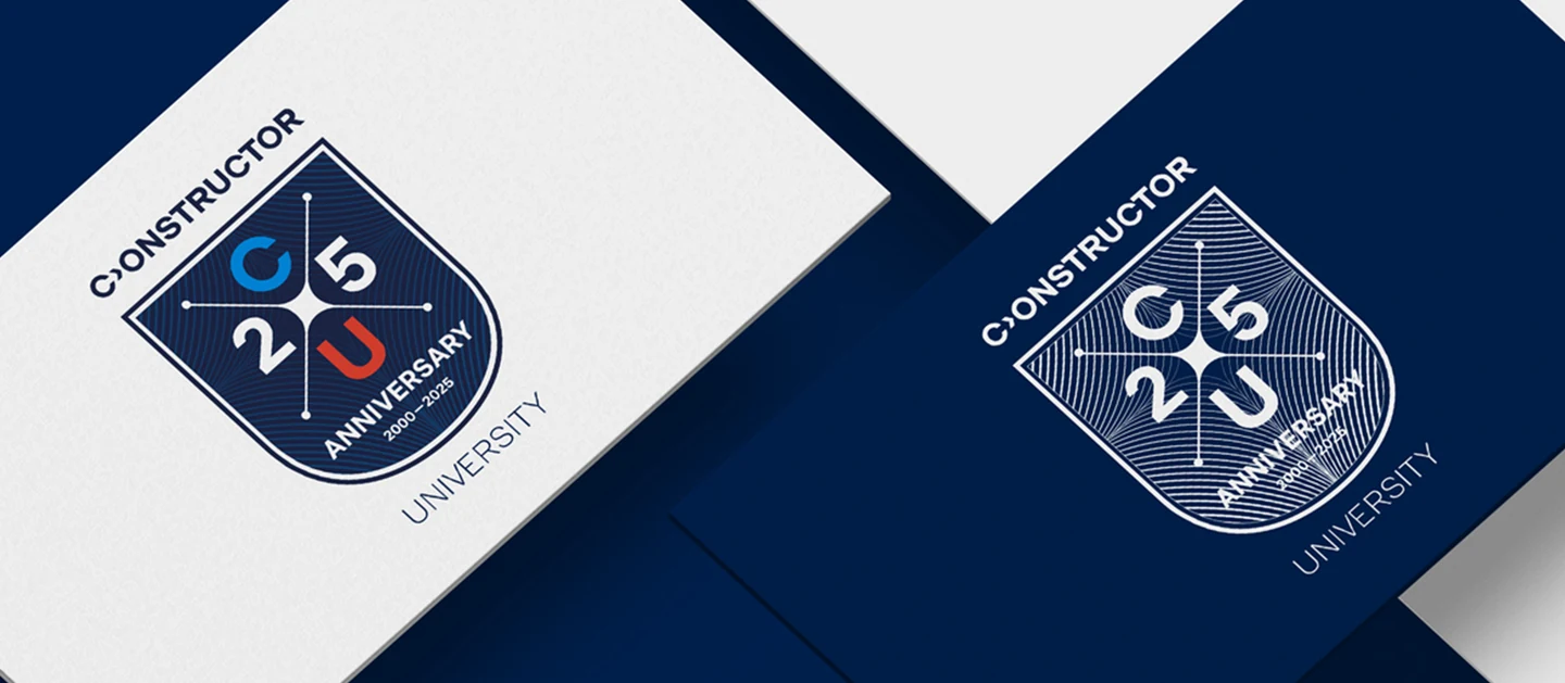
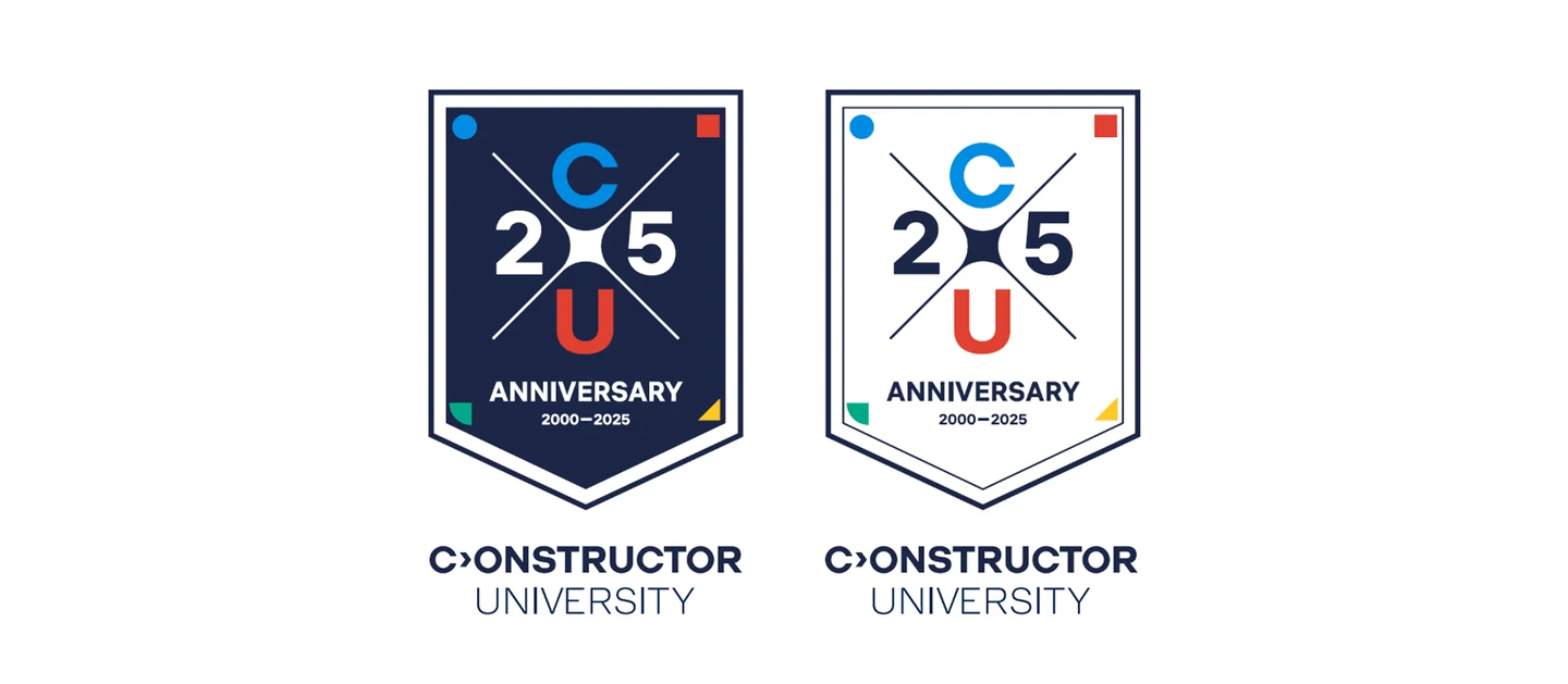
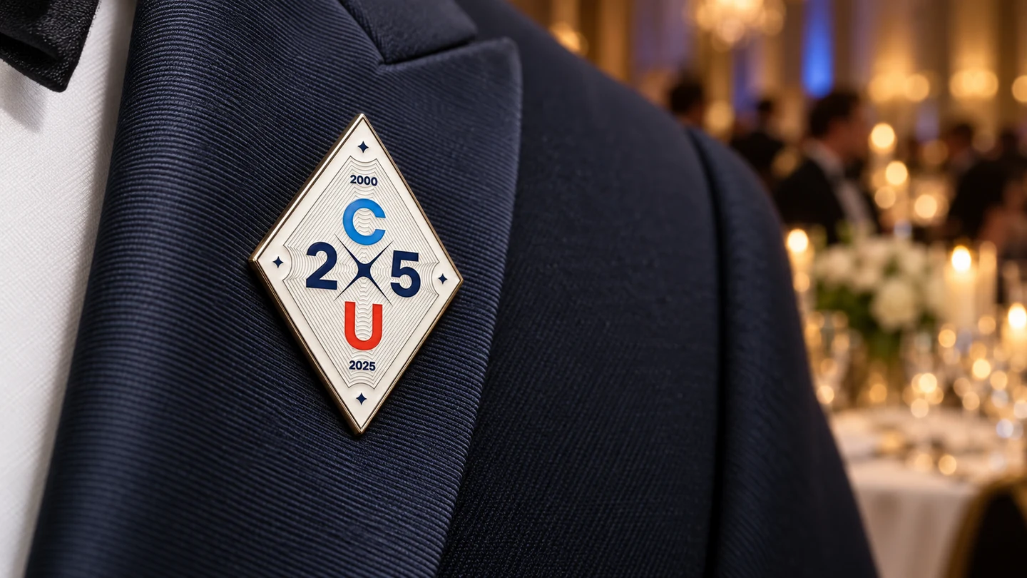
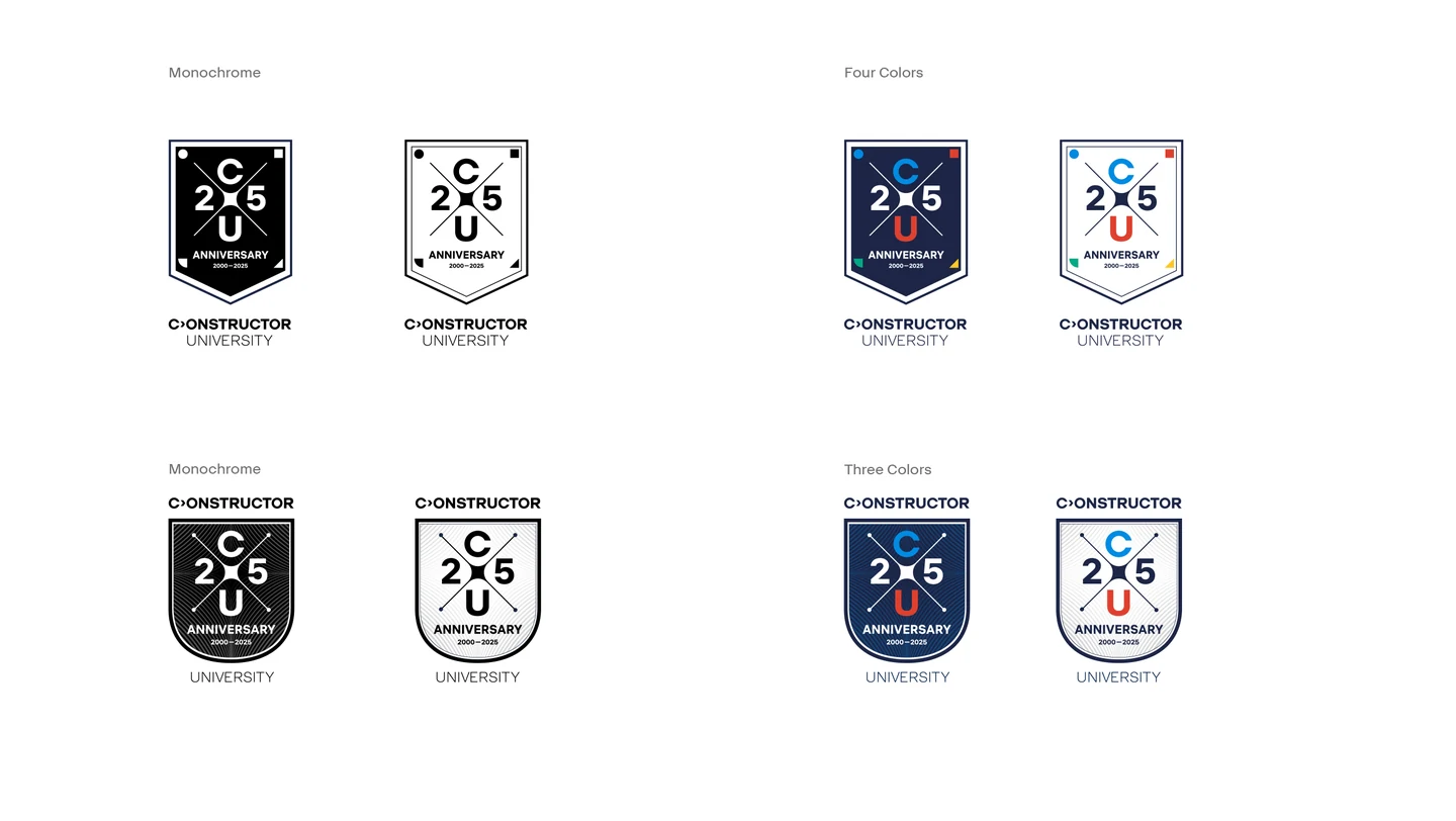
Shields, diamonds and engraved lines give the anniversary a ceremonial character. They work particularly well as objects: a badge, a flag, a pin. The trade-off is detail. Fine lines get lost at small sizes, while a crest beside the university logo can feel like another institution’s badge. We needed something less self-contained.
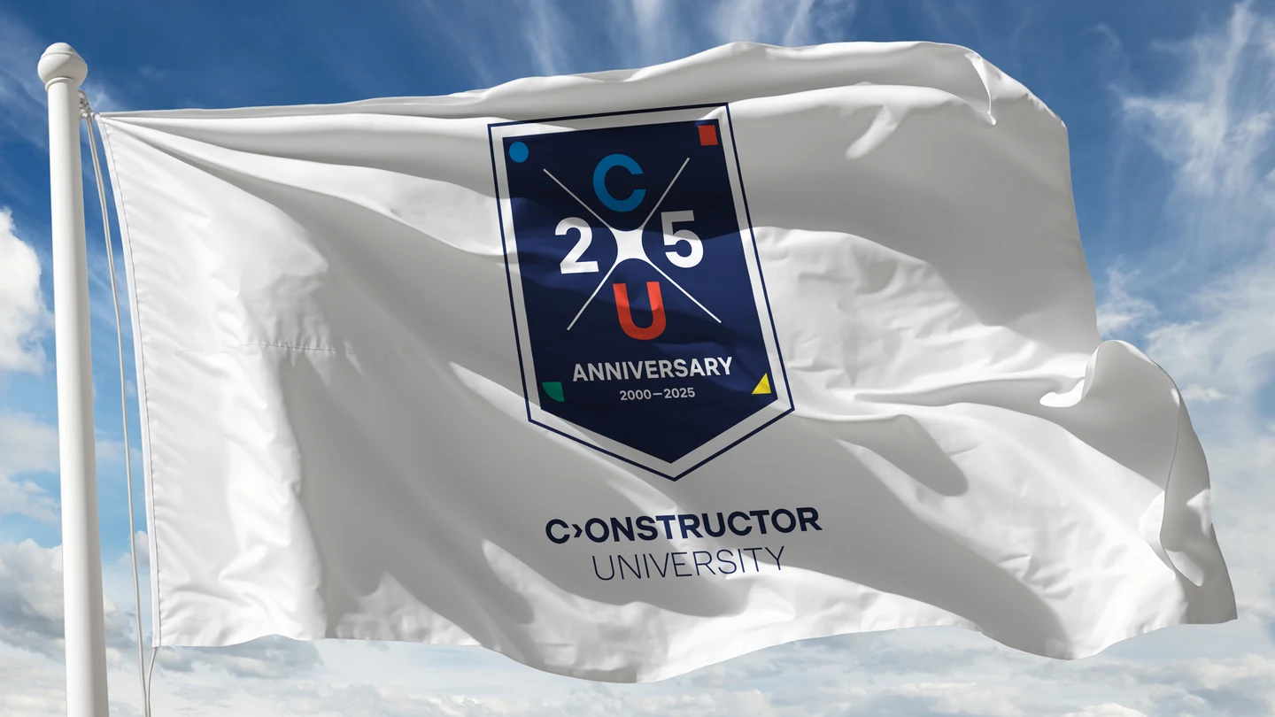
The crest concept on a flag.
The crest route: compact symbols in colour and monochrome.
Testing a crest on university stationery.
An anniversary badge, explored in light and dark.
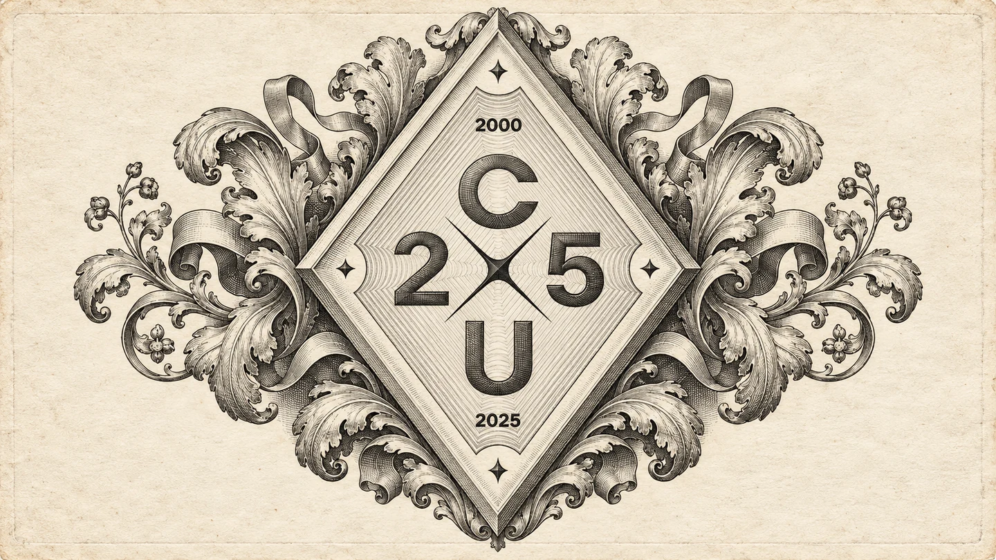
A more elaborate heraldic direction — part of the search, not the chosen identity.
The diamond-shaped badge as a lapel-pin concept — an early exploration.
03 / COMPARE, THEN SIMPLIFY

Less emblem.
More room for the university.

Putting the directions side by side made the choice easier to see. The ornate options carry a whole visual world of their own. The simpler typographic combinations leave room for the university’s name, photography and message. That was the better fit for an identity with so many different jobs.
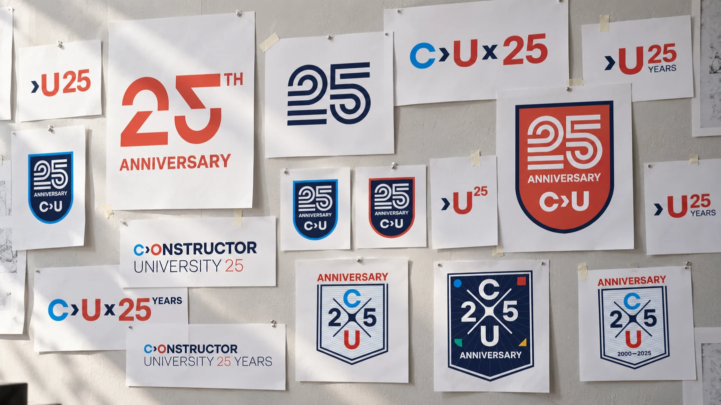
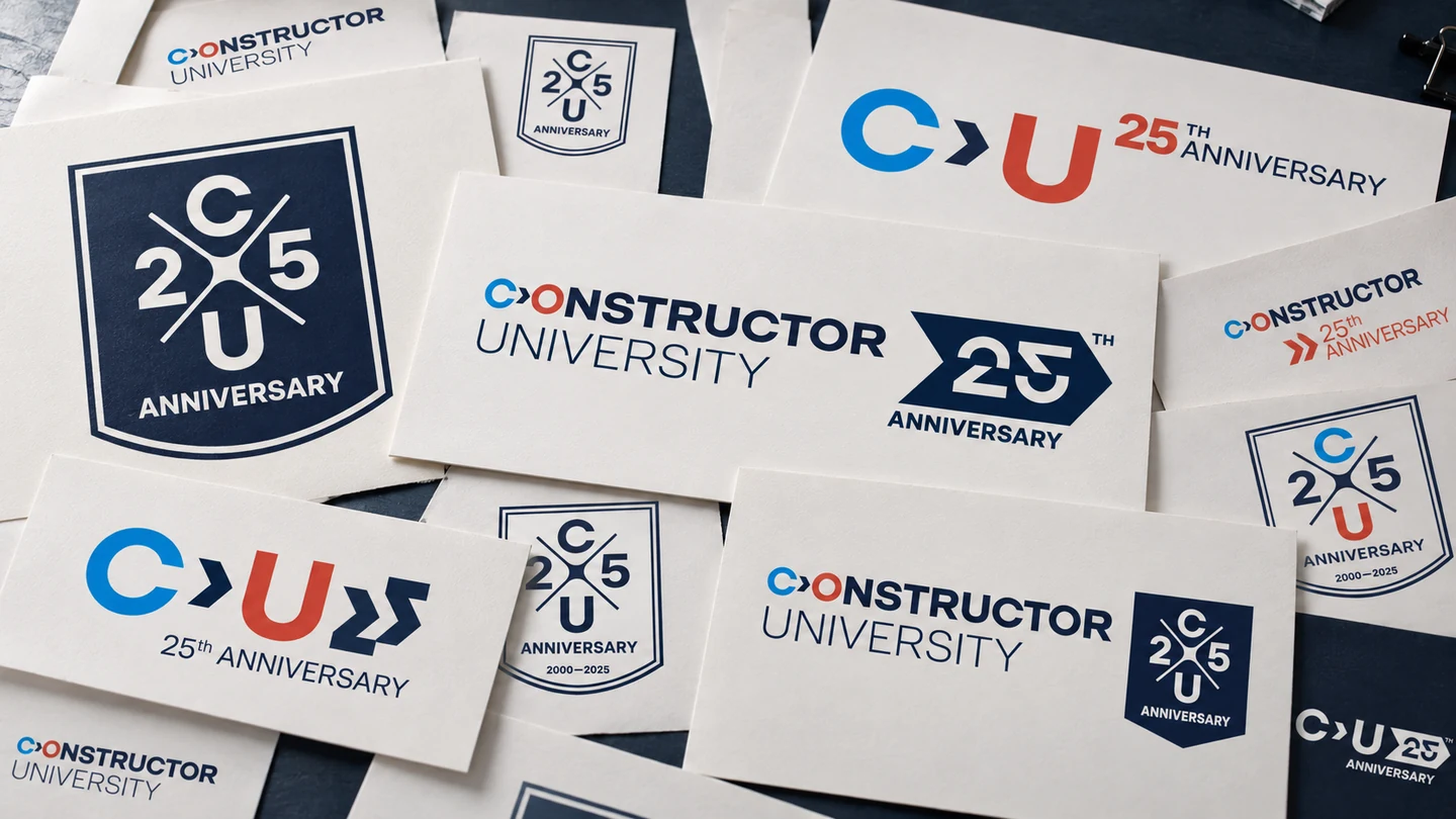
Different answers to the same brief, seen together.
Comparing the options at the scale of everyday materials.
02 / THE CHOSEN IDENTITY

A university
anniversary logo
built to scale.

The chosen direction brings the university and its anniversary together through typography. It can sit beside the full name or become a compact mark when space is tight.

From a notebook to a stage, the job stays the same: make 25 visible, keep the university recognisable. The hierarchy adapts to the format without competing with the existing logo.

An anniversary edition of the brand, not a second brand for a single year.
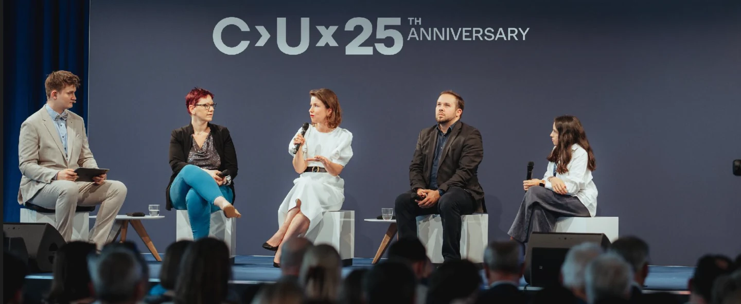
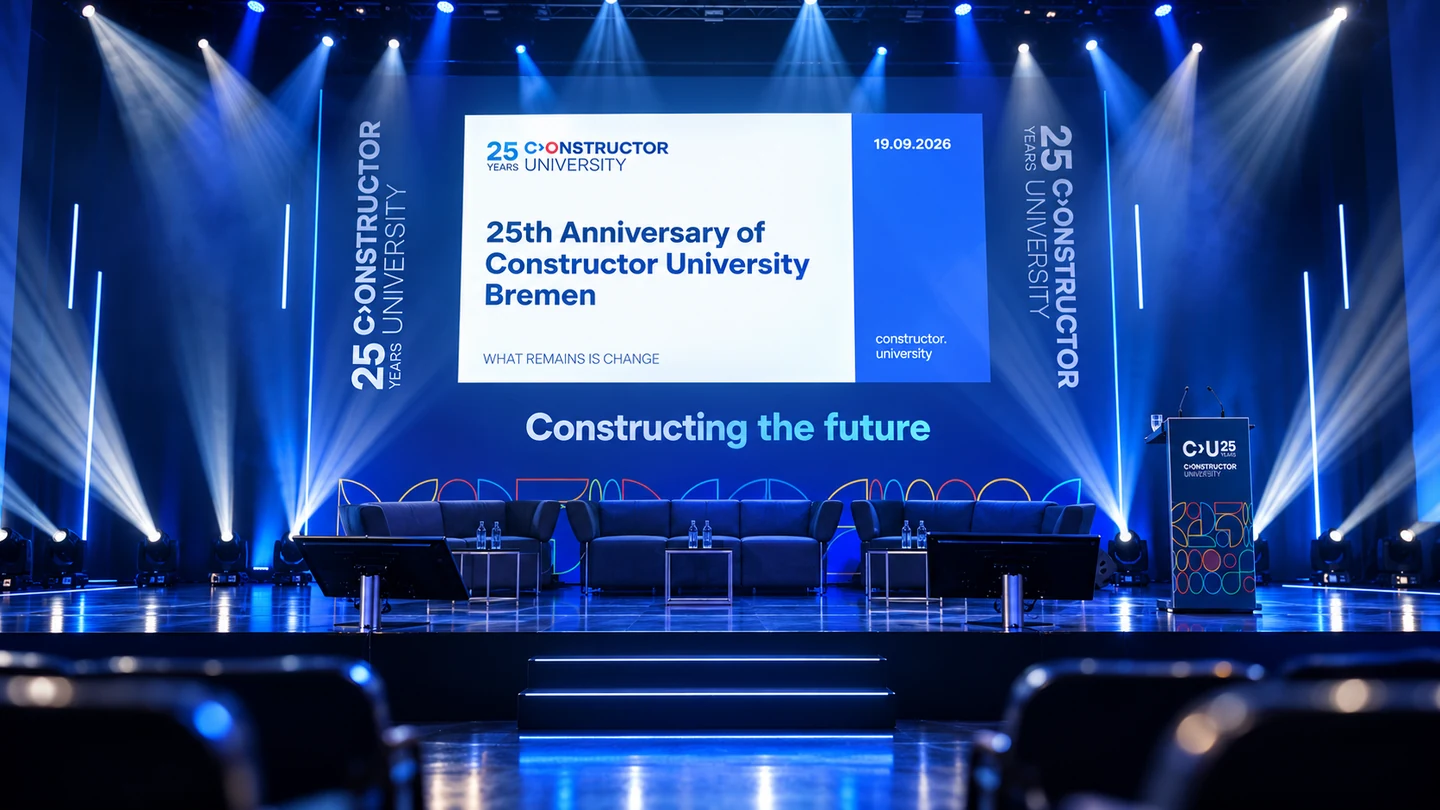
The typographic anniversary identity in a stage application.
The university name stays prominent on a notebook.
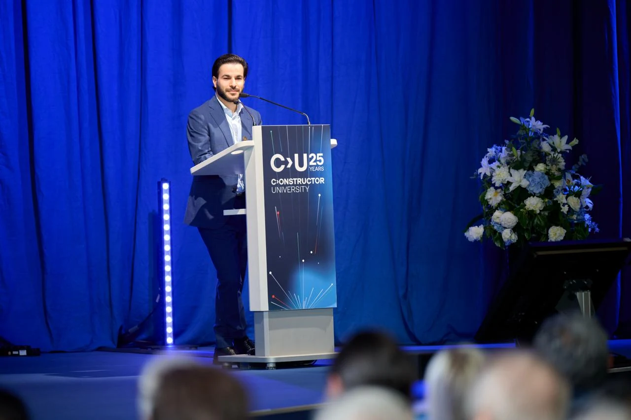
The anniversary mark on a lectern at a university event.
From presentations to campus
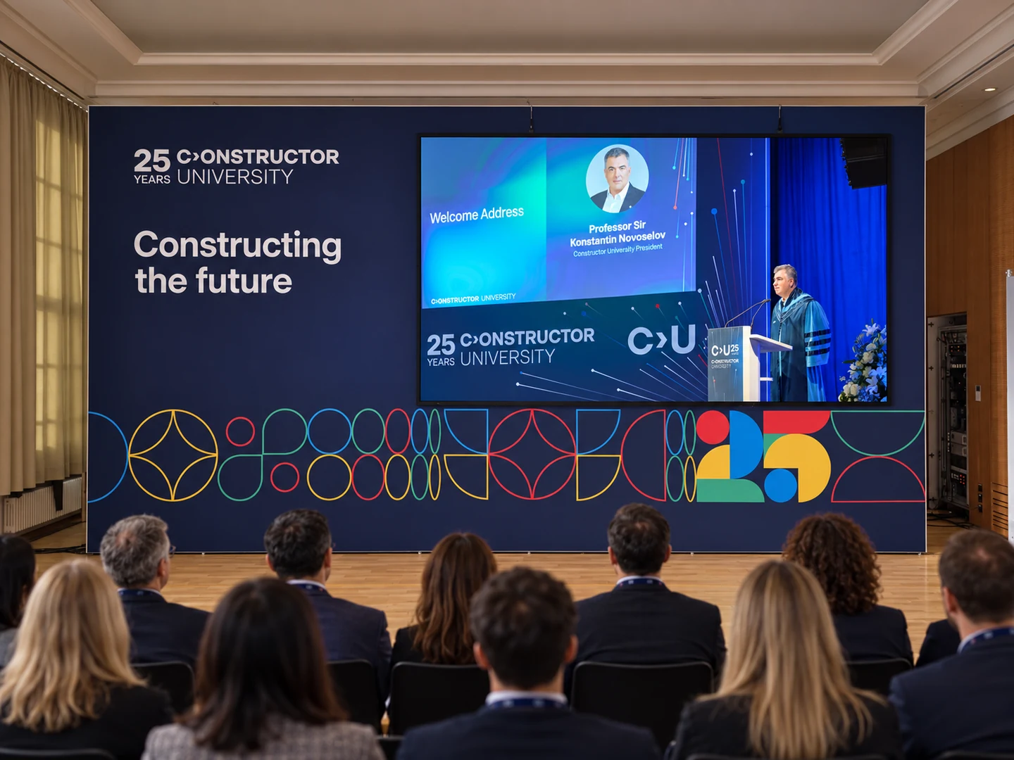
A presentation environment brings the anniversary elements together.
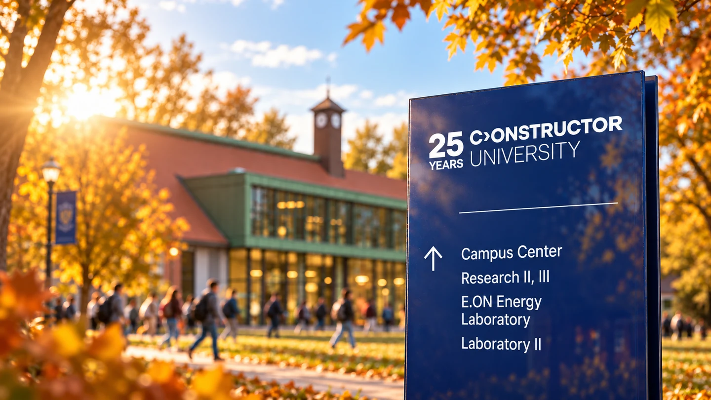
A campus wayfinding application.
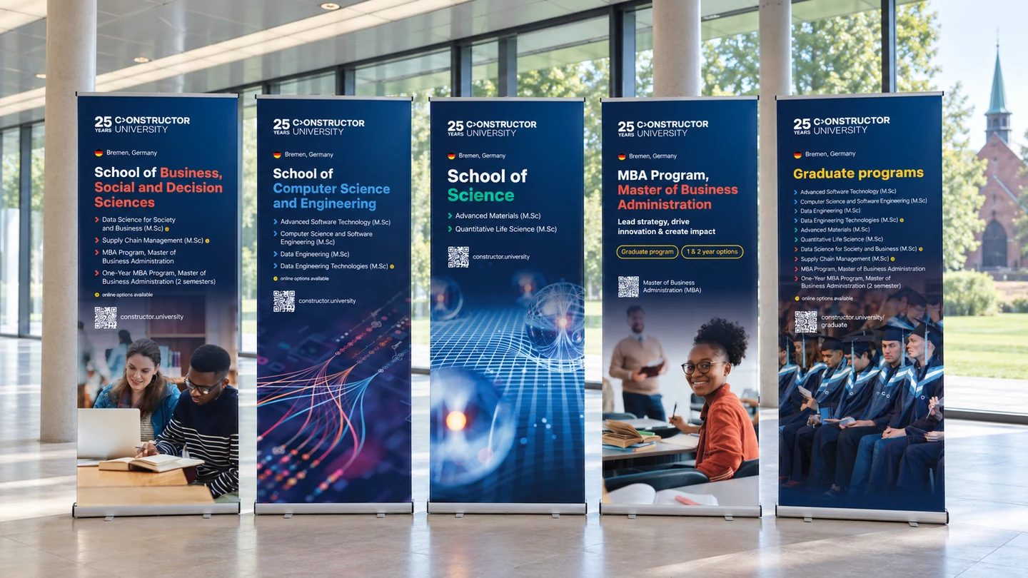
Recruitment banners keep the programmes — and the university — easy to recognise.
03 / BREMEN, ILLUSTRATED

University brand
illustrations.
Duck included.

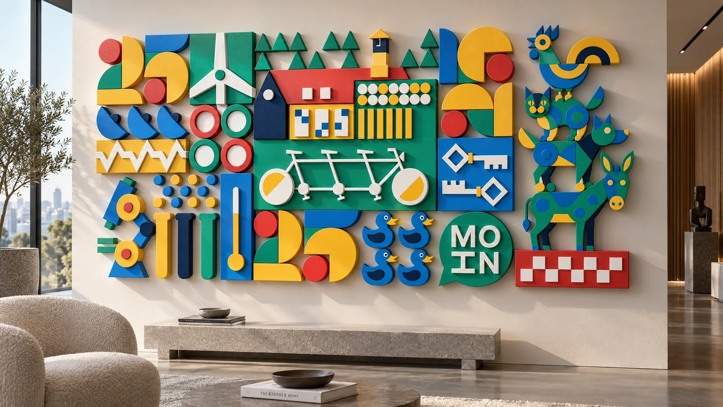
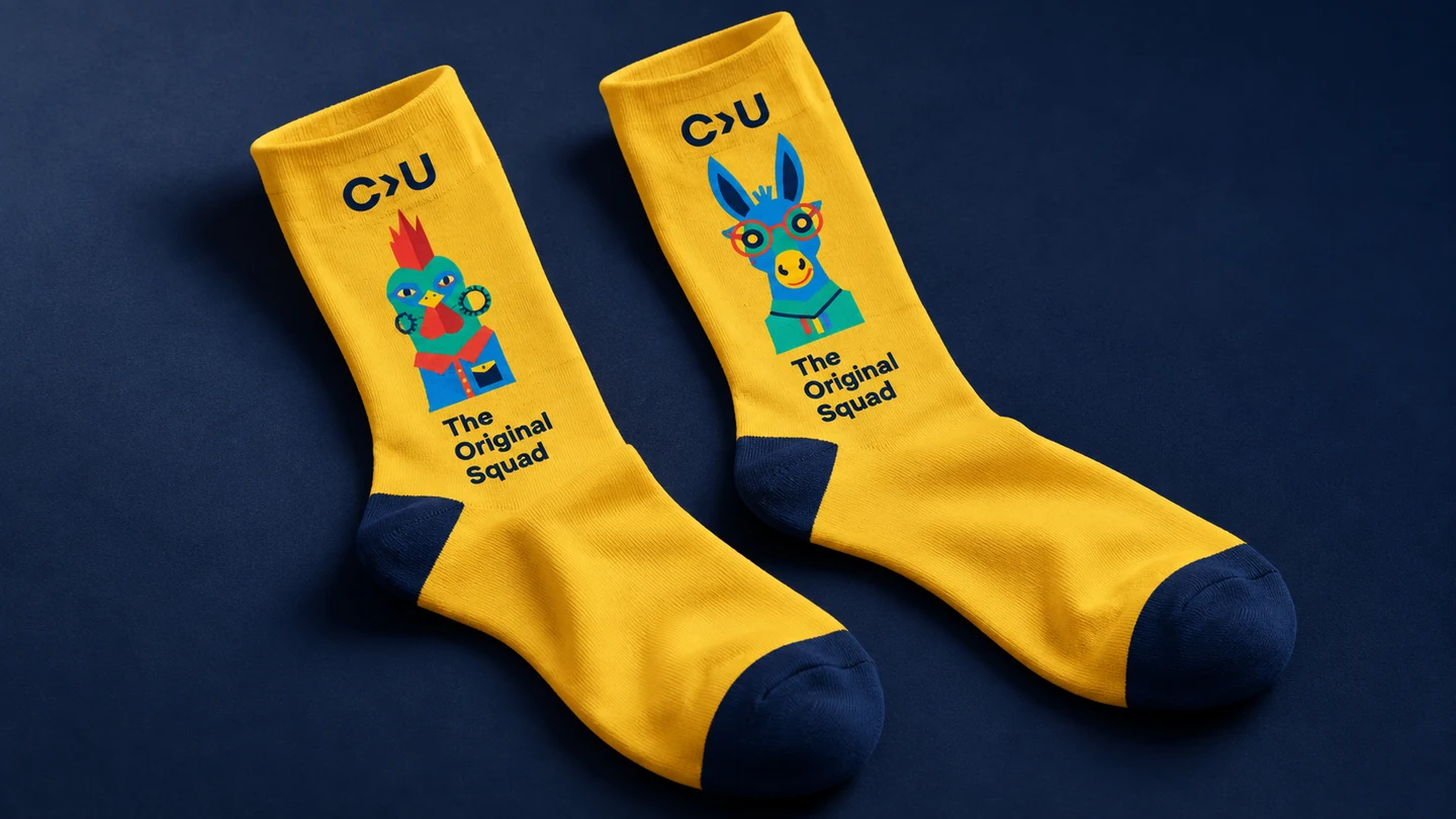
The logo marks the occasion. The illustrations tell the more personal story: the Bremen Town Musicians, a friendly “Moin”, campus landmarks, science and Joana the duck.

We turned these references into a geometric illustration kit. Individual characters, repeating patterns and larger compositions give each application its own personality without losing the shared visual language.
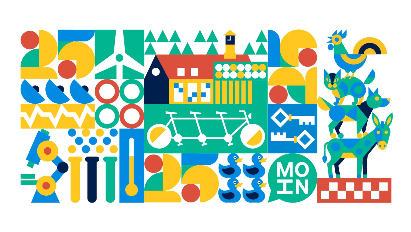
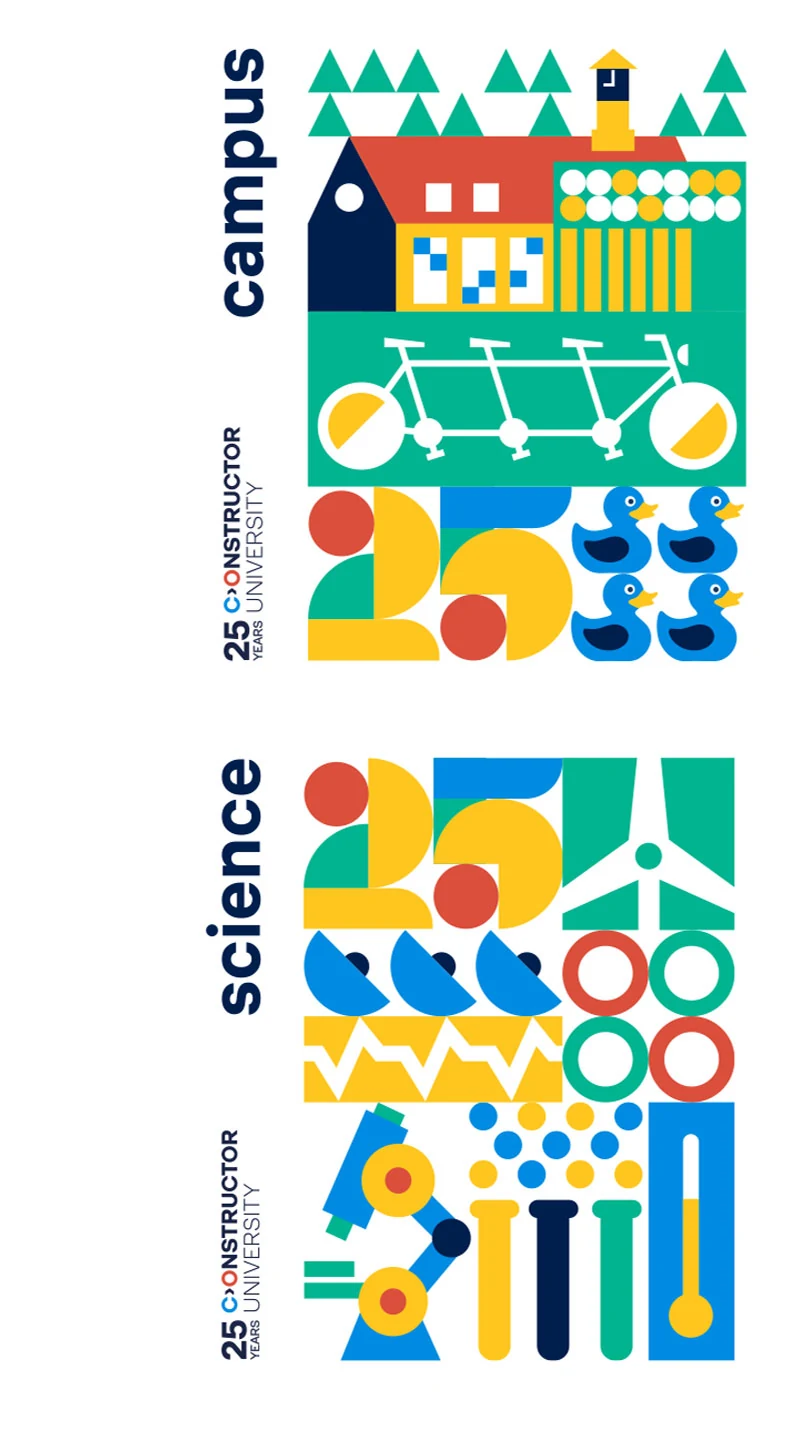
Bremen, campus life and research, brought together in one illustrated composition.
Campus and science: two combinations from the illustration toolkit.
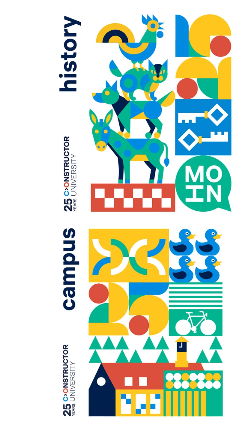
History and campus: the same visual language, different stories.

The same toolkit, arranged for narrow formats: campus, science and Bremen’s history.

One character.
Or a whole campus.

A duck can become a pattern. Scientific symbols can fill a panel. The whole set can grow into a scene. The artwork adapts to the space, rather than repeating the same picture on every surface.


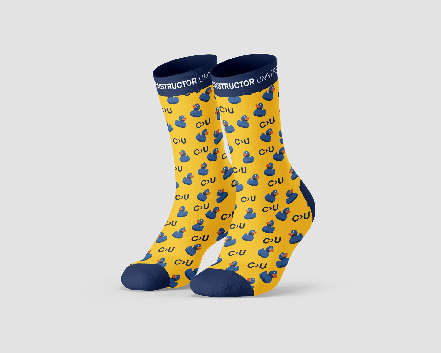
Joana the duck becomes a repeatable pattern.
Science, reduced to bright geometric shapes.
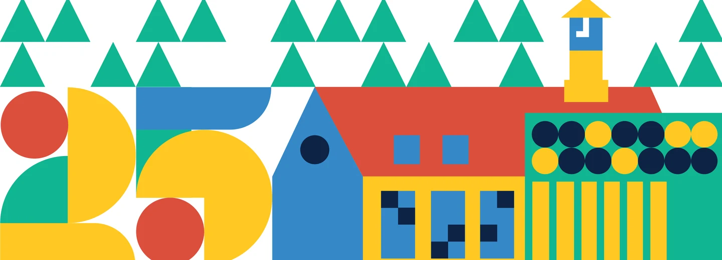
Campus architecture and the anniversary number share the same grid.
Typography joins the illustration toolkit.
An interior application of the illustration system.
04 / MERCHANDISE DESIGN

University merch
made to be used.
And worn.

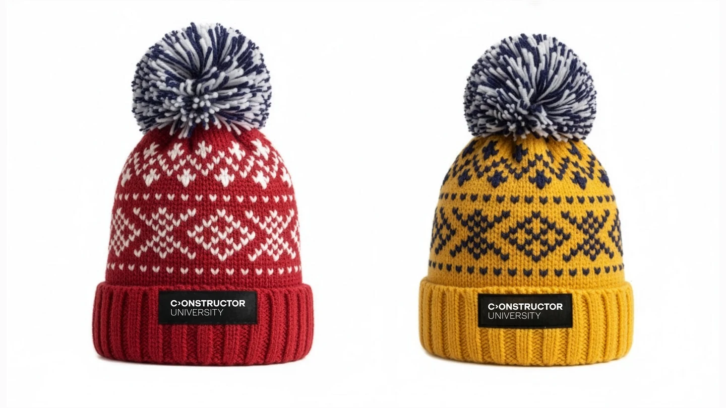
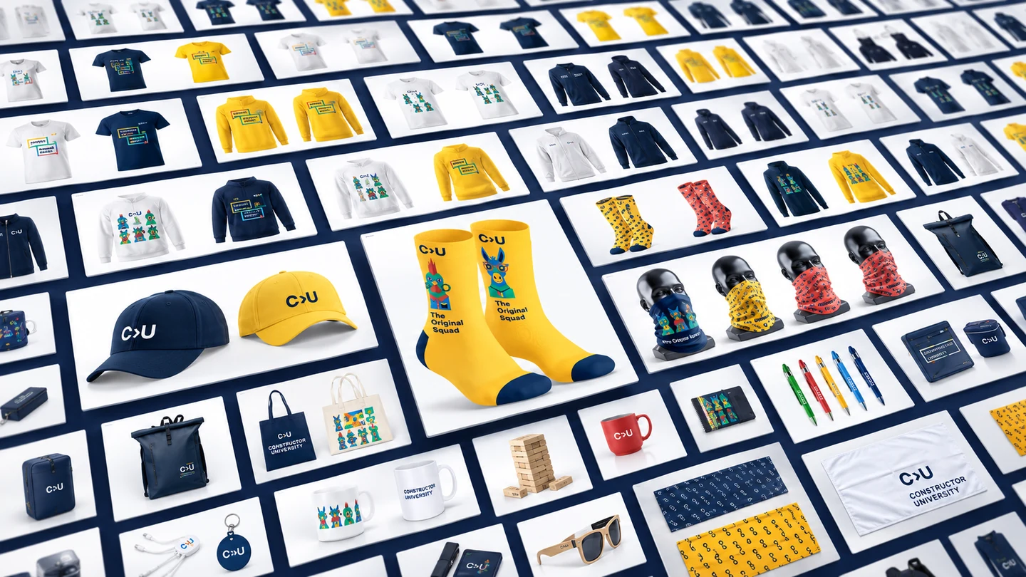
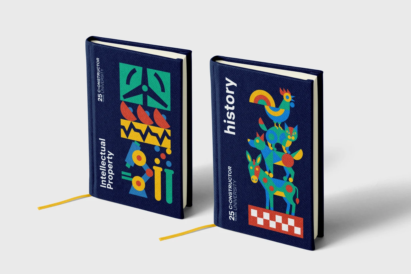
Tote bags, socks, notebooks and winter hats take the university beyond campus. We designed a collection with different levels of expression: a quiet wordmark on one item, a full illustrated scene on another.

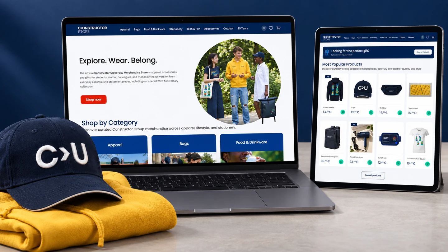
The wider merchandise project sits alongside the anniversary identity. The university store is now live, so students, alumni and supporters can find the collection beyond the events themselves.

Visit the university store ↗
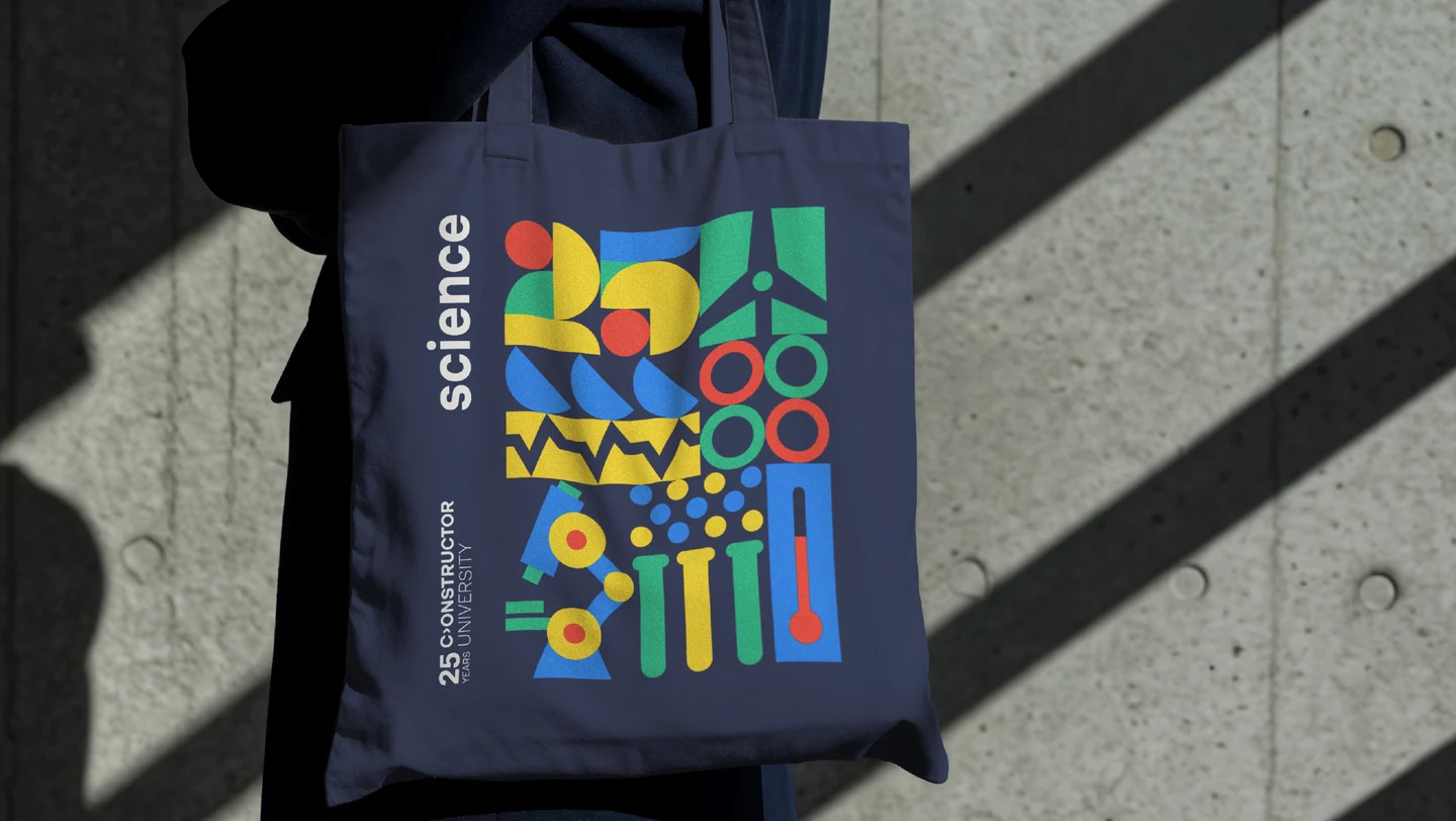
An illustrated tote bag: a small piece of campus to take with you.
Two notebook designs, built from the same set of illustrations.
A sock design from the university merchandise collection.
Knitted beanies in university colours.
The Bremen Town Musicians, reworked for a pair of socks.
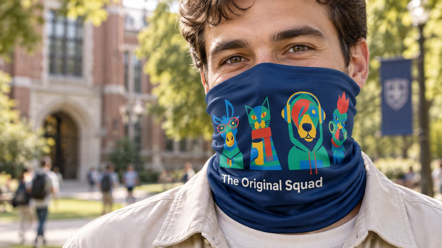
The illustrated characters on a neck gaiter.
The wider merchandise range, gathered in a catalogue view.
A presentation of the university merchandise store.
05 / ALUMNI EVENT DESIGN

Alumni Homecoming
event identity.
Milestones in Motion.

Alumni Homecoming needed its own moment within the anniversary year. “Milestones in Motion” was the event theme: the journeys, decisions and experiences that connect individual graduates to a shared twenty-five-year story.

Working from the Homecoming committee’s direction, we brought a road, a car, stars and architectural forms into the same illustrated scene. It looks ahead while making room for the idea of looking back — a fitting combination for returning to university.

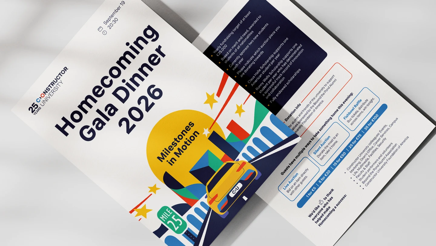
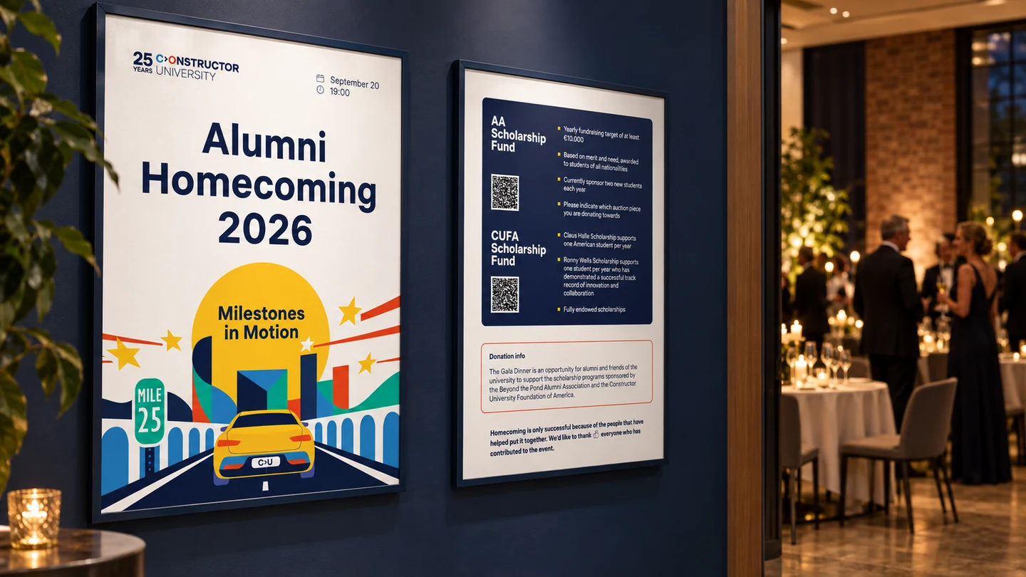
The visual then had to do useful work. Posters invite people in. Wayfinding helps them get around. A gala programme guides the evening. Different jobs, but recognisably the same event, and still part of the university’s anniversary.
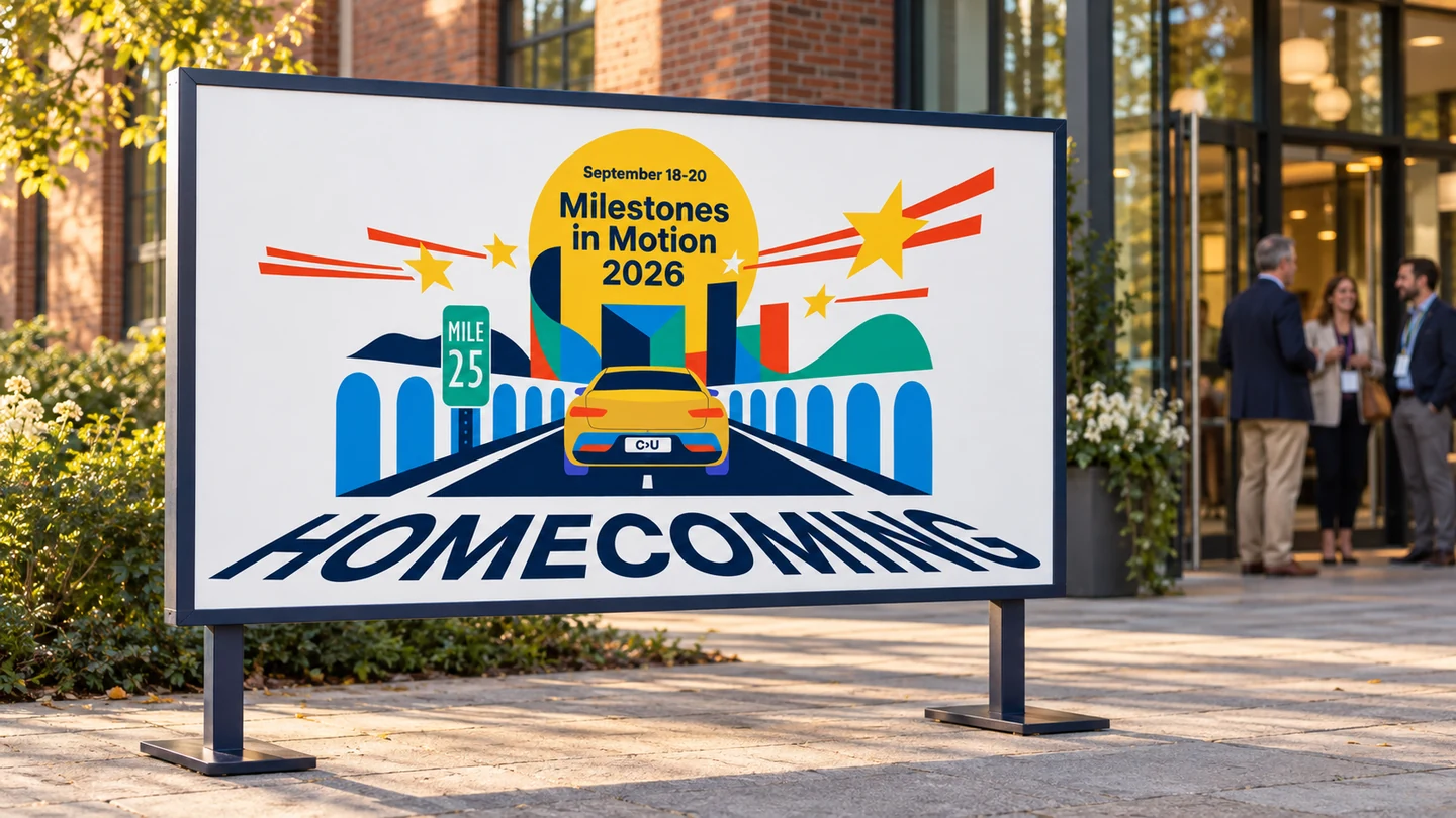
Milestones in Motion: the Homecoming visual in a poster application.
Event information and wayfinding within the Homecoming identity.
A gala programme carries the same visual through the event.
06 / CAMPUS & EVENT BRANDING

From campus signs
to the gala stage.

The real test was consistency across different settings. The result combines a typographic anniversary mark, an illustration kit and designs for merchandise, campus communications and events.

A formal stage can be restrained. A tote can be full of colour. They still belong to the same university, celebrating the same milestone. That is what a useful visual identity should do: hold together without making everything look identical.

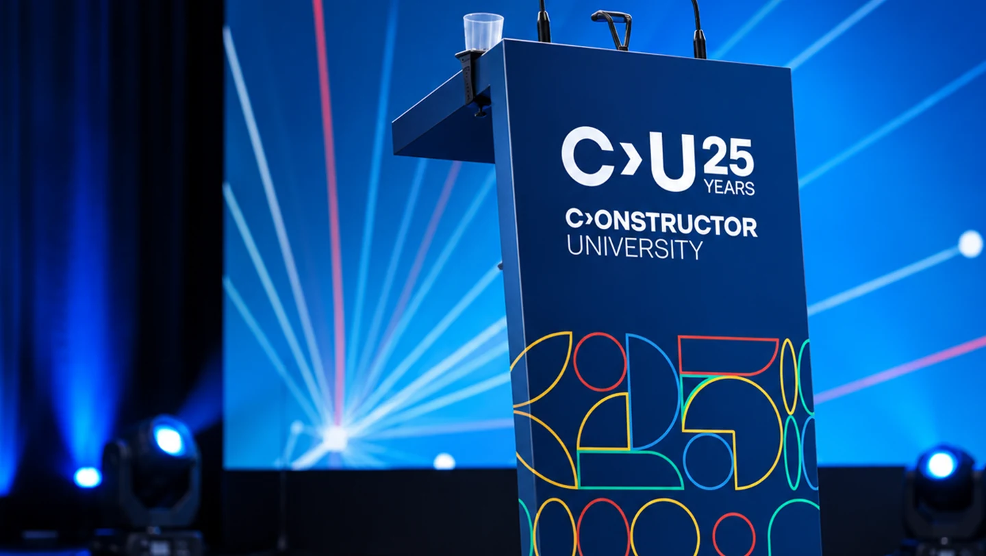
The anniversary graphics can become a quieter, linear pattern.
A lectern application combines the typographic mark and anniversary pattern.
The anniversary identity at the scale of a gala stage.
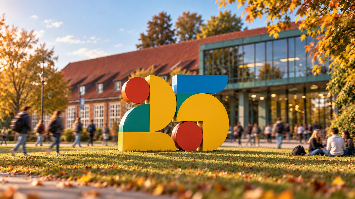
A campus installation concept gives 25 a physical presence.

Branding for universities.
From the first logo
to the last tote bag.

Discuss your university branding project ↗
NEXT PROJECT

Constructor Fabric

NEED A BRAND, WEBSITE OR PRODUCT DESIGN?SINGAPORE / WORLDWIDE

Tell us what
you need.

Share your scope, timing and budget. We’ll suggest the right next step.

Start a project