Brand and product design
for an open-source
AI software platform.
Constructor Fabric connects the work of planning, building and running software. The challenge was to make that broad platform understandable — in its identity, its website and the tools people use every day.
We designed the brand, the marketing website and the Studio product experience, from Figma foundations to a working React prototype and a shared Storybook catalogue.
- Brand identity & logo system
- Product UX/UI & information architecture
- Figma Foundations & component design
- React prototype & Storybook
- Website design & development
Structure the work.
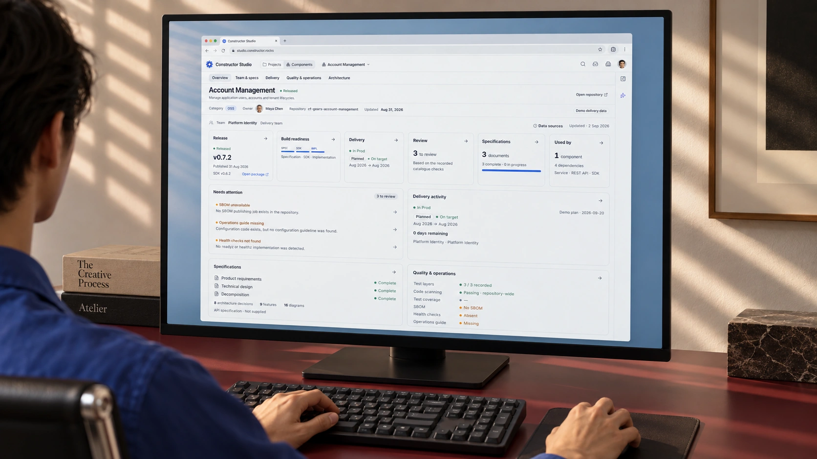
Specifications, traceability and AI governance across the software lifecycle. This is the browser workspace at the centre of our product-design work.
Measure the output.
Productivity benchmarking connects AI adoption with what teams actually deliver. Clear definitions and comparison periods matter more than impressive-looking charts.
Reuse the building blocks.
Reusable business modules, platform services and integration engines. The design helps people understand a component before bringing it into a project.
Three modular parts, not a replacement for the IDE, CI/CD or infrastructure a team already uses. About the platform ↗
A fabric made
of connections.
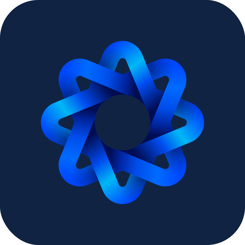
A gear suggests engineering. Woven ribbons suggest the flow between parts. Together, they give a modular software platform a distinctive mark.
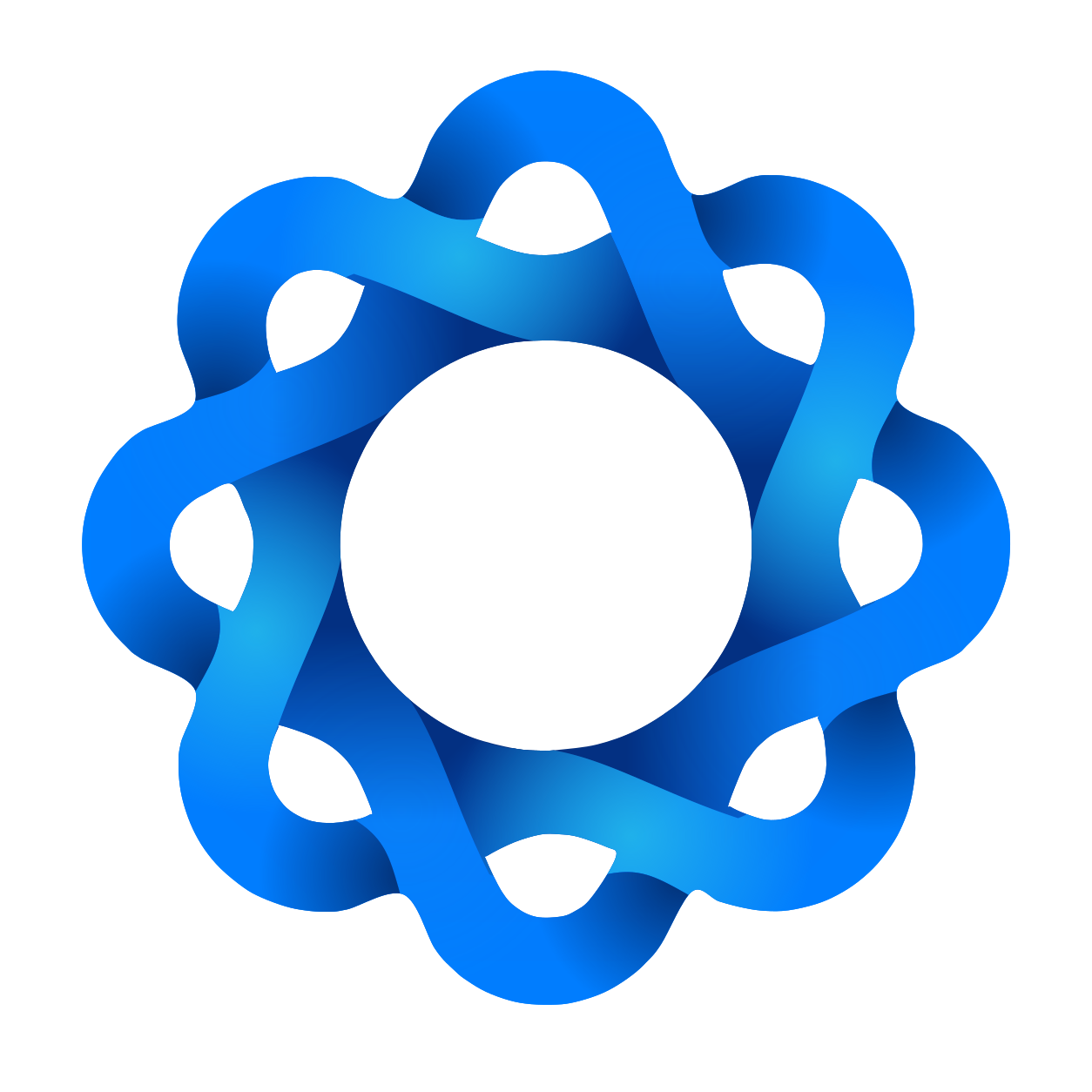
Start with the structure.
Broad folded shoulders make the gear silhouette immediate. It is a strong, more angular direction; the individual surfaces matter more than the crossings.
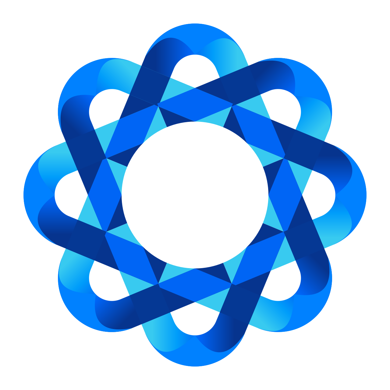
Open up the connections.
Lighter loops make the weave more explicit. The trade-off is in the overlap detail: what looks generous at poster scale has to remain legible in an app header.
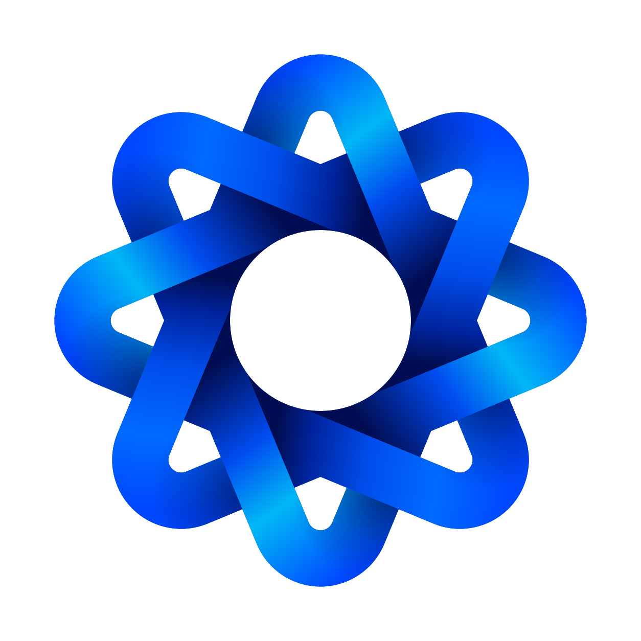
Keep the tension between both.
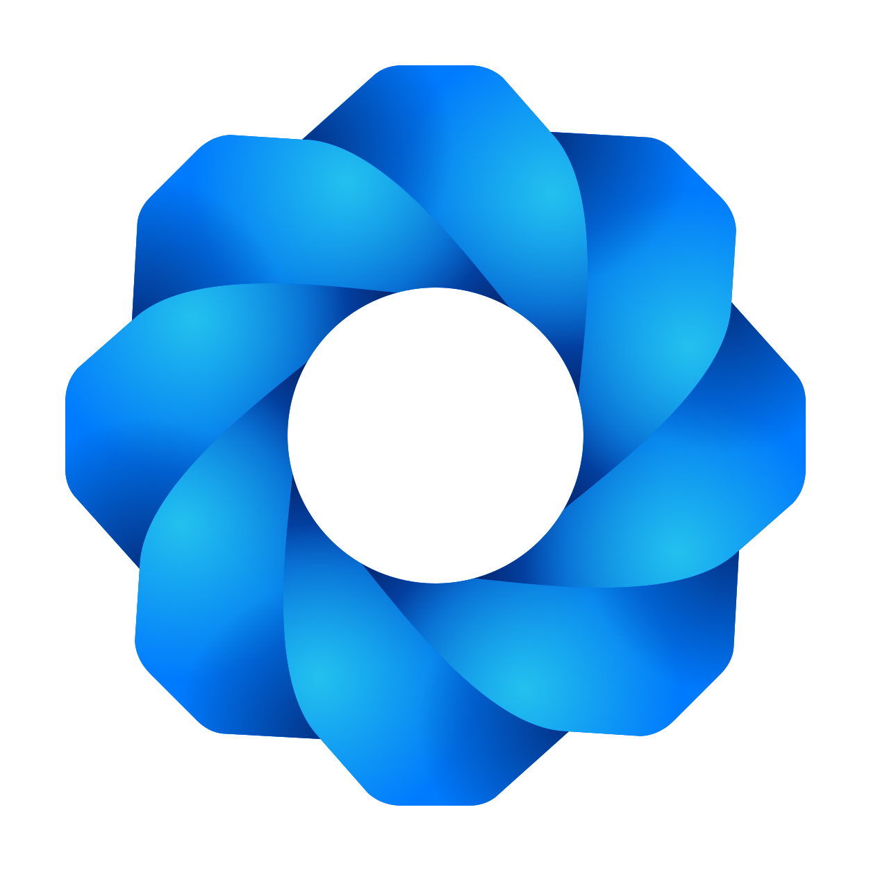
The retained mark combines the gear-like outline with a layered, continuous weave. Blue and cyan help the eye follow the ribbons; deeper blue gives the crossings depth.
The search was not about adding another symbol to the technology shelf. It was about finding the right balance: engineered, but not rigid; interconnected, but not tangled. Folded and woven studies let us compare those qualities directly. The selected artwork then became the reference for the editable vector kit.
The gear
Eight repeating modules give the silhouette its engineering character: separate parts designed to work together.
The ribbons
Continuous bands bring movement into a mechanical form. They suggest work and ideas travelling between components.
The weave
Over-and-under crossings make the connections visible. Each ribbon keeps its own shape while joining the next.
The fabric
The whole is more than a collection of parts. The name and symbol describe the same idea: connected software work.

One identity.
Several working sizes.
The product header needs a compact symbol. GitHub, LinkedIn and Telegram need avatars that survive different crops. The website needs a full wordmark; a one-colour application cannot depend on gradients. We built horizontal, compact and stacked lockups, monochrome versions and padded avatars around one master, with a dedicated asset site so the team can use the right file.
Explore the logo system ↗A recognisable entrance
to the workspace.
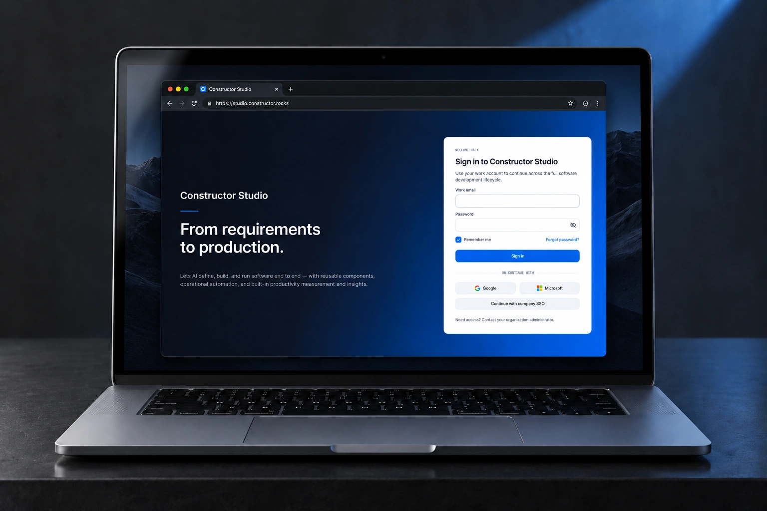
The sign-in study gives the brand room to breathe: a dark blue field, a clear product name and a bright form. Once inside, the same identity becomes quieter, leaving the work in focus.
Help people find
the next useful action.
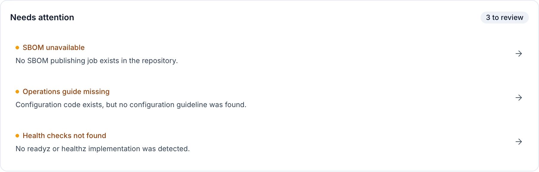
Software work is spread across documents, repositories and conversations. We organised the experience around concrete questions: what needs a review, what can be reused, and what evidence sits behind a release?

Start with the work.
Keep its context.
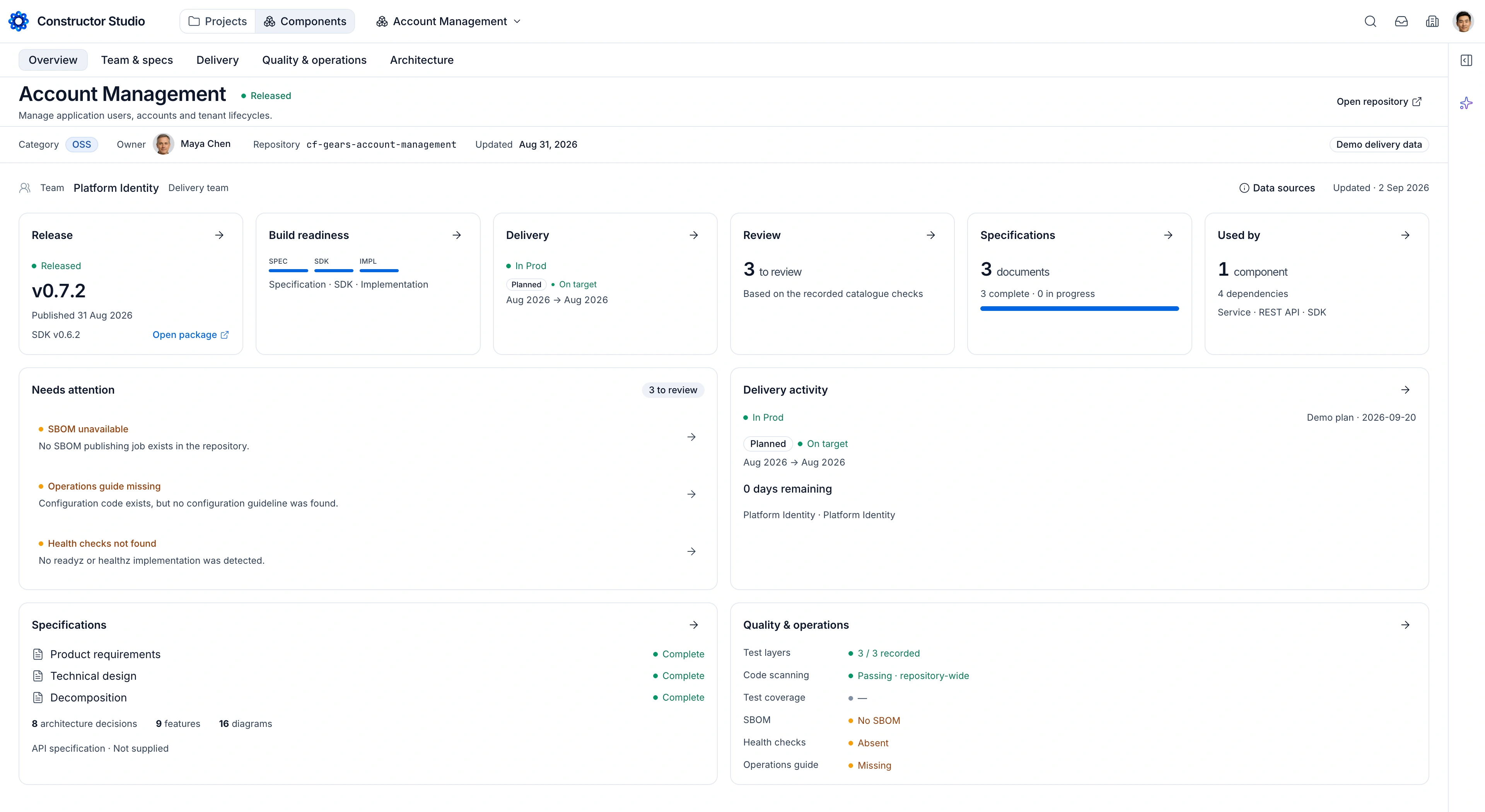
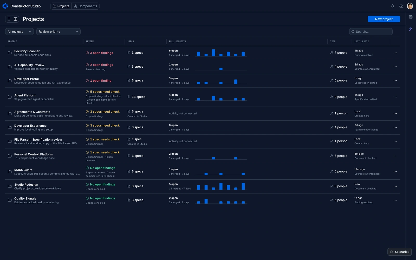
The project portfolio brings specifications, open findings, pull requests and people into the same view. A component overview then narrows the focus to release, readiness, dependencies and documentation.
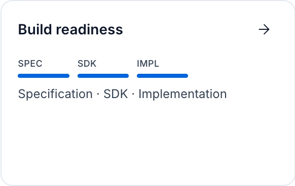
Readiness is not one number.
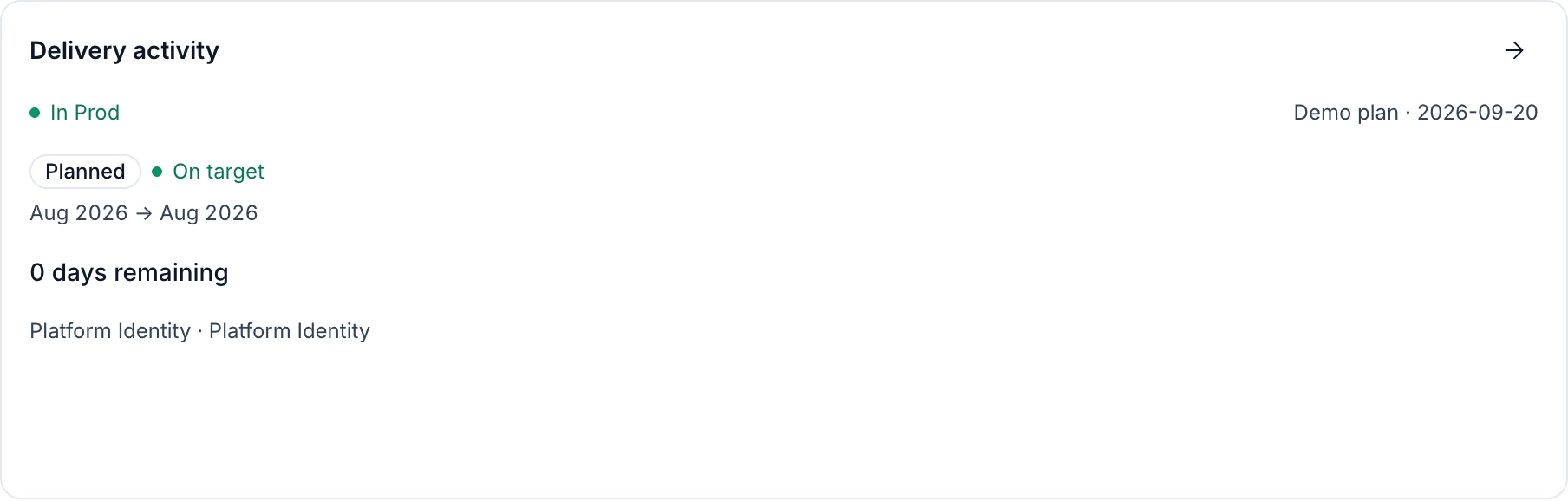
The summary preserves three dimensions — specification, SDK and implementation — so partial readiness remains visible.
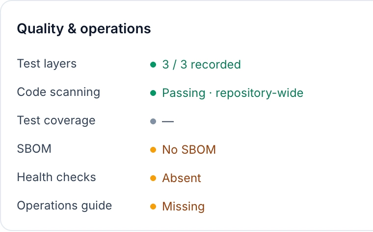
Missing evidence stays missing.
A neutral dash means coverage is unavailable. Zero would imply a measurement; a warning, a known failure. The interface keeps those meanings separate.
From the project portfolio to reusable components, specifications and architecture. Explore the views individually, or play a slow transition through the workspace.
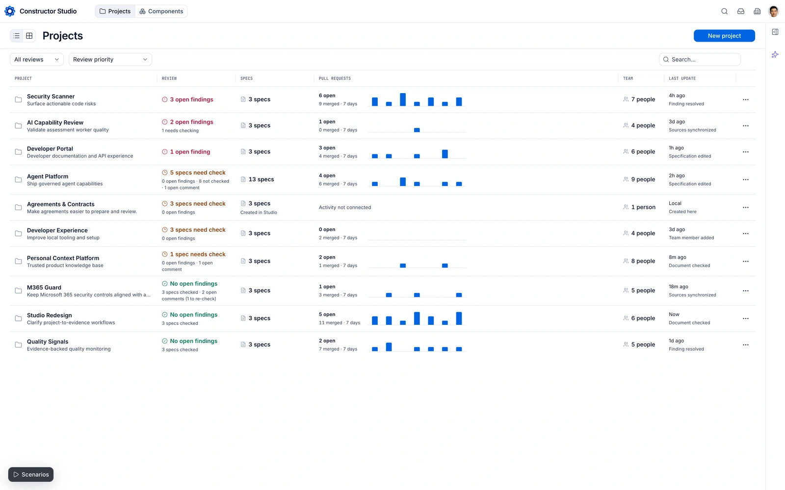
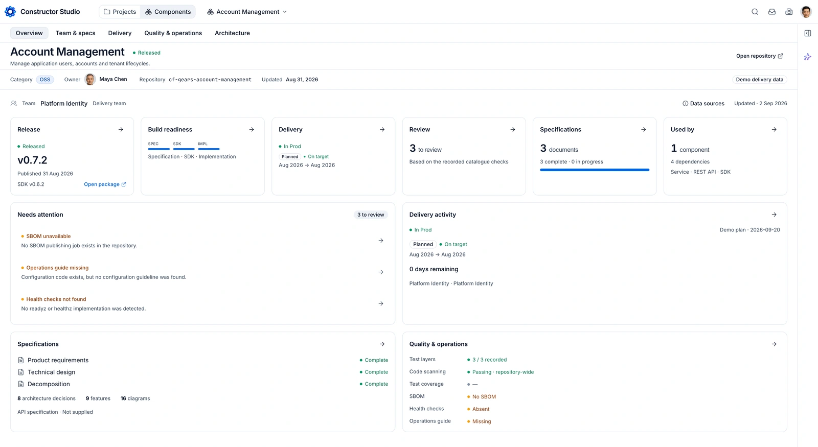
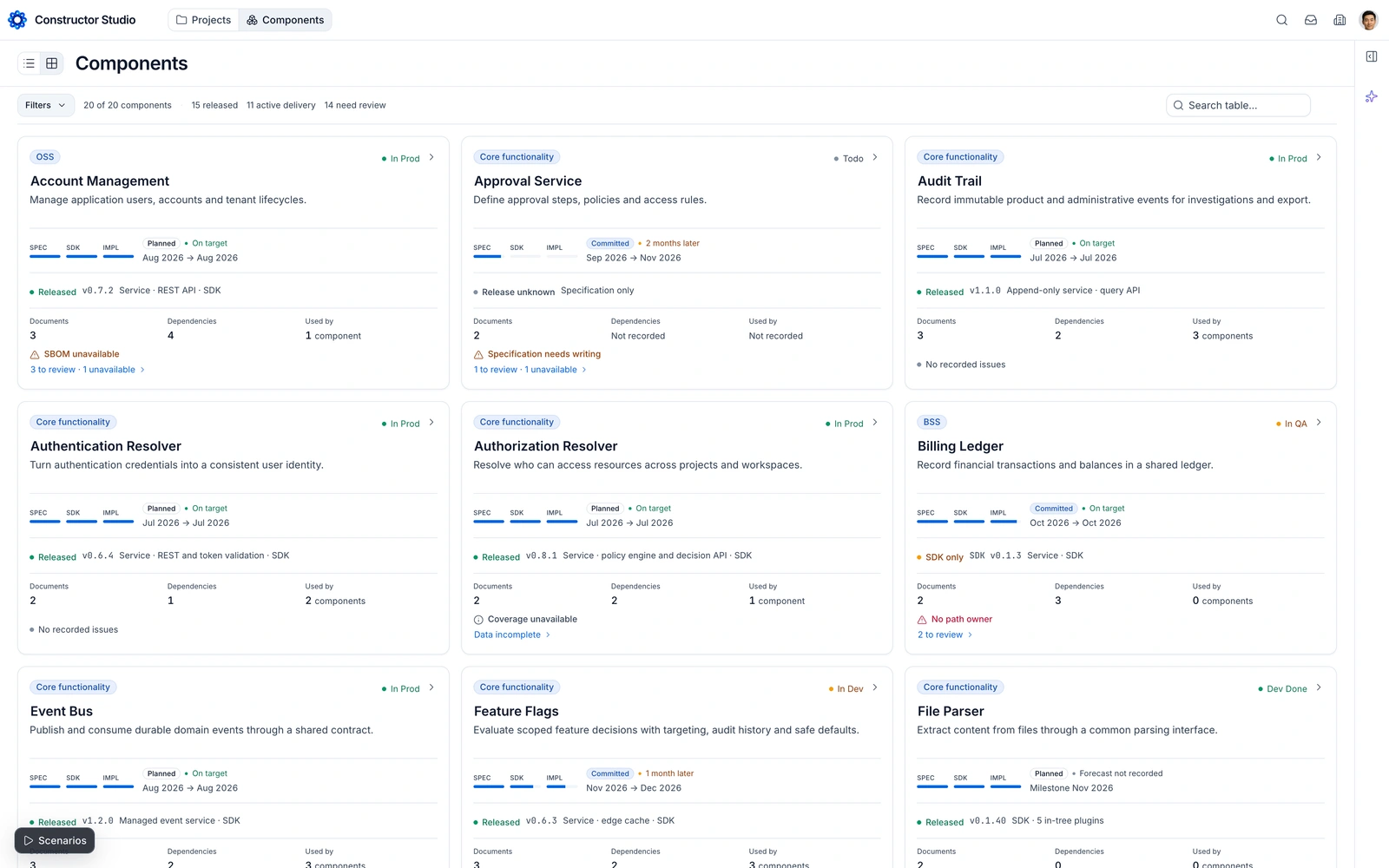
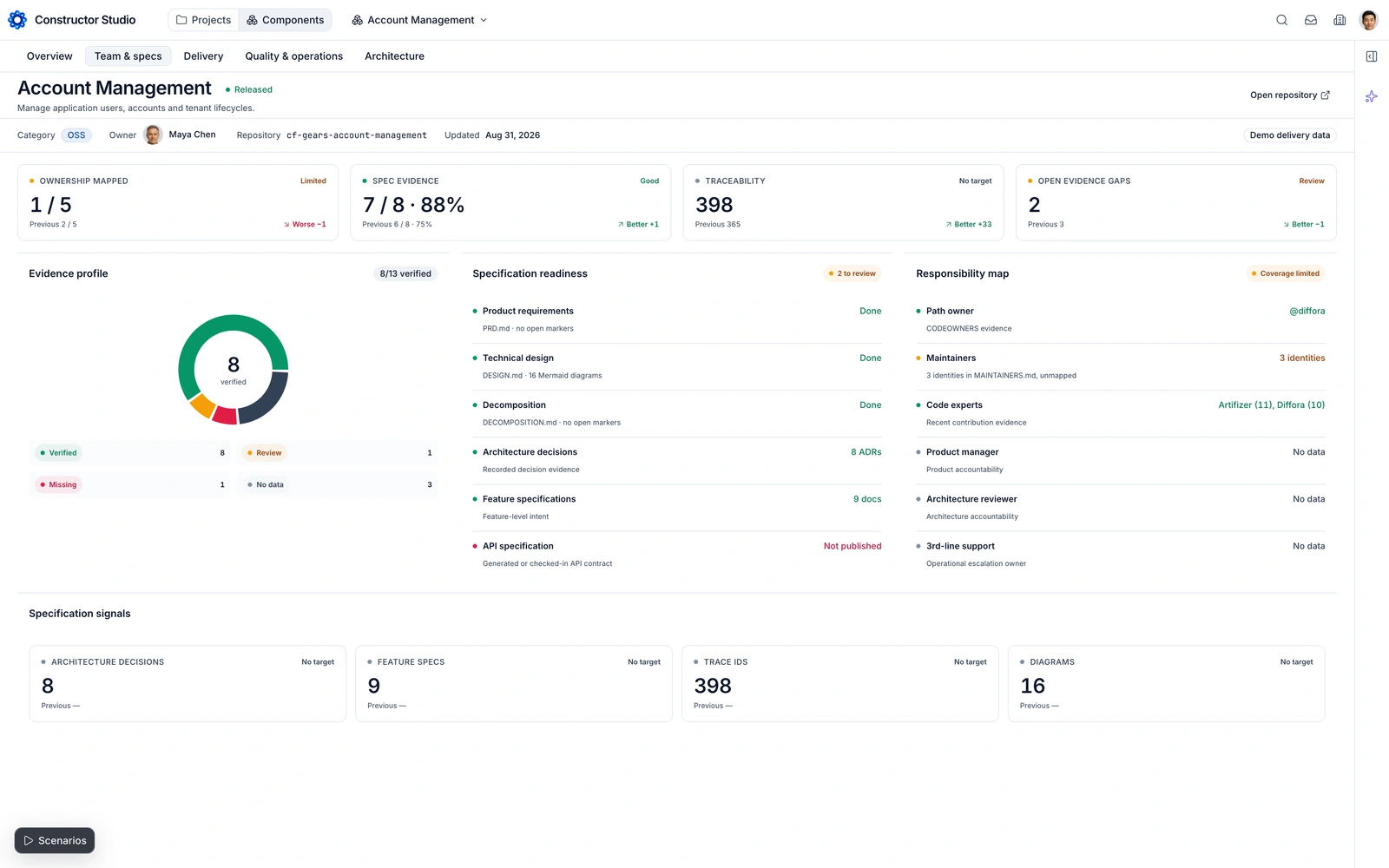
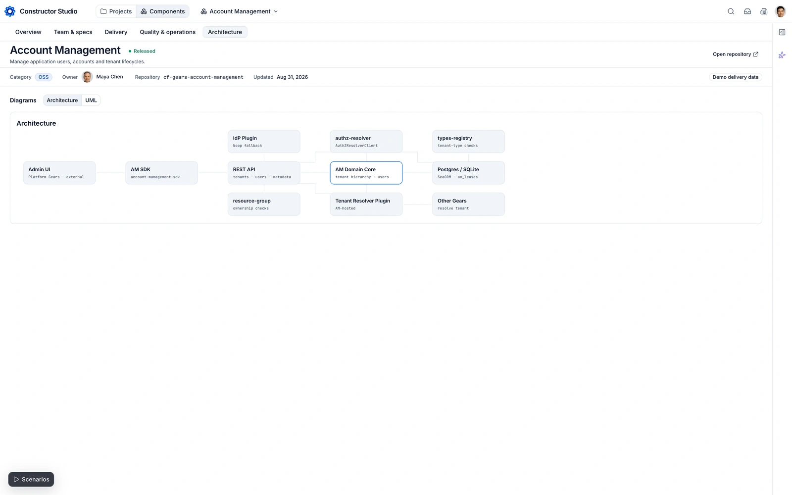
Projects: compare review needs and recent work without opening every project.
Real prototype screens. The transition is an editorial preview, not a recording of a live integration.Consistency is designed
before the next screen.
In Figma, we established a Foundation layer: typography, colour variables, spacing, component anatomy and states. Repeated controls became instances of a shared system, not slightly different drawings on every page.
Inter, from heading to detail.
One readable family, with size and weight doing the work of hierarchy. Monospace labels keep technical references distinct.
v0.7.2 / cf-gearsFamiliar controls. Consistent states.
Fields, selection controls and compact utilities share the same visual rules. People learn the pattern once and recognise it elsewhere.
Shared tokens.
Reusable components.
#0065E3Text
#0F172ASurface
#EEF2F7
Figma foundations define the visual language. shadcn component names and Base UI primitives carry it into code: buttons, inputs, navigation, menus, dialogs and tables.
Editorial specimens of the shared design language. The working components and their states live in Storybook.Same controls.
Different context.
A search field, a selection state and a details panel should not need redesigning for each feature. We mapped Figma components to shadcn names, then carried the same rules into React. As the prototype matured, its shared components became the living visual reference.
From a design file
to something you can use.
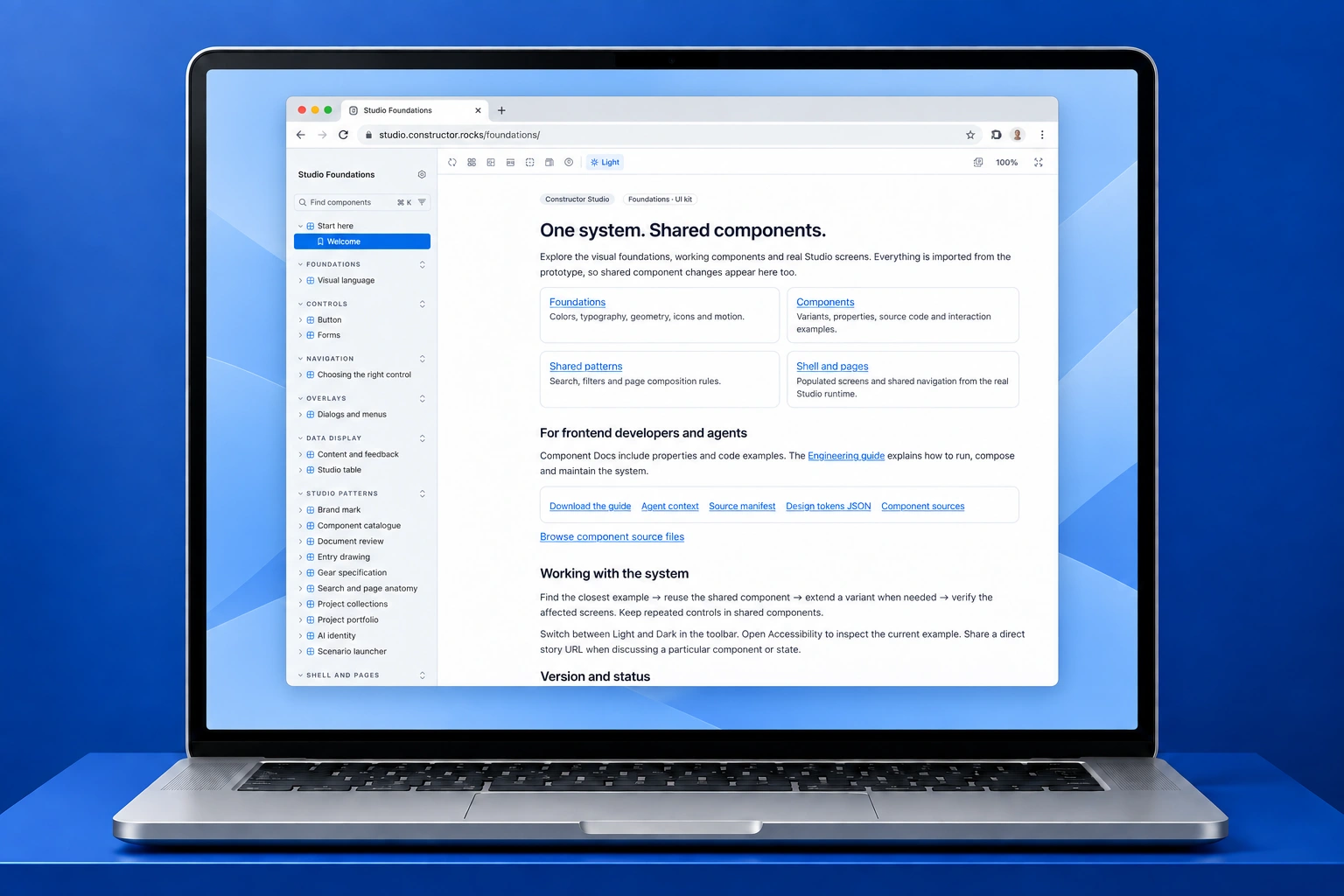
A static frame cannot tell you whether a review flow makes sense. We built the journeys in React, then used Storybook to inspect the actual components, their states and complete page examples.
- 01 / Figma
Define the visual language.
Explore screen structure, then resolve repeated controls into Foundation components, variables and states.
- 02 / shadcn + Base UI
Give design and code the same vocabulary.
Map primitives to familiar component names. Apply our own tokens instead of inheriting a default UI theme.
- 03 / React prototype
Make the journey work.
Follow a project into its documents, review findings and component details. Test the transitions, not just the individual screens.
- 04 / Storybook
Keep the system alive.
Render the actual runtime components, their states and complete page examples. Review changes in isolation and in context.
The catalogue and the product
use the same implementation.
Storybook imports the runtime components rather than maintaining a second UI kit. States, usage guidance, tokens and source references make the system useful to both frontend developers and AI-assisted workflows. Changes still need review in the real product.
Explore the live design system ↗Explain the platform.
Then show how it works.
A product this broad needs more than a large promise on its homepage. We designed and built a website around three questions: what is Fabric, where does it fit, and where should I start?
Constructor FabricProducts Learn Participate FoundationGitHub ↗Open-source
AI fabric for
Software as
a Service.
Lets AI define, build and run software end to end — with reusable components, operational automation, and built-in productivity measurement and insights.
WEBSITE DESIGN / LIVE ANIMATION STUDY
Plan. Build. Run.
And keep the links.
The lifecycle illustration shows requirements, UX, software design, code, tests, deployment and production as connected work. The outer path explains the sequence; the internal links explain traceability. Motion follows those relationships instead of adding decoration.
Three parts,
three clear explanations.
Studio gets a specification trace. Insight gets a benchmark comparison. Gears gets a reusable component with dependencies. The website uses product-specific illustrations to explain the differences before asking someone to explore further.
Different readers.
Useful next steps.
Developers can move into the code and learning materials. Technical leaders can start with the platform overview and measurement. GitHub, documentation and participation are part of the main journey, not links left for the footer.
The brand, in use.
The woven mark, blue palette and clear typographic hierarchy carry over into the website. The interface and the marketing pages have different densities, but still feel like the same product family.
Read about Constructor Fabric ↗A software platform.
One design language.
A distinctive identity, a website that explains the product, a navigable workspace and components that keep it consistent. Each part solves a different design problem. Together, they make a complex engineering idea easier to understand and work with.
GitHub links, source references and pull-request activity keep engineering context close. Figma established the visual foundations; the React prototype and Storybook carry those decisions into something the team can inspect, use and extend.
Need a brand, website or design system for your software? ↗Screens show a working prototype and illustrative data, not customer results or proof that every service is live. The website is shown as a design/build preview, not a launch claim. Device and interior photographs are AI-generated illustrative mockups, not photographs of the client’s team or offices.