Constructor Group
Giving transformation a shape.
The story behind a shared identity for science, technology and education.
FROM RESEARCH TO REAL LIFE
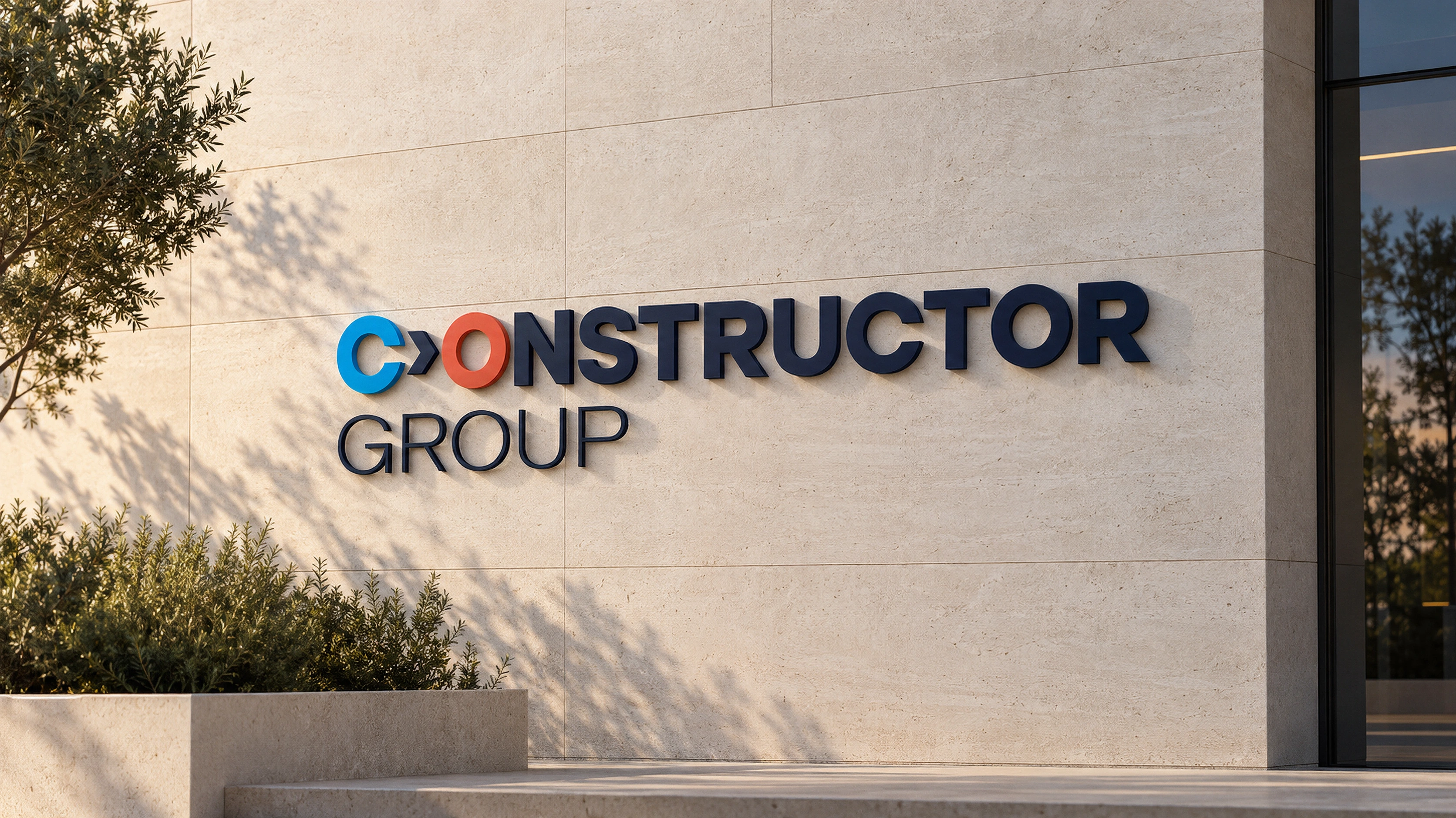
CONSTRUCTOR GROUP / ARCHITECTURAL SIGNAGE STUDY
One ecosystem.
Many different worlds.
A university should feel open and full of discovery. A technology business needs clarity. An investment organisation needs credibility. Constructor Group brings these worlds together, and its visual identity had to make the connection visible.
Our design challenge was to create a recognisable family without making every organisation look identical. The brand needed to work on a research presentation, a student’s hoodie and the entrance to an office.
Before a logo,
a way of thinking.
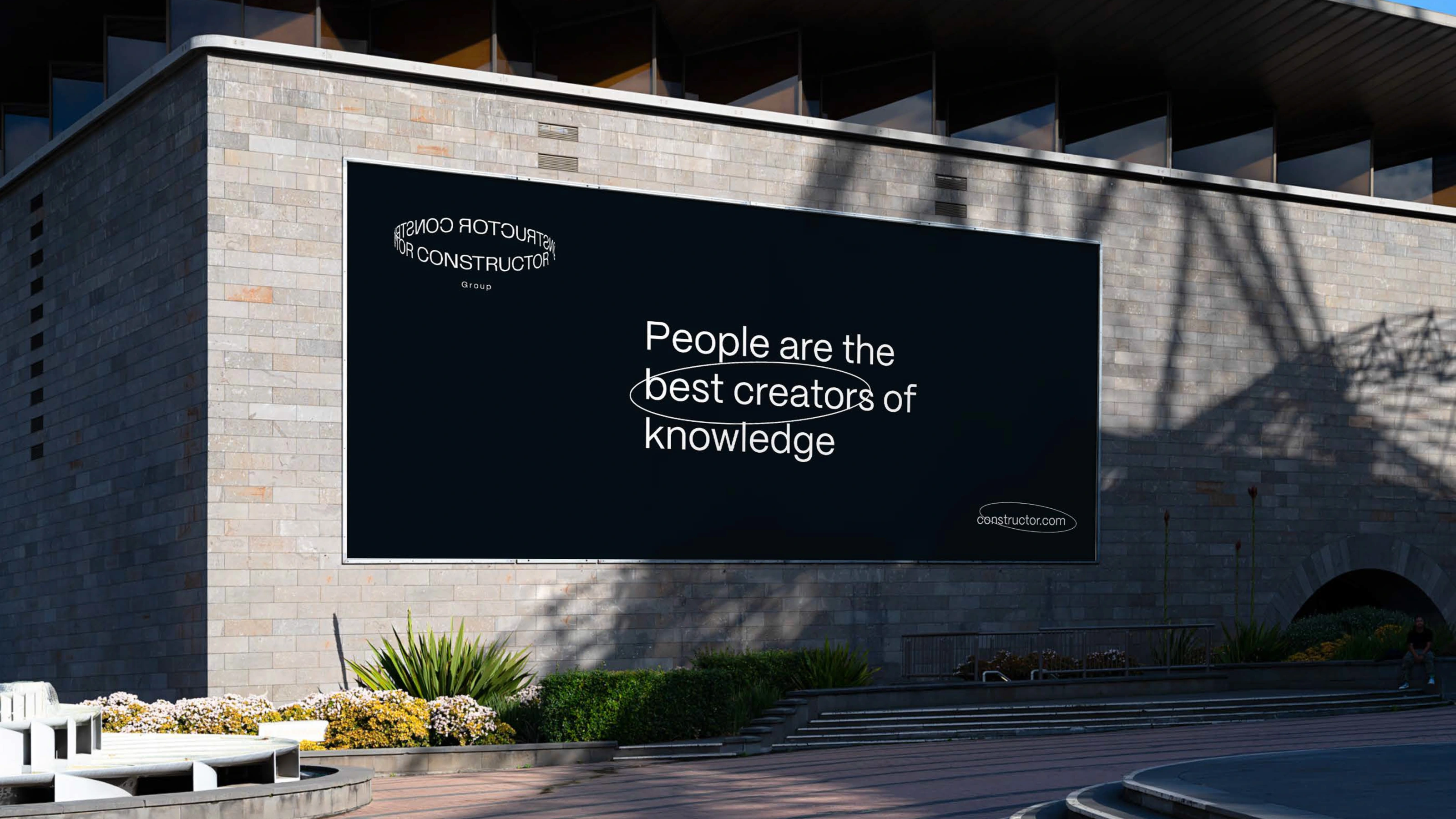
The name came from constructor theory, introduced by physicist David Deutsch and developed with Chiara Marletto. It asks which physical transformations are possible, which are impossible, and why.
In this framework, a constructor is something that can perform a transformation while retaining the ability to do it again. The object it acts on changes; the capacity to make that change remains.
For our brief, this became a visual challenge: how do you express transformation in a sign that a scientist, a software developer or a student can all recognise? We wanted something simple enough to draw, with enough character to connect a diverse group of organisations.
Read about constructor theory ↗A starting point for the design: change, continuity and the ability to make things happen.
We did not start
with the answer.
The brief sounded scientific and complex. The identity had to feel clear, memorable and open. Across several rounds, we explored how a symbol, a long name and a bright palette could work together. Here is the path we took.
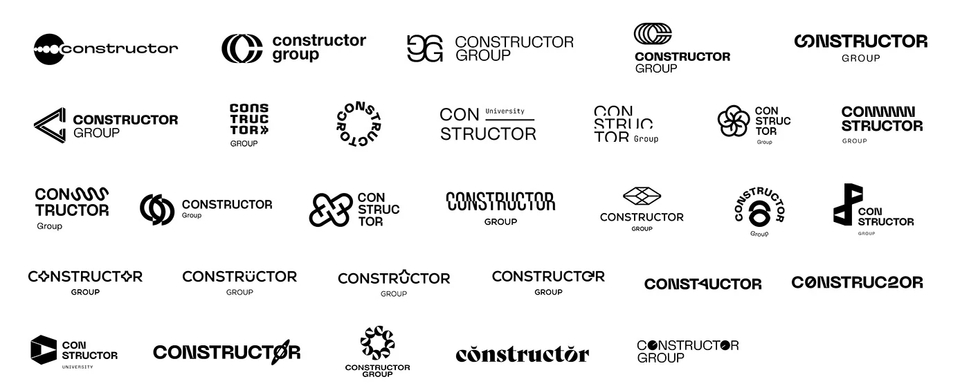
First, open the field.
We began with a wide search: monograms, interlocking forms, stacked names and symbols suggesting movement. The point was to find a way into the idea of transformation before committing to a particular shape.
Take the ideas off the page.
The early directions also appeared in application studies. Seeing a proposal at different scales helped put the identity in context: it had to be more than an interesting symbol on a white sheet.
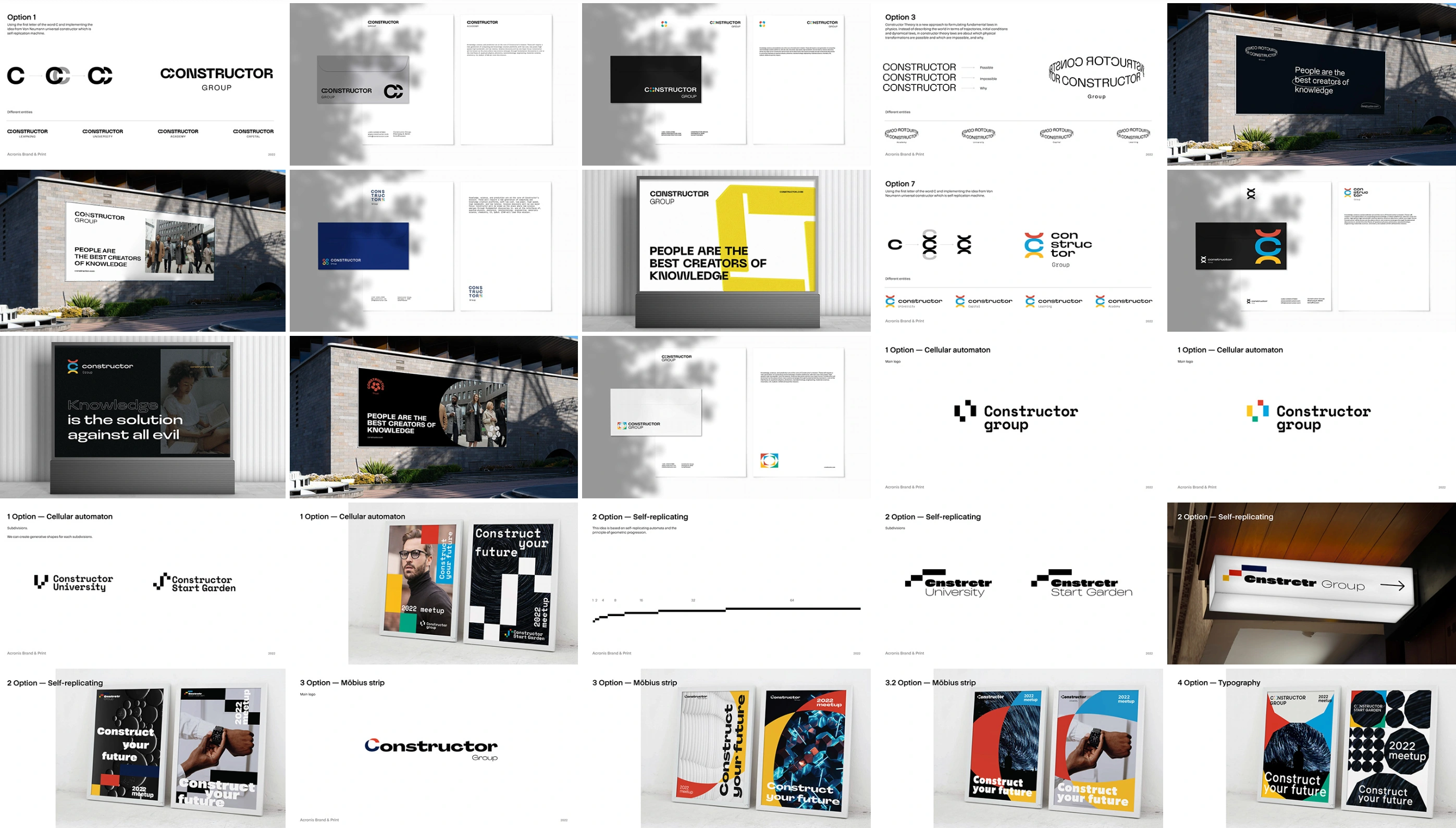
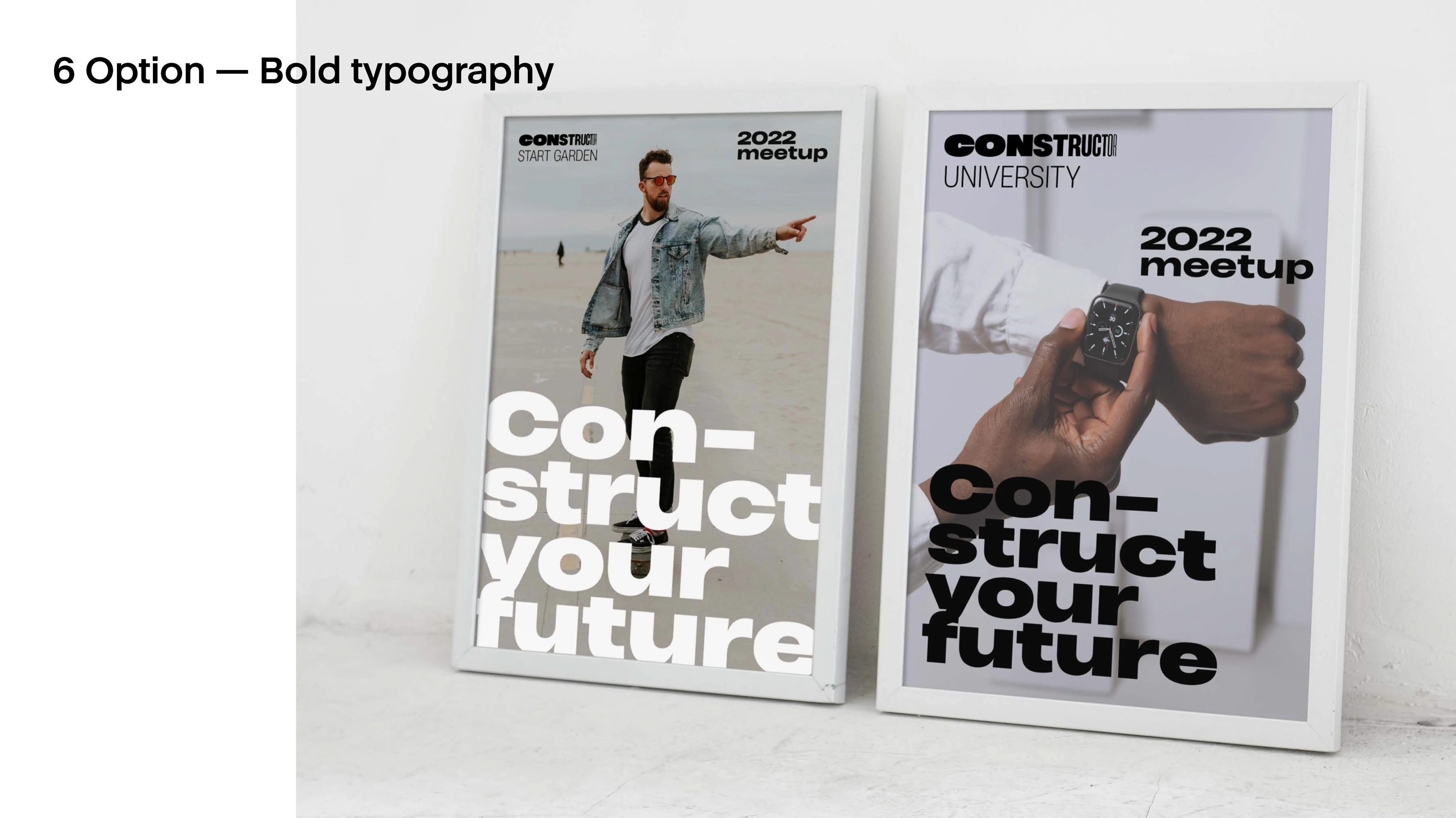
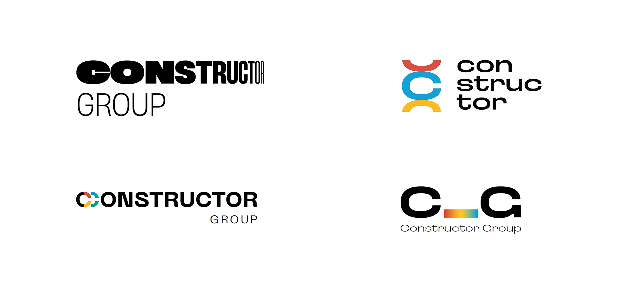
A long name. Fewer elements.
As the search narrowed, transformation became the central thread. CONSTRUCTOR was already a long word; adding a complicated standalone symbol would give people even more to remember. We shortlisted simpler options with clear colour accents.
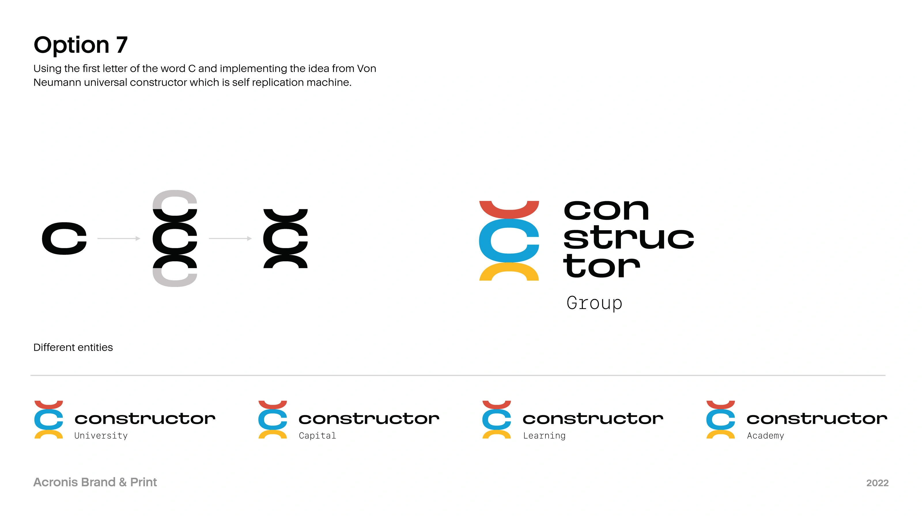
Could the name become a symbol?
We tried abbreviations and combinations of the initial letters. But shortening Constructor without losing its meaning proved difficult. The most promising question was becoming clearer: could the symbol and the name be the same thing?
Interesting to look at.
Harder to draw.
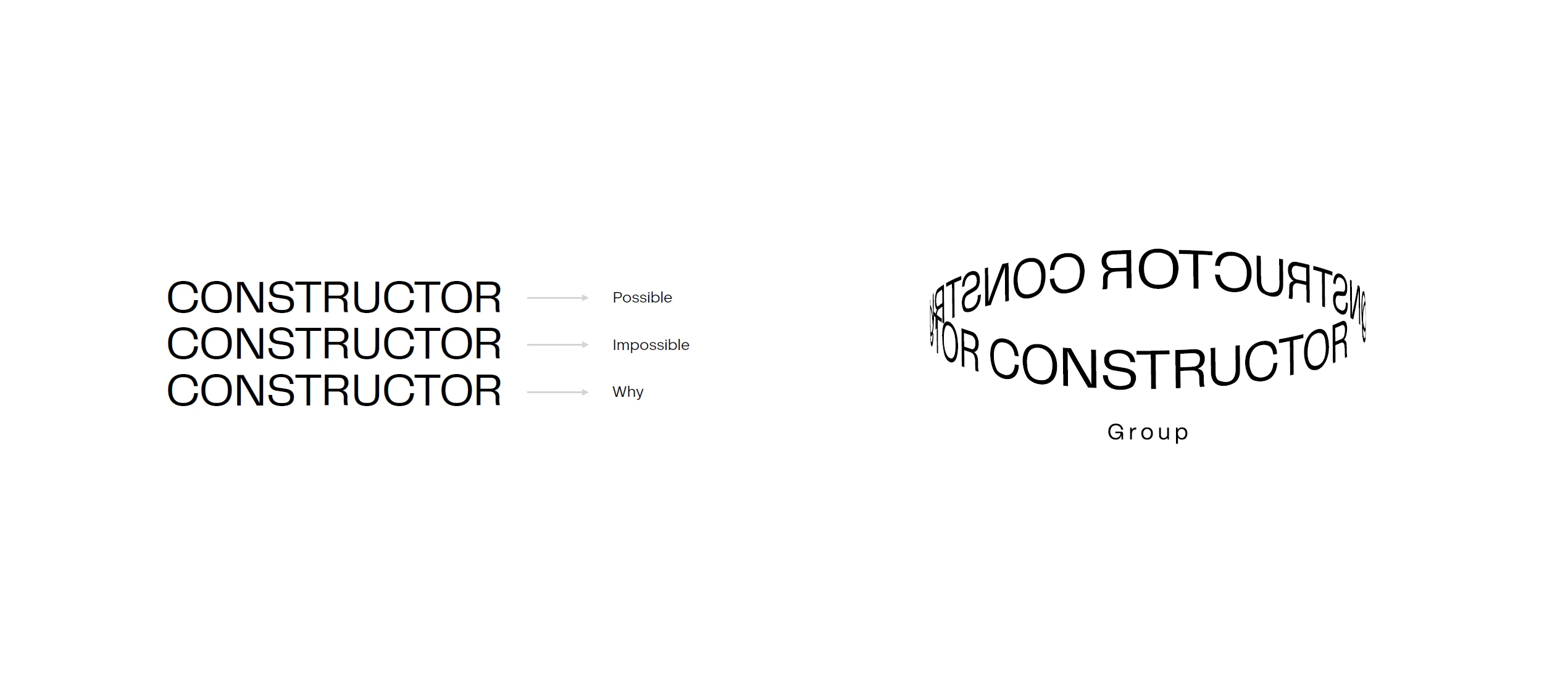
Typographic experiments took the name into repeated lines and a continuous loop. They were intriguing, but they moved away from a key requirement of the brief: a mark simple enough to remember and draw by hand. We let those directions go.
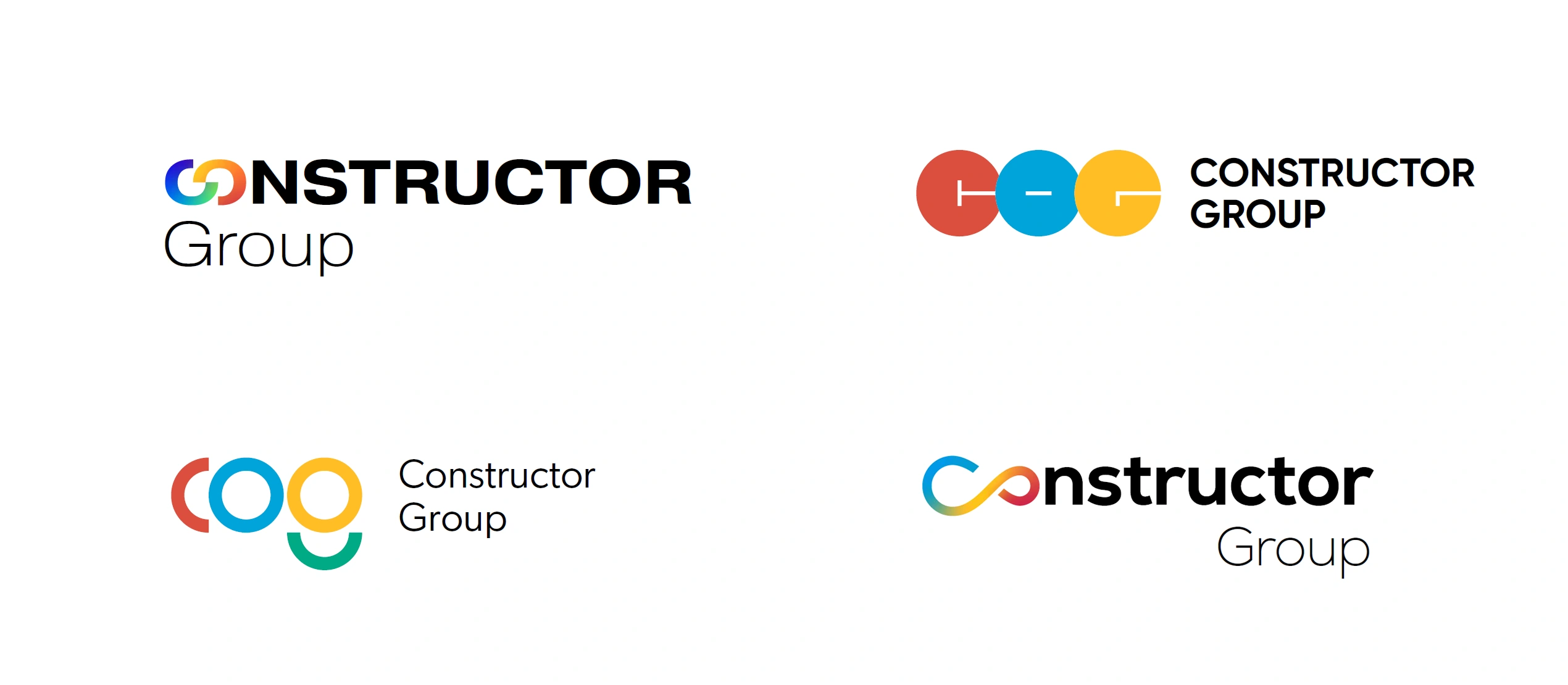
Almost infinity.
Not quite Constructor.
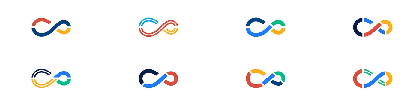
The letters C and O suggested an infinity sign. We explored that connection through colour, broken curves and interlocking loops. The idea of continuity was useful, but a conventional infinity symbol felt too familiar to be the final answer.
The answer was
inside the name.
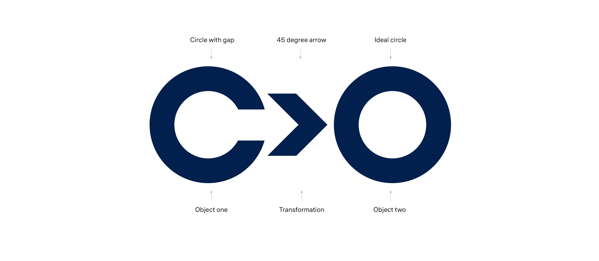
After all those routes, the simplest relationship was already in the name. C can be read as an unfinished O. An arrow gives that change a direction. The opening letters became both a word and a symbol — a compact visual metaphor for transformation.

An open C.
A form with something
still to become.

A direction.
The change from
one state to another.

A complete O.
The next form,
already inside the name.

The symbol becomes the opening of the word. The name carries the idea.
C>OThere was a useful bonus: the idea could be typed with three ordinary keyboard characters. A signature that could travel through a message, an email or a line of code.
A clear shape with an idea behind it.
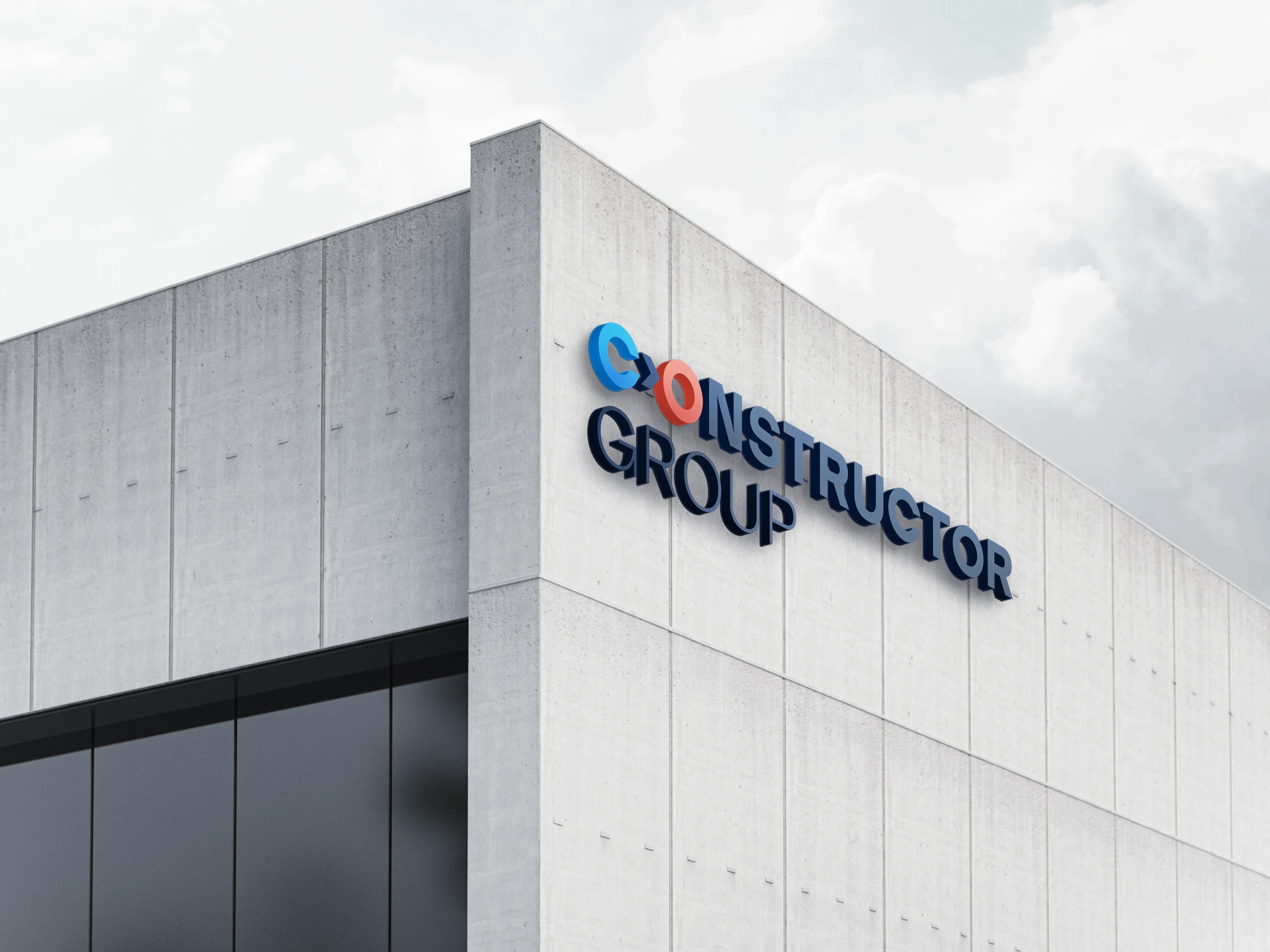
From a keyboard to a building facade.
A consistent starting point for many voices.
A family resemblance.
Room to be different.
One wordmark holds the ecosystem together. A second line identifies each organisation, while colour and imagery give individual applications their own character. The result is a visual identity system that can move between education, research and business.
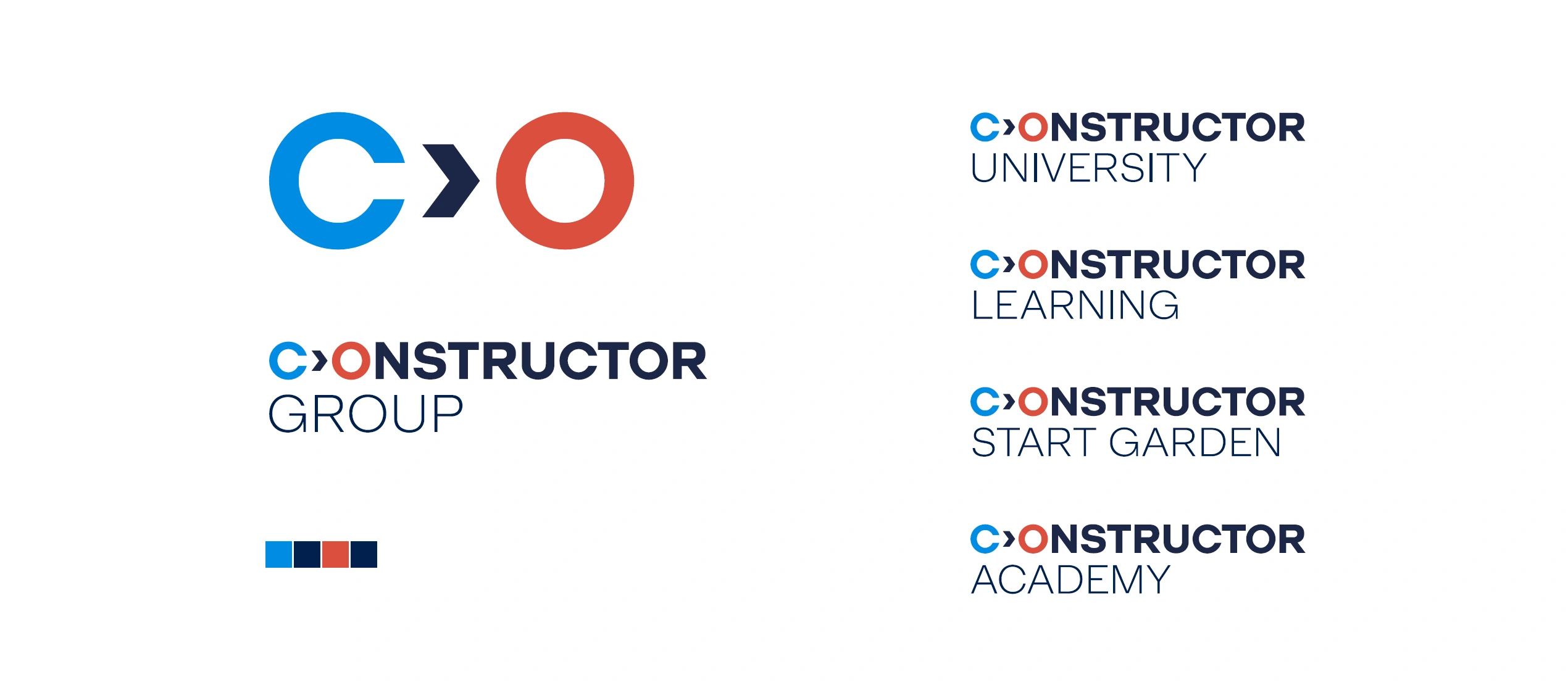
The original construction drawing and facade mockup, kept alongside the refreshed presentation.
Serious about science.
Alive with colour.
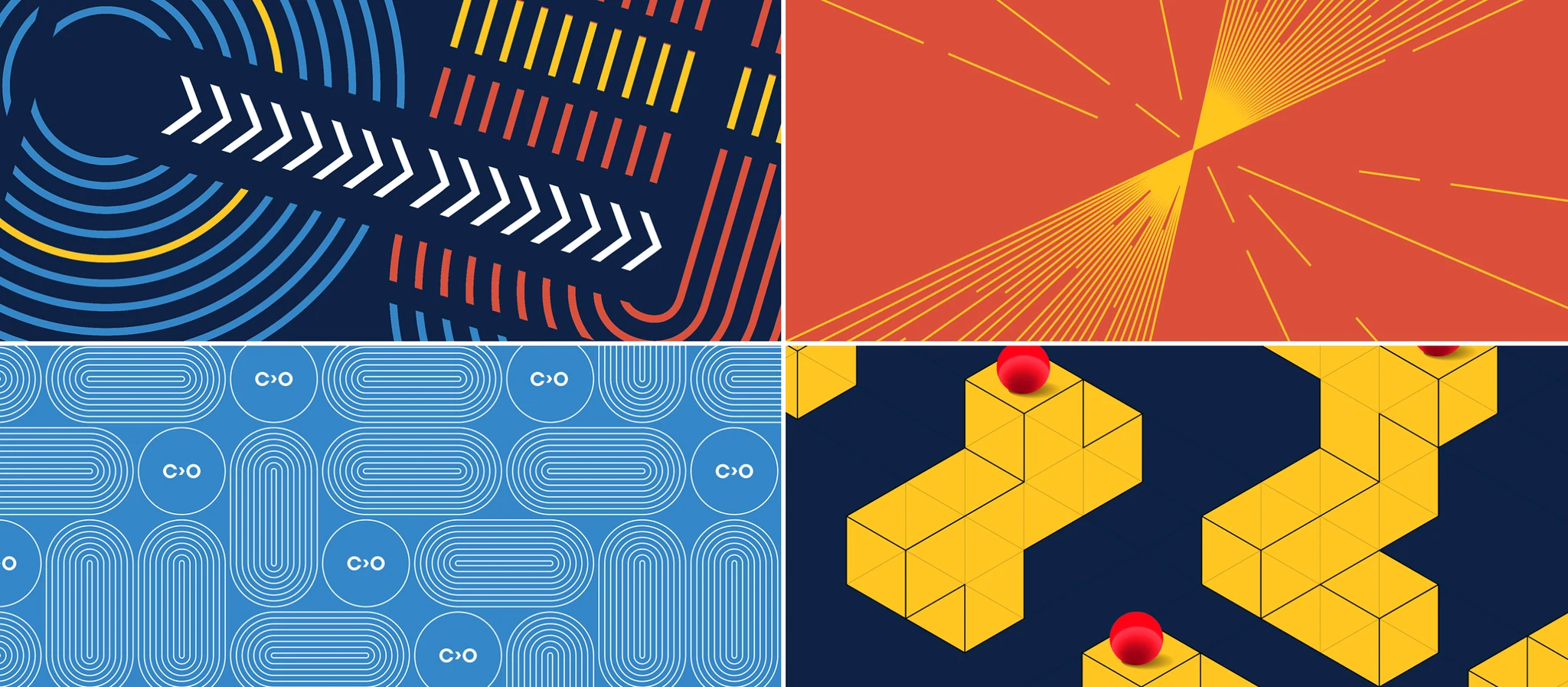
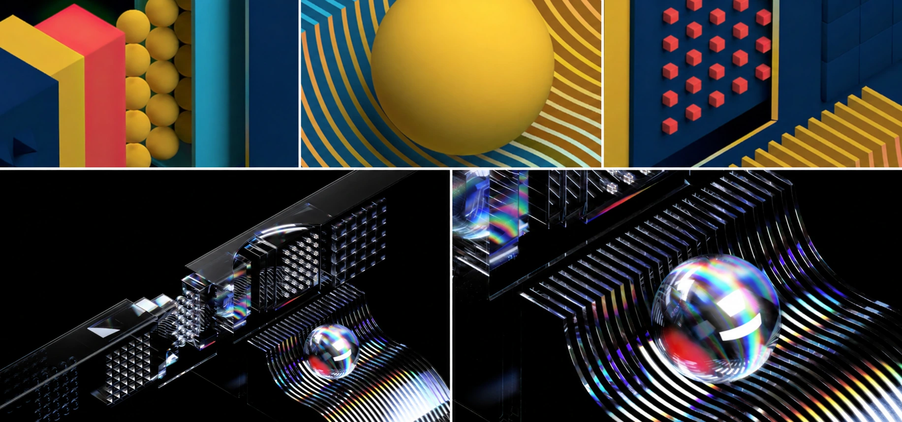
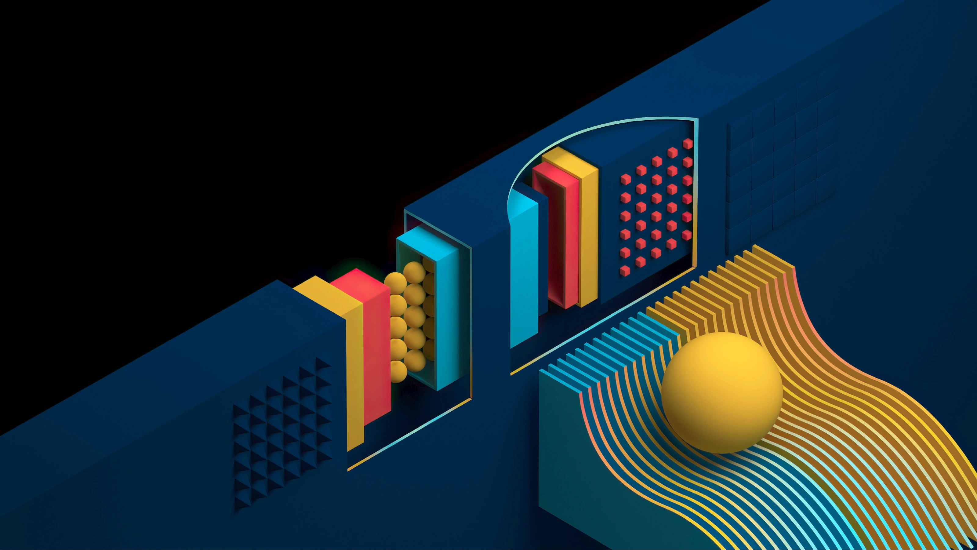
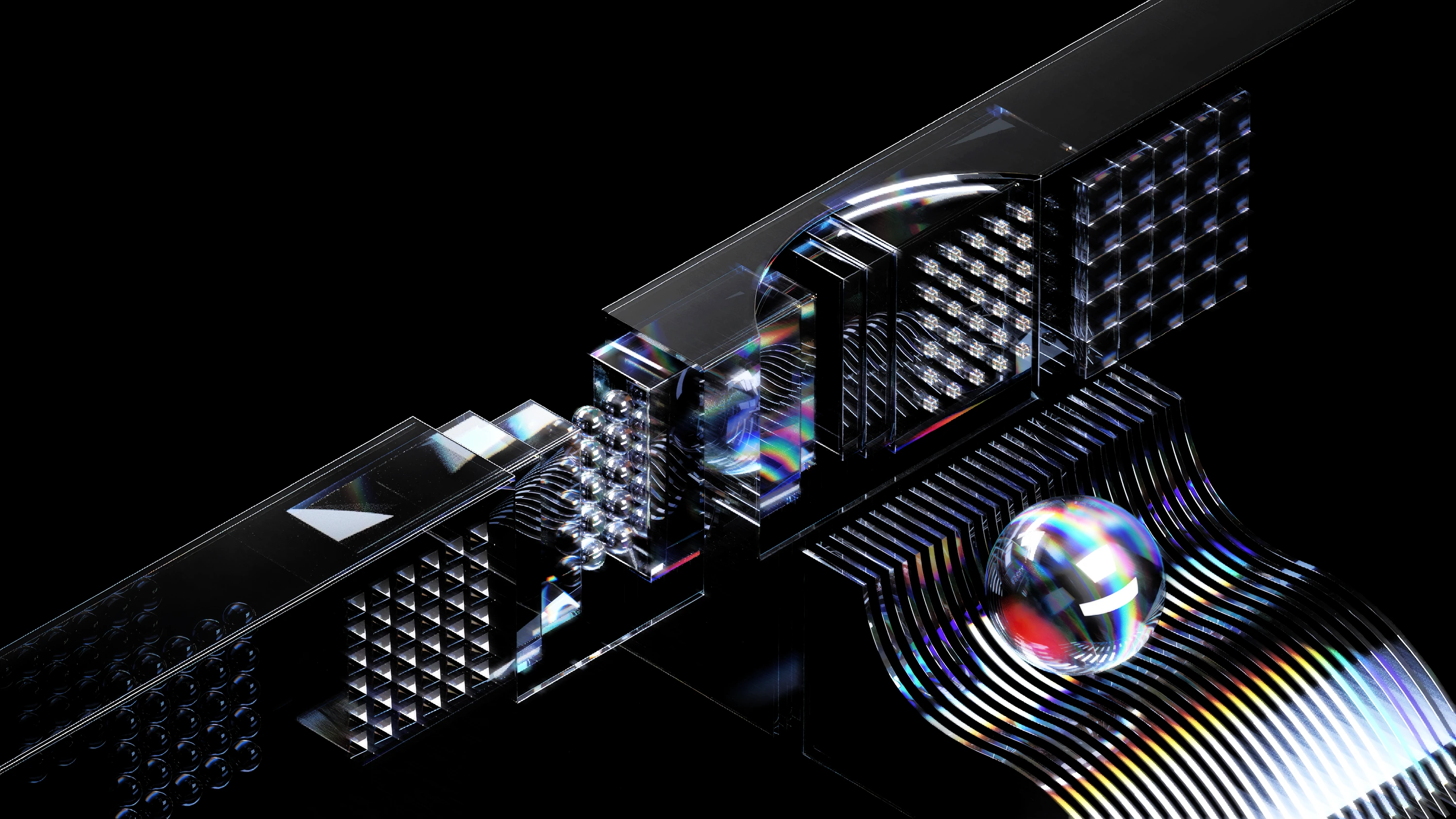
Scientific and physical motifs became a source of patterns and illustrations. Geometry gives the system structure; a vivid palette gives it energy. It is a way to speak about ambitious ideas while staying approachable.
Designed to leave
the guidelines.
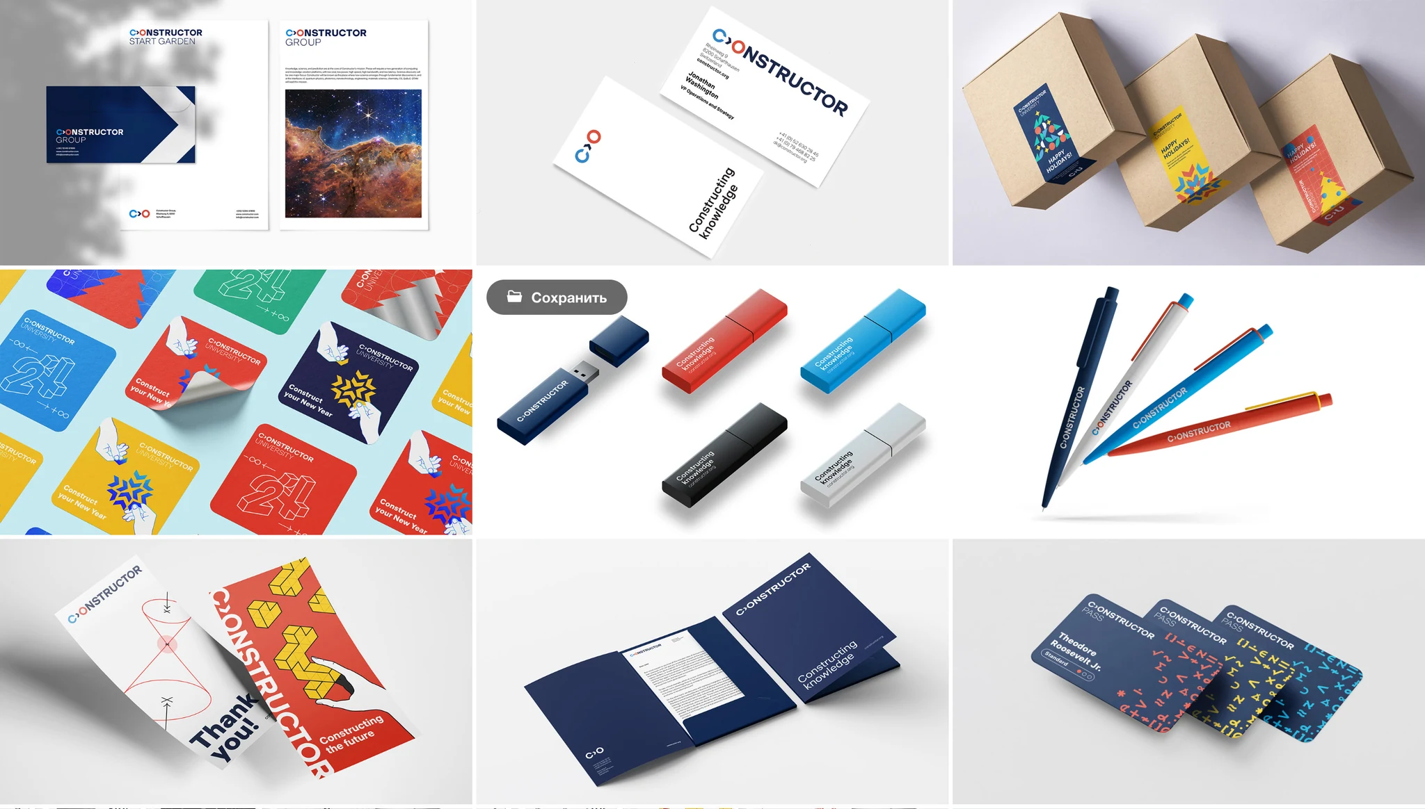
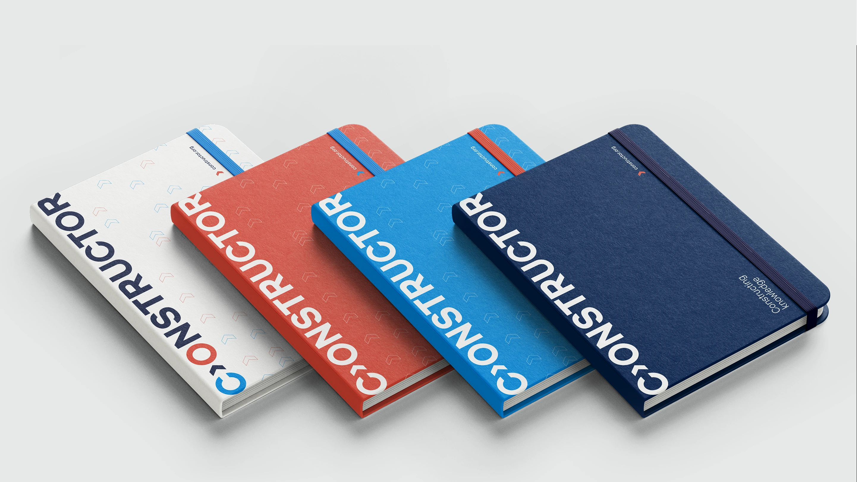
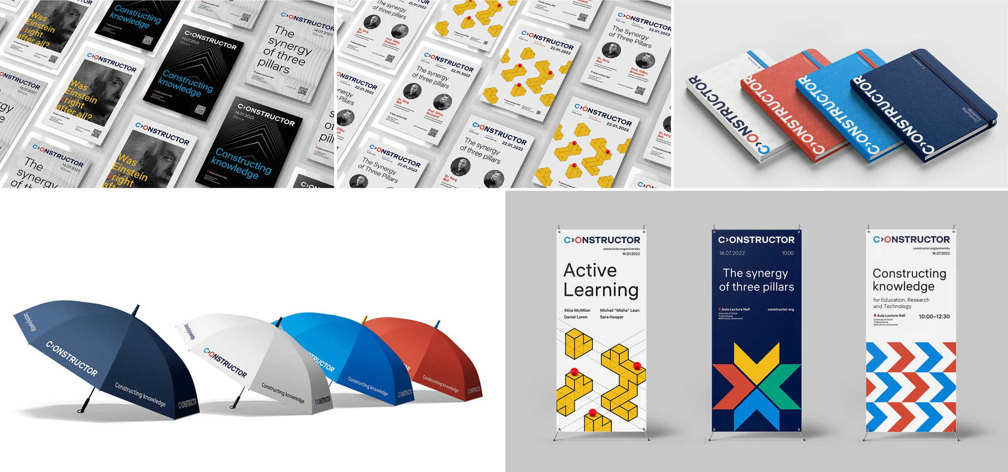
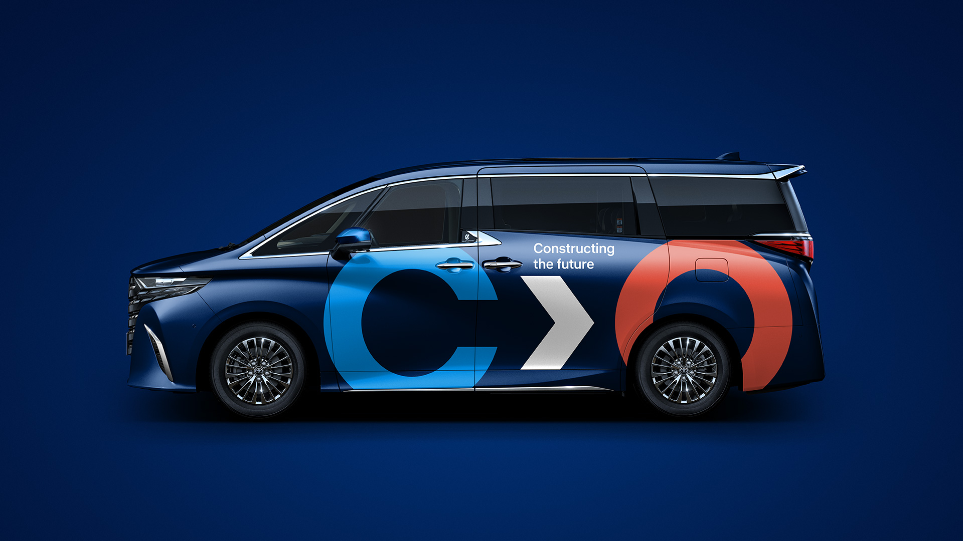
A brand becomes real through the things people see, use and keep. We carried the identity into stationery, publications, packaging and everyday objects, balancing a recognisable signature with varied compositions.
From belonging
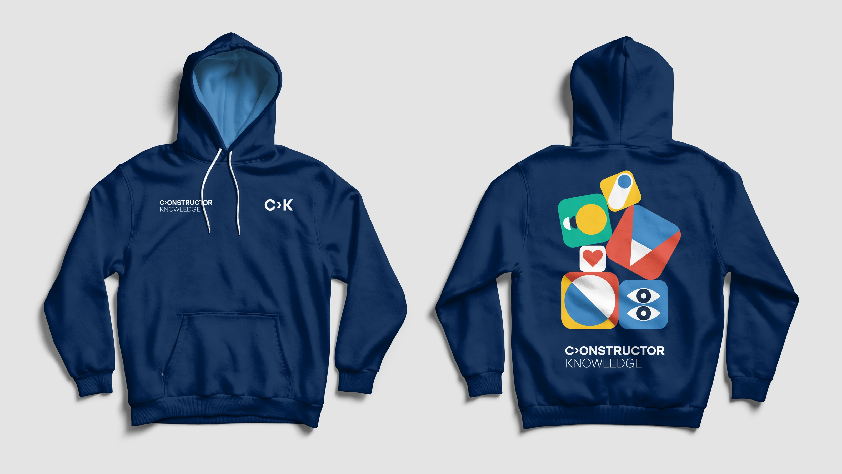
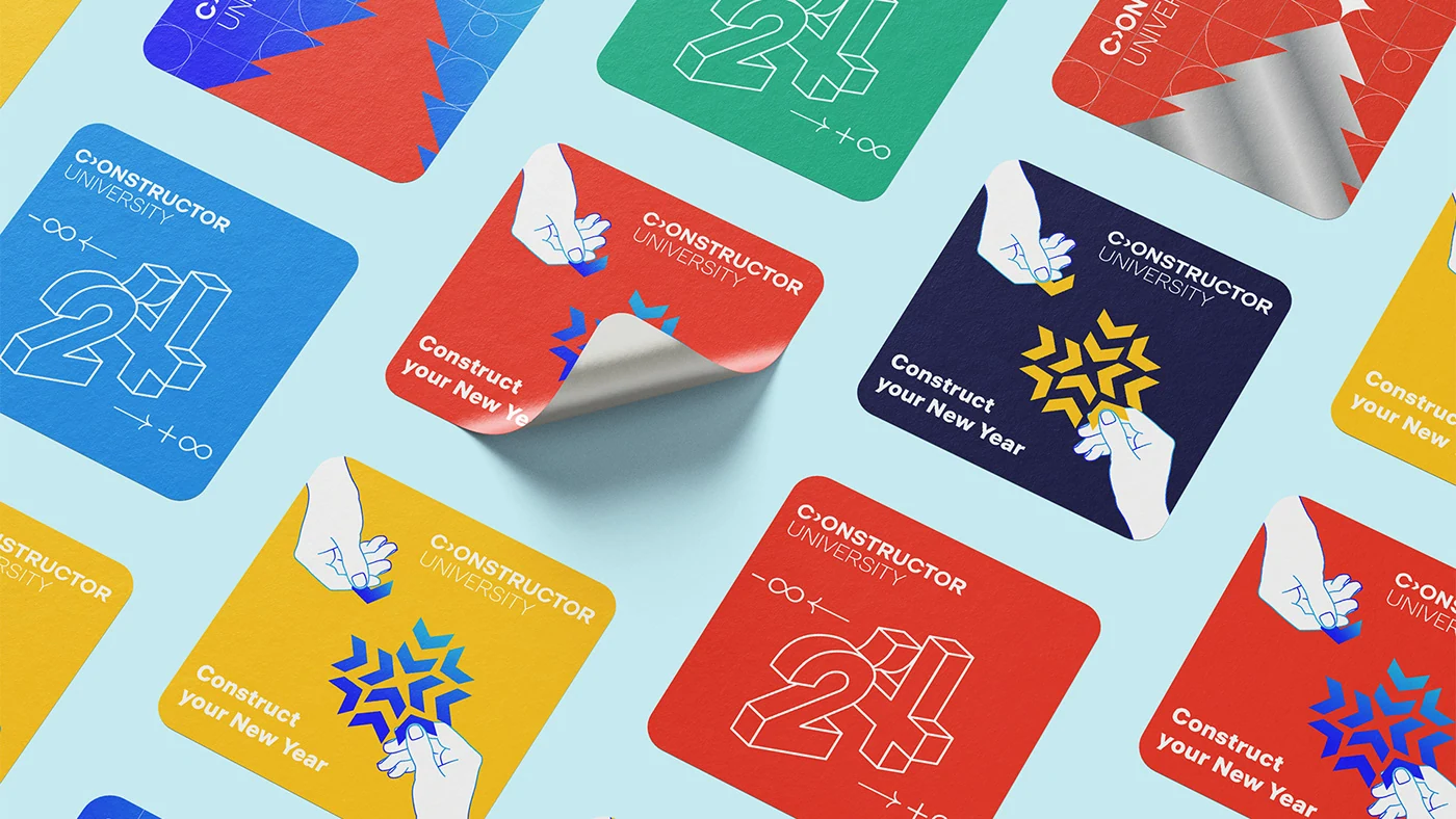
to belongings.
Illustration makes room for personality. A hoodie can be expressive; a greeting card can be playful. Both still belong to the same Constructor world.
Not just on a page.
Part of a place.
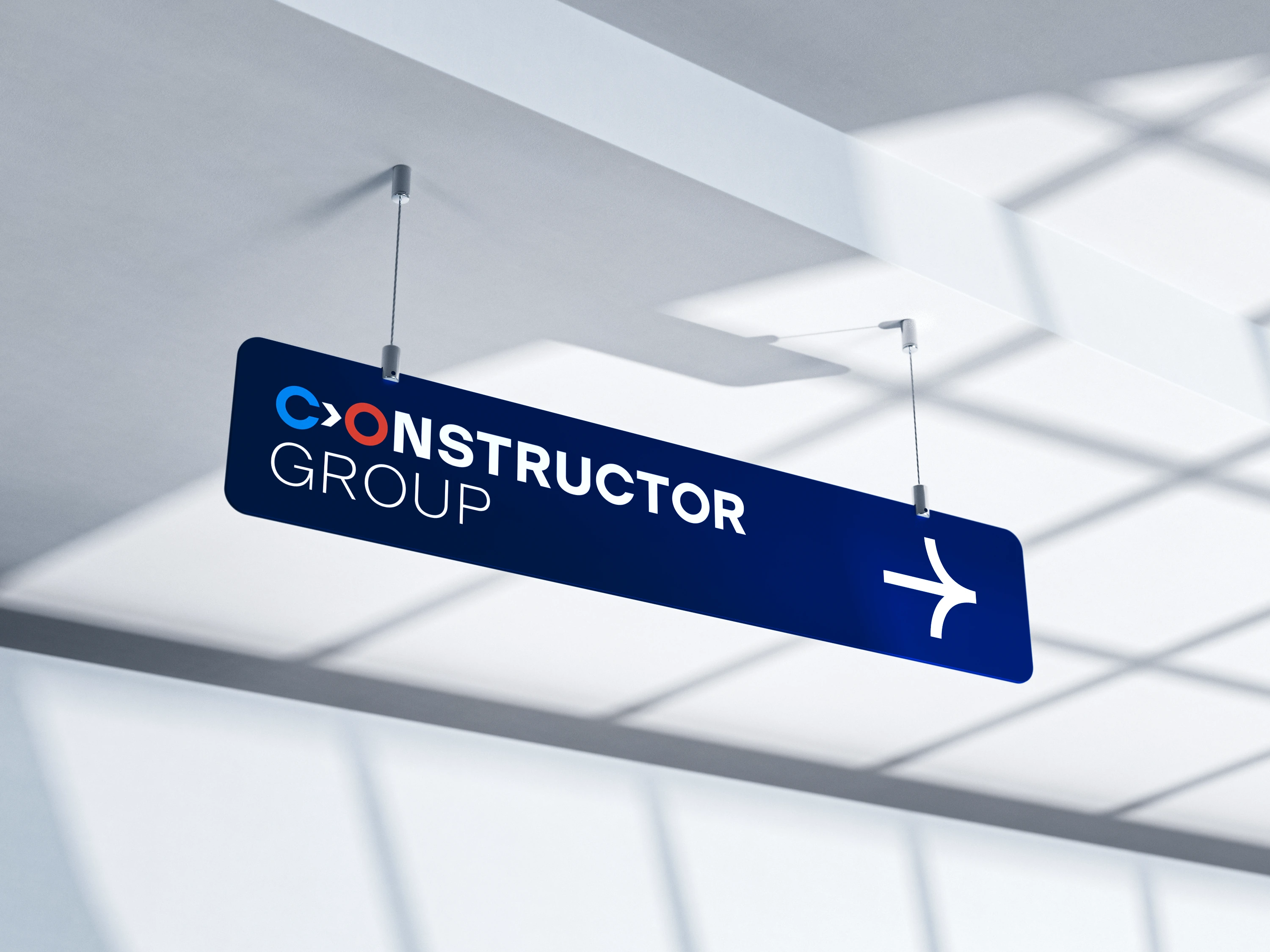
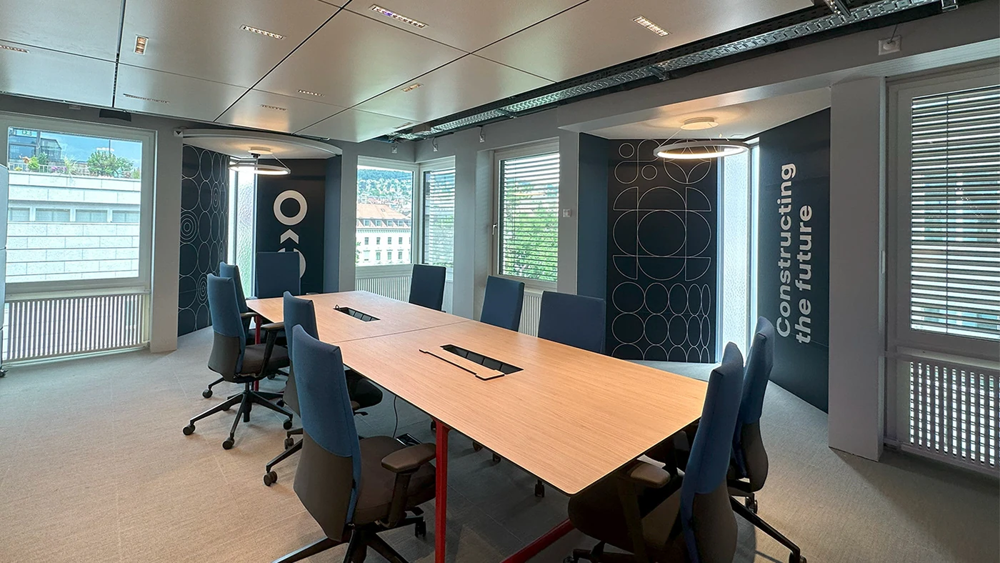
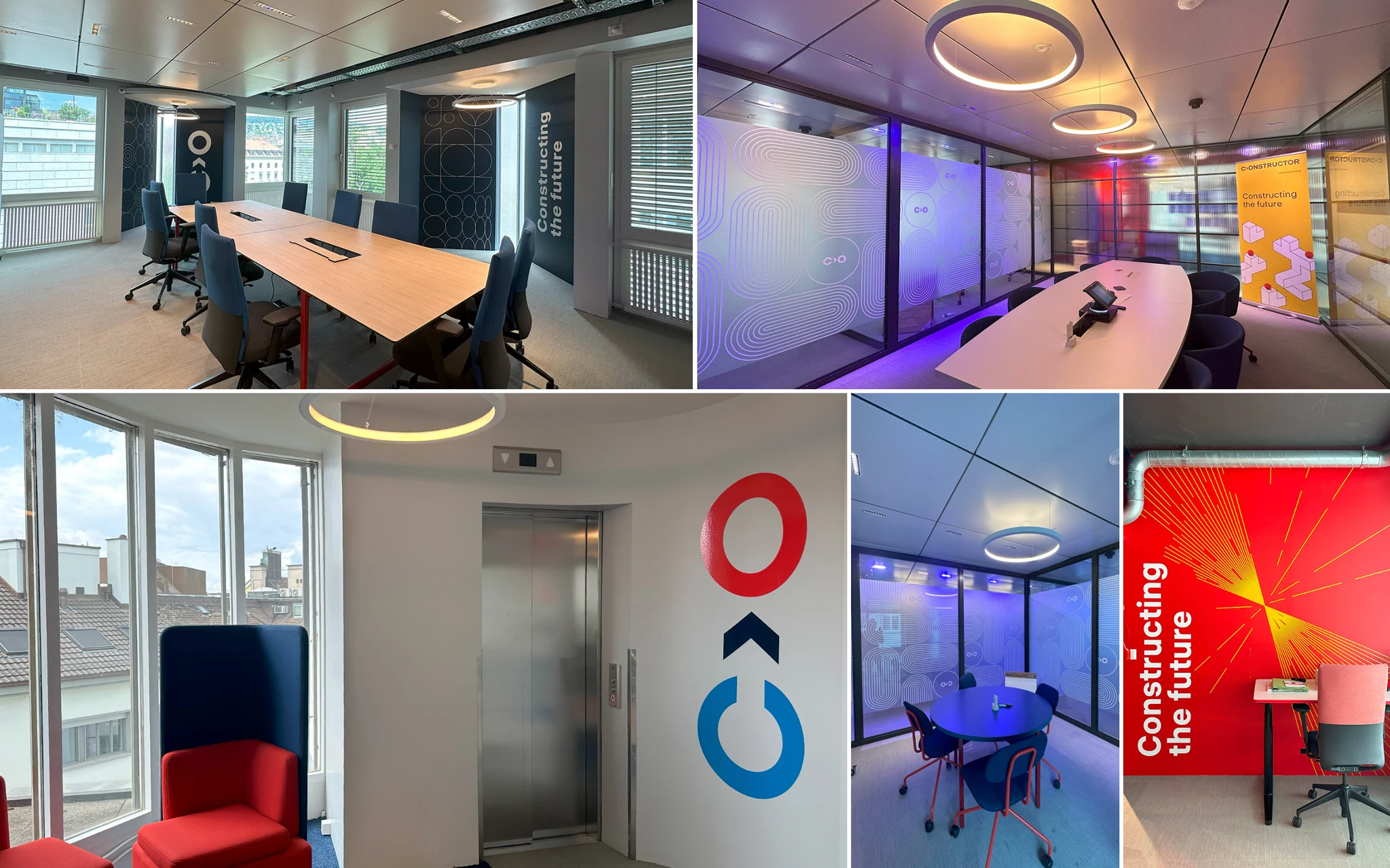
The identity also moved into office interiors. Large-scale typography, wayfinding and graphic surfaces connect the physical environment to the brand, bringing colour and character to spaces for meeting and working.
One clear idea.
A system for many contexts.
The Constructor Group brand identity connects a family of organisations across digital materials, publications, merchandise and office interiors. The core mark stays recognisable while the visual language adapts to the people and places using it.
For our design studio, this is what a brand system should do: make the organisation easier to recognise, and give its teams a practical starting point for what comes next.
Let’s talk about your brand Explore our editorial design for Constructor University